Are you a member of the Splunk Community?
- Find Answers
- :
- Using Splunk
- :
- Splunk Search
- :
- Better PDF report visualization
- Subscribe to RSS Feed
- Mark Topic as New
- Mark Topic as Read
- Float this Topic for Current User
- Bookmark Topic
- Subscribe to Topic
- Mute Topic
- Printer Friendly Page
- Mark as New
- Bookmark Message
- Subscribe to Message
- Mute Message
- Subscribe to RSS Feed
- Permalink
- Report Inappropriate Content
Better PDF report visualization
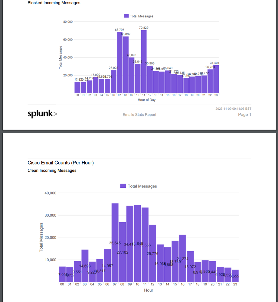
Hello, i am reaching out to ask if there is any way to make the chart that was generated with the scheduled PDF report option look any better.
We have this dashboard:
It looks fine. Everything looks nice and clean. When we use the schedule PDF, and we generate a pdf, it does not look good. It looks like
As an fyi, the above SS included both types for chart formatting, one had the values in the middle, and one had values above. Both look good in the dashboard, but neither look good in the pdf.
Is there a way to edit the chart bars so they have more space, or to edit the size of the numerals above the bars?
Is there an app that allows better editing of PDF within splunk? I feel like we have done everything we can to make the pdf look good, but we can not seem to be able to get the numbers to look good on the pdf.
Thank you for any guidance.


