- Find Answers
- :
- Using Splunk
- :
- Splunk Search
- :
- Arranging column chart X-axis labels in static ord...
- Subscribe to RSS Feed
- Mark Topic as New
- Mark Topic as Read
- Float this Topic for Current User
- Bookmark Topic
- Subscribe to Topic
- Mute Topic
- Printer Friendly Page
- Mark as New
- Bookmark Message
- Subscribe to Message
- Mute Message
- Subscribe to RSS Feed
- Permalink
- Report Inappropriate Content
Hi Everyone,
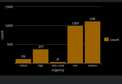
I have a column chart for the below query. As shown in the below screenshot, the x-axis label is sorted in alphabetical order, but my requirement is display it in a static order (critical,high,medium,low,informational) and in additional can we have unique color for the bar for each x-axis label (ex:critical:red, high:green). Can someone guide me on how to implement these changes. Appreciate your help in advance!!
Query:
`notable`
| stats count by urgency
- Mark as New
- Bookmark Message
- Subscribe to Message
- Mute Message
- Subscribe to RSS Feed
- Permalink
- Report Inappropriate Content
I was able to achieve this on my local instance by a stats aggregation by "severity" field and then doing a transpose of results so that the splunk chary visualization will display it this way.
Example of SPL:
<base_search>
    | stats
        count as count
            by severity
    | transpose header_field=severity column_name=severity
    | fields + severity, critical, high, medium, low, informational
In the dashboard XML you should be able to add this option tag to your bar chart visualization to assign colors for each unique severity value.
<option name="charting.fieldColors">{"critical":0xFF0000,"high":0xFF7F50,"medium":0xFFBF00,"low":0xDFFF00,"informational":0x40E0D0}</option>
Screenshot of results.
Full SPL used to replicate on my local instance:
| makeresults count=377
    | eval
        severity="high"
    | append
        [
            | makeresults count=1118
                | eval
                    severity="medium"
            ]
    | append
        [
            | makeresults count=119
                | eval
                    severity="critical"
            ]
    | append
        [
            | makeresults count=1001
                | eval
                    severity="low"
            ]
    | append
        [
            | makeresults count=41
                | eval
                    severity="informational"
            ]

    | stats
        count as count
            by severity
    | transpose header_field=severity column_name=severity
| fields + severity, critical, high, medium, low, informational- Mark as New
- Bookmark Message
- Subscribe to Message
- Mute Message
- Subscribe to RSS Feed
- Permalink
- Report Inappropriate Content
Thank You, this helped.
- Mark as New
- Bookmark Message
- Subscribe to Message
- Mute Message
- Subscribe to RSS Feed
- Permalink
- Report Inappropriate Content
I was able to achieve this on my local instance by a stats aggregation by "severity" field and then doing a transpose of results so that the splunk chary visualization will display it this way.
Example of SPL:
<base_search>
    | stats
        count as count
            by severity
    | transpose header_field=severity column_name=severity
    | fields + severity, critical, high, medium, low, informational
In the dashboard XML you should be able to add this option tag to your bar chart visualization to assign colors for each unique severity value.
<option name="charting.fieldColors">{"critical":0xFF0000,"high":0xFF7F50,"medium":0xFFBF00,"low":0xDFFF00,"informational":0x40E0D0}</option>
Screenshot of results.
Full SPL used to replicate on my local instance:
| makeresults count=377
    | eval
        severity="high"
    | append
        [
            | makeresults count=1118
                | eval
                    severity="medium"
            ]
    | append
        [
            | makeresults count=119
                | eval
                    severity="critical"
            ]
    | append
        [
            | makeresults count=1001
                | eval
                    severity="low"
            ]
    | append
        [
            | makeresults count=41
                | eval
                    severity="informational"
            ]

    | stats
        count as count
            by severity
    | transpose header_field=severity column_name=severity
    | fields + severity, critical, high, medium, low, informational

