- Find Answers
- :
- Splunk Platform
- :
- Splunk Enterprise
- :
- Help with Dashboard panel features?
- Subscribe to RSS Feed
- Mark Topic as New
- Mark Topic as Read
- Float this Topic for Current User
- Bookmark Topic
- Subscribe to Topic
- Mute Topic
- Printer Friendly Page
- Mark as New
- Bookmark Message
- Subscribe to Message
- Mute Message
- Subscribe to RSS Feed
- Permalink
- Report Inappropriate Content
Help with Dashboard panel features?
I have a dashboard where I want to get the following features:
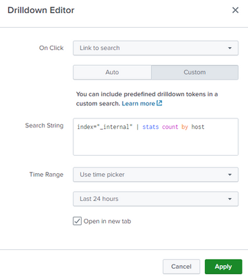
1. Drill down option i mentioned to "Link to search" but when i am clicking on the graph it is the search page is opening in same tab, but i want to open that in another tab.
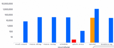
2. I have another panel where the bar graph is showing by hosts, so i want to show up different colors for each host, how can i do this.
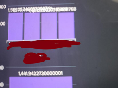
3. i want to display the values on the graph, it is displaying but it is overlapping, how can make them display clearly.
- Mark as New
- Bookmark Message
- Subscribe to Message
- Mute Message
- Subscribe to RSS Feed
- Permalink
- Report Inappropriate Content
Hi
please find following repponses
1. Drill down option i mentioned to "Link to search" but when i am clicking on the graph it is the search page is opening in same tab, but i want to open that in another tab.
in dashboard panel seetins you can check option open in tab , then your drilldown open in new tab
2. I have another panel where the bar graph is showing by hosts, so i want to show up different colors for each host, how can i do this.
you can use follwing option to give cutsom colors
<option name="charting.fieldColors">{"count": #66FF00}</option>
https://docs.splunk.com/Documentation/Splunk/latest/Viz/ChartConfigurationReference?_ga=2.144048631....
- Mark as New
- Bookmark Message
- Subscribe to Message
- Mute Message
- Subscribe to RSS Feed
- Permalink
- Report Inappropriate Content
Hi @SanjayReddy , thank you for replying .
1. now its working as expected-Drill down option in new tab.
2. I have another panel where the bar graph is showing by hosts, so i want to show up different colors for each host, how can i do this
For this my query is: index=asdf sourcetype=ghtfg |stats count by host.
So my dashboard panel is displaying with multiple hosts as bar graph.
here i want to show each single host in different colours.
For example: in the dashboard panel if it is dsiplaying 4 hosts
1st host should display as red, 2nd host should display as green so on....
3.. i want to display the values on the graph, it is displaying but it is overlapping, how can make them display clearly.
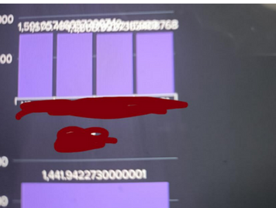
if you see here all values are overlapping, i want this values should individually without overlapping.
- Mark as New
- Bookmark Message
- Subscribe to Message
- Mute Message
- Subscribe to RSS Feed
- Permalink
- Report Inappropriate Content
If you are doing
search...
| stats count by host
then just add
| transpose 0 header_field=host column_name=Hostbut that graph example you posted is not a count by host.
If you have two fields then you can use the chart command to get multi-series
search...
| chart count over X by Y
where Y will by the multi series that is shown in different colours
As for your overlapping values, with your non-rounded values, where you are displaying 13 decimal places, you should round those values - do you really need all 13 places??
| eval x=round(x,2)will round to 2dp
- Mark as New
- Bookmark Message
- Subscribe to Message
- Mute Message
- Subscribe to RSS Feed
- Permalink
- Report Inappropriate Content
2. for the multi series colours : Please tell me what i should add so that i can get the different colours.
Here i am calculating the avg response time by host and code_desc.
i am using the below query :
index=xxxxx code_desc=NH23FG OR code_desc=TH45GH source=xxxx*
|stats avg(responsetime) as Avg_response by host, code_desc
|sort by Avg_response
|where Avg_response>500
Output:
3. i have rounded up the value upto 2 decimal places, now it is showing correctly, but if i want to show complete number upto 13 .
how can i do that??
- Mark as New
- Bookmark Message
- Subscribe to Message
- Mute Message
- Subscribe to RSS Feed
- Permalink
- Report Inappropriate Content
For multi series colour, use
| chart avg(responsetime) as Avg_response over host by code_descrather than stats
If you want to show 13 decimal places for all values on the chart, then it will look like the messy chart you have.
- Mark as New
- Bookmark Message
- Subscribe to Message
- Mute Message
- Subscribe to RSS Feed
- Permalink
- Report Inappropriate Content
when i am using chart no data is coming from the query.
| chart avg(responsetime) as Avg_response over host by code_desc
on e more point how can i mention the option name
<option name ="charting.fieldSeries">{xxxxxxxxx}</option>
please advise.
- Mark as New
- Bookmark Message
- Subscribe to Message
- Mute Message
- Subscribe to RSS Feed
- Permalink
- Report Inappropriate Content
There will be no field Avg_response using chart, so you can put the chart line after your where clause
index=xxxxx code_desc=NH23FG OR code_desc=TH45GH source=xxxx*
| stats avg(responsetime) as Avg_response by host, code_desc
| where Avg_response>500
| sort by Avg_response
| chart values(Avg_response) as Avg_response over host by code_desc


