- Find Answers
- :
- Using Splunk
- :
- Dashboards & Visualizations
- :
- sparkline length (width) out of control?
- Subscribe to RSS Feed
- Mark Topic as New
- Mark Topic as Read
- Float this Topic for Current User
- Bookmark Topic
- Subscribe to Topic
- Mute Topic
- Printer Friendly Page
- Mark as New
- Bookmark Message
- Subscribe to Message
- Mute Message
- Subscribe to RSS Feed
- Permalink
- Report Inappropriate Content
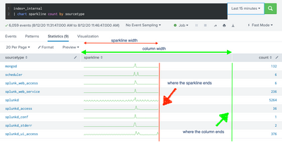
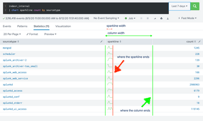
Why is this happening and is there a way to fix it? (1. Sparkline not filling the width of the column it's supposed to be in - often significantly narrower than the column; 2. Sparkline width inconsistent between similar searches when only the timeframe is changed.)
Sample search (from "Add sparklines to search results"):
index=_internal
| chart sparkline count by sourcetype
(Tested and reproduced in Splunk versions 7.2.3, 8.0.1, 8.04.1, 8.05, multiple versions of Chrome and Safari.)
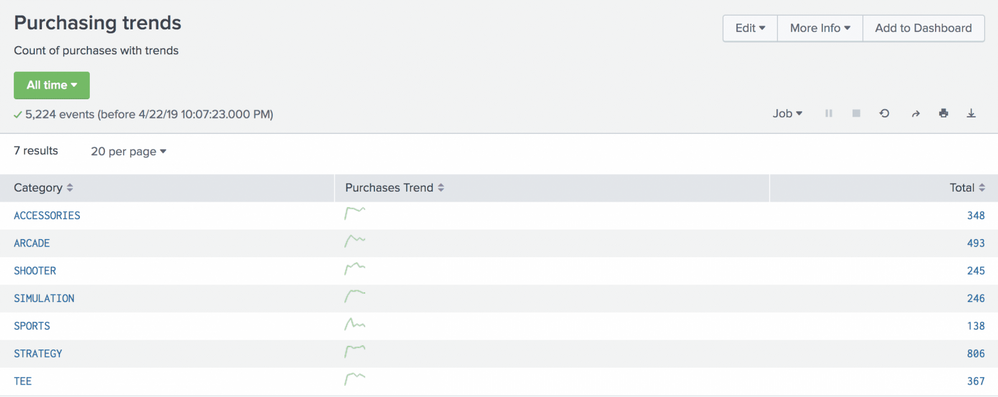
P.S. The issue is also evident in Splunk's own screenshots, e.g. in "Create a report from a sparkline chart" and "Add sparklines to search results":
- Mark as New
- Bookmark Message
- Subscribe to Message
- Mute Message
- Subscribe to RSS Feed
- Permalink
- Report Inappropriate Content
So, in general, the column width in the Search and Reporting app does not adjust to the length of the largest value; whether that's a string field, a numeric field, or a sparkline. There is that.
Secondly, the length of the sparkline depends on the number of data values which in turn depends on the search timeframe (i.e. total events). How much time a single sparkline point spans is chosen depending on your search timeframe unless you explicitly specify it. If you choose a large search time frame with few results you get a shorter line than if you are running a short time frame search.
Try this:
index=_internal earliest=-60m
| stats sparkline(count,30s) as SparkLine, count by sourcetype | fields SparkLine, sourcetype, count
This is going back 60 minutes and the counts for the sparkline span 30secs each. That results in 120 "bins" and a reasonably long line. If you change the sparkline span to 30mins, you'll get two data points, and a short sparkline. Sparklines can display a maximum of 101 data points.
If you have enough screen width, the space will be divided amongst columns evenly, so you'll end up with extra space for column values that cannot use it.
If you run this:
index=_internal earliest=-200m
| stats sparkline(count,2min) as SparkLine, count by sourcetype | fields SparkLine, sourcetype, count, "AAAAAAAA", "BBBBBBBB", "CCCCCCCC", "DDDDDDDD", "EEEEEEEE"
you may see that your sparkline fills the -now smaller- column width out better.
HTH!
- Mark as New
- Bookmark Message
- Subscribe to Message
- Mute Message
- Subscribe to RSS Feed
- Permalink
- Report Inappropriate Content
What Splunk version? What search timeframes? Same behavior in different browsers?
- Mark as New
- Bookmark Message
- Subscribe to Message
- Mute Message
- Subscribe to RSS Feed
- Permalink
- Report Inappropriate Content
Splunk Enterprise versions 7.2.3, 8.0.1, 8.04.1, 8.05, multiple versions of Chrome (76 through 84) and Safari.
Timeframes: 15 minutes, 4 hours, 24 hours, 7 days, 30 days.
P.S. This does not happen for you, for the same search and timeframes I listed?
- Mark as New
- Bookmark Message
- Subscribe to Message
- Mute Message
- Subscribe to RSS Feed
- Permalink
- Report Inappropriate Content
So, in general, the column width in the Search and Reporting app does not adjust to the length of the largest value; whether that's a string field, a numeric field, or a sparkline. There is that.
Secondly, the length of the sparkline depends on the number of data values which in turn depends on the search timeframe (i.e. total events). How much time a single sparkline point spans is chosen depending on your search timeframe unless you explicitly specify it. If you choose a large search time frame with few results you get a shorter line than if you are running a short time frame search.
Try this:
index=_internal earliest=-60m
| stats sparkline(count,30s) as SparkLine, count by sourcetype | fields SparkLine, sourcetype, count
This is going back 60 minutes and the counts for the sparkline span 30secs each. That results in 120 "bins" and a reasonably long line. If you change the sparkline span to 30mins, you'll get two data points, and a short sparkline. Sparklines can display a maximum of 101 data points.
If you have enough screen width, the space will be divided amongst columns evenly, so you'll end up with extra space for column values that cannot use it.
If you run this:
index=_internal earliest=-200m
| stats sparkline(count,2min) as SparkLine, count by sourcetype | fields SparkLine, sourcetype, count, "AAAAAAAA", "BBBBBBBB", "CCCCCCCC", "DDDDDDDD", "EEEEEEEE"
you may see that your sparkline fills the -now smaller- column width out better.
HTH!
- Mark as New
- Bookmark Message
- Subscribe to Message
- Mute Message
- Subscribe to RSS Feed
- Permalink
- Report Inappropriate Content
Thank you @s2_splunk., appreciate the answer.
So there isn't really a solution other than to pad the table with more fields?
So, in general, the column width in the Search and Reporting app does not adjust to the length of the largest value; whether that's a string field, a numeric field, or a sparkline. There is that.
I'd love for the UI to clearly indicate where the sparklines end when they don't fill the column width. Without that, they look awkward at best, very confusing at worst - especially when they take a tiny fraction of the column on a search spanning a lot of events.
- Mark as New
- Bookmark Message
- Subscribe to Message
- Mute Message
- Subscribe to RSS Feed
- Permalink
- Report Inappropriate Content
Clarification: You can customize column width in your own dashboard panels (using css or javascript), just not in the S&R app.
Feel free to submit your idea for enhancements on the Ideas Portal!
- Mark as New
- Bookmark Message
- Subscribe to Message
- Mute Message
- Subscribe to RSS Feed
- Permalink
- Report Inappropriate Content
> Feel free to submit your idea for enhancements on the Ideas Portal!
Thank you, done:
force sparklines to fill column width in Search & Reports (EID-I-504)
- Mark as New
- Bookmark Message
- Subscribe to Message
- Mute Message
- Subscribe to RSS Feed
- Permalink
- Report Inappropriate Content
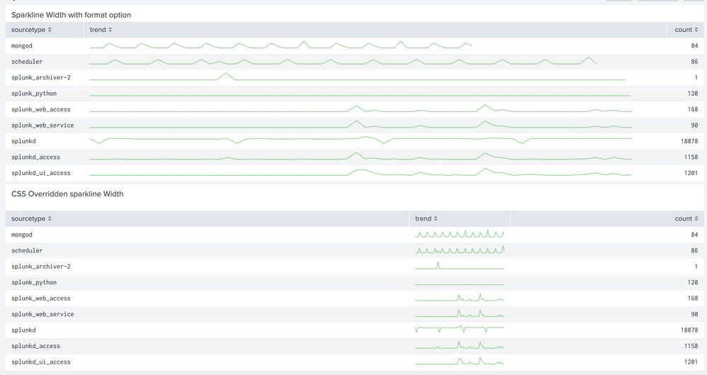
@mitag @s2_splunk I dont think this needs Idea submission are two ways the width can be adjusted
Option 1 Table Sparkline Format Option width: The feature you are requesting is already available in Simple XML Dashboards. Refer to documentation: https://docs.splunk.com/Documentation/Splunk/latest/Viz/PanelreferenceforSimplifiedXML#Table_sparkli...
Option 2 Table column width as per sparkline using CSS Override: Sparkline if you have not added spacing and bar width using sparkline format option will take 75px width, which you have already seen. You can use Simple XML CSS extension to adjust column width as per sparkline width. Refer to one of my older answers for changing table column width: https://community.splunk.com/t5/Splunk-Search/Column-width/td-p/309644
PS: I am waiting for about a month for one of my apps to be published on Splunkbase through which you can create your own Sparklines using jQueryUI Sparkline by Omnipotent. Which means sparkline chart within table can be anything besides just values over time.
Following is a run anywhere example which demos both options. Please try out and confirm, and if it works please update the comment/reference in the idea that is already submitted.
<dashboard>
  <label>Sparkline Width</label>
  <row>
    <panel>
      <title>Sparkline Width with format option</title>
      <table>
        <search>
          <query>index=_internal
| chart sparkline as trend count by sourcetype</query>
          <earliest>-60m@m</earliest>
          <latest>now</latest>
          <sampleRatio>1</sampleRatio>
        </search>
        <option name="count">100</option>
        <option name="dataOverlayMode">none</option>
        <option name="drilldown">none</option>
        <option name="percentagesRow">false</option>
        <option name="refresh.display">progressbar</option>
        <option name="rowNumbers">false</option>
        <option name="totalsRow">false</option>
        <option name="wrap">true</option>
        <!-- Set sparkline options here; make sure that field matches field name of the search results -->
        <format type="sparkline" field="trend">
          <option name="width">95%</option>
        </format>
      </table>
    </panel>
  </row>
  <row>
    <panel>
      <title>CSS Overridden sparkline Width</title>
      <html>
        <style>
          #tableWithSparklineWidth table thead th[data-sort-key="trend"]{
            width: 75px !important;
          }
        </style>
      </html>
      <table id="tableWithSparklineWidth">
        <search>
          <query>index=_internal
| chart sparkline as trend count by sourcetype</query>
          <earliest>-60m@m</earliest>
          <latest>now</latest>
          <sampleRatio>1</sampleRatio>
        </search>
        <option name="count">100</option>
        <option name="dataOverlayMode">none</option>
        <option name="drilldown">none</option>
        <option name="percentagesRow">false</option>
        <option name="refresh.display">progressbar</option>
        <option name="rowNumbers">false</option>
        <option name="totalsRow">false</option>
        <option name="wrap">true</option>
      </table>
    </panel>
  </row>
</dashboard>
| makeresults | eval message= "Happy Splunking!!!"
- Mark as New
- Bookmark Message
- Subscribe to Message
- Mute Message
- Subscribe to RSS Feed
- Permalink
- Report Inappropriate Content
Just a quick clarification @niketn: All fair points regarding XML/CSS options in custom dashboards, which I had mentioned in my responses. My suggestion for an Ideas post was purely related to the default behavior in the Search&Reporting app.


