Are you a member of the Splunk Community?
- Find Answers
- :
- Using Splunk
- :
- Dashboards & Visualizations
- :
- how to create a stacked bar chart but stack only 2...
- Subscribe to RSS Feed
- Mark Topic as New
- Mark Topic as Read
- Float this Topic for Current User
- Bookmark Topic
- Subscribe to Topic
- Mute Topic
- Printer Friendly Page
- Mark as New
- Bookmark Message
- Subscribe to Message
- Mute Message
- Subscribe to RSS Feed
- Permalink
- Report Inappropriate Content
how to create a stacked bar chart but stack only 2 bars
Hi,
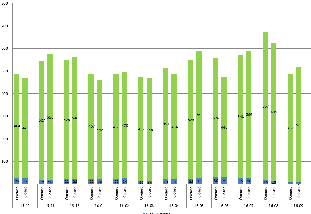
I have a bar chart with 4 values. I would like to stack them by 1 field.
example:
The code I am using:
index=snow assignment_group_name=*israel* (dv_state="Ope*" OR dv_state="Clos*") (priority=2 OR priority=4)
| dedup number
| eval newTime = strftime(_time,"%Y-%m-%d")
| eval year = substr(substr(newTime,3,4),1,2)
| eval month = substr(substr(newTime,6,7),1,2)
| eval realDate = year+"."+month
| eval monthCreated = substr(substr(sys_created_on,6,7),1,2)
| eval yearCreated = substr(substr(sys_created_on,3,4),1,2)
| eval dateCreated = yearCreated+"."+monthCreated
| where tonumber(substr(dateCreated,1,2)) > 16
| replace "Closed Complete" with Closed "Closed Incomplete" with Closed "Closed Skipped" with Closed "Pending Customer" with Pending in dv_state
| replace 4 with Normal 2 with High in priority
| table number realDate dateCreated dv_state priority _time
| chart count(eval(realDate==dateCreated)) as Opened count(eval(dv_state=="Closed")) as Closed over realDate by priority
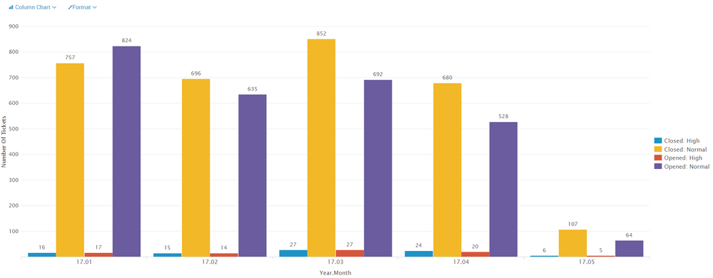
Photo of the result with the current code:
If I choose the stacked option it stacks all 4 options (in legend). I want to stack them only by priority field so that the result will be similar to this:
Is it possible?
Thank you
- Mark as New
- Bookmark Message
- Subscribe to Message
- Mute Message
- Subscribe to RSS Feed
- Permalink
- Report Inappropriate Content
you cannot do multi-layer axis like you can in excel. the closest you could get is to create a field like:
|eval Status=if(count(eval(realDate==dateCreated)),"Opened","Closed")|eval YearMonthStatus=year+"."+month+"."+Status| chart limit=0 count by priority YearMonthStatus
- Mark as New
- Bookmark Message
- Subscribe to Message
- Mute Message
- Subscribe to RSS Feed
- Permalink
- Report Inappropriate Content
thanks for the comment. I have tried something like that.
I hope there is a way to do it like the excel.
maybe in pivot?
- Mark as New
- Bookmark Message
- Subscribe to Message
- Mute Message
- Subscribe to RSS Feed
- Permalink
- Report Inappropriate Content
splunk pivot is not like excel pivot. splunk pivot uses data models to create tables and charts. you can accelerate the data model to allow the pivot table to run faster.
https://docs.splunk.com/Documentation/Splunk/6.5.3/PivotTutorial/Aboutpivotreports
https://docs.splunk.com/Documentation/Splunk/6.5.3/PivotTutorial/Createpivottable
- Mark as New
- Bookmark Message
- Subscribe to Message
- Mute Message
- Subscribe to RSS Feed
- Permalink
- Report Inappropriate Content
Looks that you should stats by united field realDate_status try to change
| chart count(eval(realDate==dateCreated)) as Opened count(eval(dv_state=="Closed")) as Closed over realDate by priority
to something like
| eval status=case(realDate==dateCreated, "opened", dv_state=="Closed", "closed")
| eval realDate_status=realDate."_".status
| eval priority_high=if(priority=="High","1",NULL)
| eval priority_normal=if(priority=="Normal","1",NULL)
| stats sum(priority_high) as High sum(priority_normal) as Normal by realDate_status
| sort - limit=10
which will give you result similar to your expectations
- Mark as New
- Bookmark Message
- Subscribe to Message
- Mute Message
- Subscribe to RSS Feed
- Permalink
- Report Inappropriate Content
by what field did you mean to sort?
- Mark as New
- Bookmark Message
- Subscribe to Message
- Mute Message
- Subscribe to RSS Feed
- Permalink
- Report Inappropriate Content
| sort - limit=10 realDate_status
- Mark as New
- Bookmark Message
- Subscribe to Message
- Mute Message
- Subscribe to RSS Feed
- Permalink
- Report Inappropriate Content
Thanks for the comment. I have tried something like that.
Maybe it is not possible to do what I need.
- Mark as New
- Bookmark Message
- Subscribe to Message
- Mute Message
- Subscribe to RSS Feed
- Permalink
- Report Inappropriate Content
Hi,
Is my problem too complicated?
Thanks
- Mark as New
- Bookmark Message
- Subscribe to Message
- Mute Message
- Subscribe to RSS Feed
- Permalink
- Report Inappropriate Content
Hi
Did you get any solution for the above problem ? If yes, please let me know. I need to stack two columns per day and each column would have 2 different status ?
Thanks in advance.


