Turn on suggestions
Auto-suggest helps you quickly narrow down your search results by suggesting possible matches as you type.
Dashboards & Visualizations
×
Are you a member of the Splunk Community?
Sign in or Register with your Splunk account to get your questions answered, access valuable resources and connect with experts!
Turn on suggestions
Auto-suggest helps you quickly narrow down your search results by suggesting possible matches as you type.
- Find Answers
- :
- Using Splunk
- :
- Dashboards & Visualizations
- :
- Why are there differences in Cluster Map visualiza...
Options
- Subscribe to RSS Feed
- Mark Topic as New
- Mark Topic as Read
- Float this Topic for Current User
- Bookmark Topic
- Subscribe to Topic
- Mute Topic
- Printer Friendly Page
- Mark as New
- Bookmark Message
- Subscribe to Message
- Mute Message
- Subscribe to RSS Feed
- Permalink
- Report Inappropriate Content
Why are there differences in Cluster Map visualization with the same search and data?
gcusello

SplunkTrust
07-26-2022
12:15 AM
Hi at all,
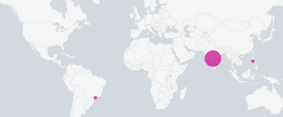
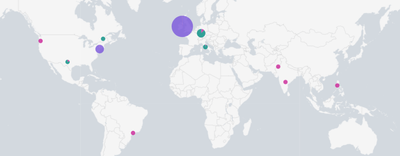
I found a difference in visualization of Cluster Map between dashboard and Search (or refreshing the panel) using the same data and search.
In dashboard
in Search or refreshing the panel:
As you can see the same data give different visualization .
Anyone has some idea why this happens?
Ciao.
Giuseppe
Get Updates on the Splunk Community!
Observe and Secure All Apps with Splunk
Join Us for Our Next Tech Talk: Observe and Secure All Apps with SplunkAs organizations continue to innovate ...
Splunk Decoded: Business Transactions vs Business IQ
It’s the morning of Black Friday, and your e-commerce site is handling 10x normal traffic. Orders are flowing, ...
Fastest way to demo Observability
I’ve been having a lot of fun learning about Kubernetes and Observability. I set myself an interesting ...


