Turn on suggestions
Auto-suggest helps you quickly narrow down your search results by suggesting possible matches as you type.
Dashboards & Visualizations
×
Join the Conversation
Without signing in, you're just watching from the sidelines. Sign in or Register to connect, share, and be part of the Splunk Community.
Turn on suggestions
Auto-suggest helps you quickly narrow down your search results by suggesting possible matches as you type.
- Find Answers
- :
- Using Splunk
- :
- Dashboards & Visualizations
- :
- Two y Axis
Options
- Subscribe to RSS Feed
- Mark Topic as New
- Mark Topic as Read
- Float this Topic for Current User
- Bookmark Topic
- Subscribe to Topic
- Mute Topic
- Printer Friendly Page
- Mark as New
- Bookmark Message
- Subscribe to Message
- Mute Message
- Subscribe to RSS Feed
- Permalink
- Report Inappropriate Content
Two y Axis
corematrix
New Member
07-18-2018
01:27 PM
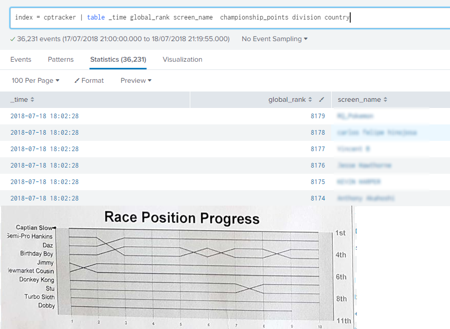
I have a very simple index which tracks a competitive game. Over the course of the year, people earn points for the top 16 positions switch places. In a CSV I track their Name, rank, score at regular intervals.
Below is a screenshot of my data in a simple table and an example of the kinda of the graph I wish to build.
How would I go about making this?
Name on the right > < Rank on the left
> time along the bottom <
- Mark as New
- Bookmark Message
- Subscribe to Message
- Mute Message
- Subscribe to RSS Feed
- Permalink
- Report Inappropriate Content
corematrix
New Member
07-19-2018
07:04 AM
- Mark as New
- Bookmark Message
- Subscribe to Message
- Mute Message
- Subscribe to RSS Feed
- Permalink
- Report Inappropriate Content
renjith_nair
Legend
07-20-2018
09:43 PM
@corematrix, have you selected "Multi-series Mode" on? In that case, each line uses its own series and there wont be any overlap
---
What goes around comes around. If it helps, hit it with Karma 🙂
What goes around comes around. If it helps, hit it with Karma 🙂
- Mark as New
- Bookmark Message
- Subscribe to Message
- Mute Message
- Subscribe to RSS Feed
- Permalink
- Report Inappropriate Content
renjith_nair
Legend
07-18-2018
10:40 PM
@corematrix ,
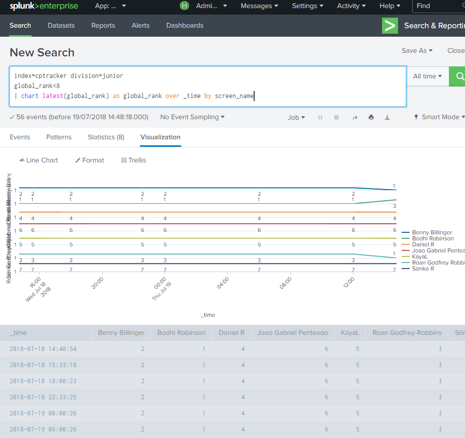
Does this work for you ?
index=cptracker|timechart latest(global_rank) as global_rank by screen_name
or
index=cptracker|chart latest(global_rank) as global_rank over _time by screen_name
---
What goes around comes around. If it helps, hit it with Karma 🙂
What goes around comes around. If it helps, hit it with Karma 🙂
Related Topics
Get Updates on the Splunk Community!
AI for AppInspect
We’re excited to announce two new updates to AppInspect designed to save you time and make the app approval ...
App Platform's 2025 Year in Review: A Year of Innovation, Growth, and Community
As we step into 2026, it’s the perfect moment to reflect on what an extraordinary year 2025 was for the Splunk ...
Operationalizing Entity Risk Score with Enterprise Security 8.3+
Overview
Enterprise Security 8.3 introduces a powerful new feature called “Entity Risk Scoring” (ERS) for ...


