Turn on suggestions
Auto-suggest helps you quickly narrow down your search results by suggesting possible matches as you type.
Showing results for
Dashboards & Visualizations
Turn on suggestions
Auto-suggest helps you quickly narrow down your search results by suggesting possible matches as you type.
Showing results for
- Splunk Answers
- :
- Using Splunk
- :
- Dashboards & Visualizations
- :
- Splunk Charting Data Based on Type
Options
- Subscribe to RSS Feed
- Mark Topic as New
- Mark Topic as Read
- Float this Topic for Current User
- Bookmark Topic
- Subscribe to Topic
- Mute Topic
- Printer Friendly Page
- Mark as New
- Bookmark Message
- Subscribe to Message
- Mute Message
- Subscribe to RSS Feed
- Permalink
- Report Inappropriate Content
naralkar
Engager
11-25-2020
11:30 PM
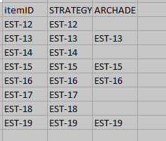
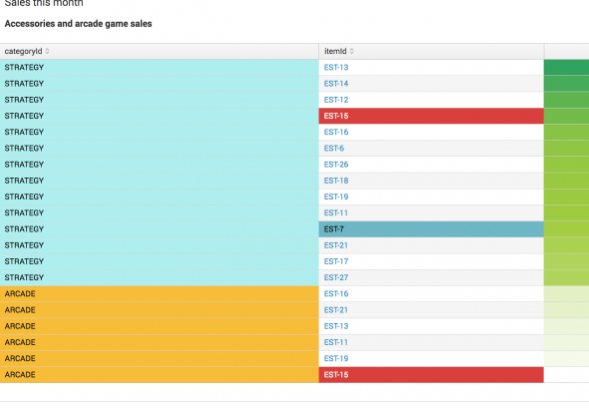
I have derived data from Splunk in the following format (Actual Format). But I want to format furthermore it in such a way that I can see which items are present in which categories, and which are missing (Expected Format). I am trying to chart it based on categoryID, but it's not working for me as I do not think max function is appropriate for this. Can anyone please help me know how can I achieve this
Tried using
| chart max(itemId) over itemId by categoryID
Expected Format

Actual Format

1 Solution
- Mark as New
- Bookmark Message
- Subscribe to Message
- Mute Message
- Subscribe to RSS Feed
- Permalink
- Report Inappropriate Content
to4kawa
Ultra Champion
11-26-2020
12:39 AM
| makeresults count=30
| eval categoryID=mvindex(split("Strategy,Archade",","),random() % 2)
| eval itemId="EST-1".(random() % 9 + 1)
| rex "(?<Comment>(?# this is your actual result, check this.
from here, the logic))"
| xyseries itemId categoryID itemId- Mark as New
- Bookmark Message
- Subscribe to Message
- Mute Message
- Subscribe to RSS Feed
- Permalink
- Report Inappropriate Content
naralkar
Engager
11-26-2020
02:58 AM
Thanks @to4kawa . This was all I needed..
Get Updates on the Splunk Community!
Introducing the Splunk Community Dashboard Challenge!
Welcome to Splunk Community Dashboard Challenge! This is your chance to showcase your skills in creating ...
Built-in Service Level Objectives Management to Bridge the Gap Between Service & ...
Wednesday, May 29, 2024 | 11AM PST / 2PM ESTRegister now and join us to learn more about how you can ...
Get Your Exclusive Splunk Certified Cybersecurity Defense Engineer Certification at ...
We’re excited to announce a new Splunk certification exam being released at .conf24! If you’re headed to Vegas ...
