Join the Conversation
- Find Answers
- :
- Using Splunk
- :
- Dashboards & Visualizations
- :
- Pie chart vs Label colors
- Subscribe to RSS Feed
- Mark Topic as New
- Mark Topic as Read
- Float this Topic for Current User
- Bookmark Topic
- Subscribe to Topic
- Mute Topic
- Printer Friendly Page
- Mark as New
- Bookmark Message
- Subscribe to Message
- Mute Message
- Subscribe to RSS Feed
- Permalink
- Report Inappropriate Content
Hi All,
Is there a way that we can have same colors as pie chart to the labels separately written to represent?
Regards,
BK
- Mark as New
- Bookmark Message
- Subscribe to Message
- Mute Message
- Subscribe to RSS Feed
- Permalink
- Report Inappropriate Content
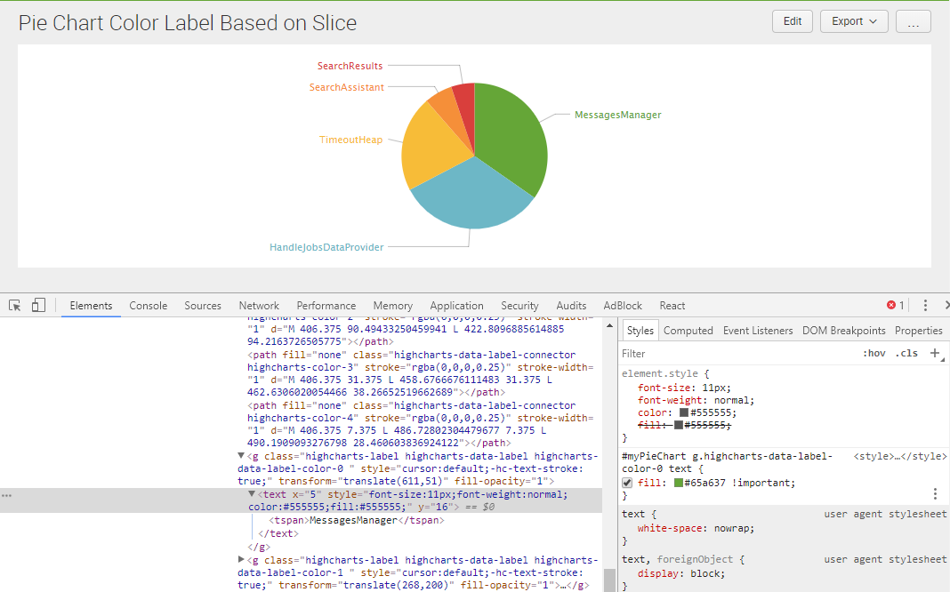
@bharathkumarnec, Label Text for Pie Chart can be colored using CSS Style Override.

In the following run anywhere example I have used charting.seriesColors to apply color to Pie Chart Slices and also series sequence to the corresponding label text. Text Color override would also be possible, however, I feel jQuery will be required for that. Please see if seriesColors suits your needs or not.
Following is the run anywhere dashboard code for screenshot attached.
<dashboard>
  <label>Pie Chart Color Label Based on Slice</label>
  <init>
    <set token="tokGreen">0x65a637</set>
    <set token="tokBlue">0x6db7c6</set>
    <set token="tokYellow">0xf7bc38</set>
    <set token="tokOrange">0xf58f39</set>
    <set token="tokRed">0xd93f3c</set>
  </init>
  <row>
    <panel>
      <html depends="$alwaysHideCSSStyle$">
        <style>
          #myPieChart g.highcharts-data-label-color-0 text{
            fill:#65a637 !important;
          }
          #myPieChart g.highcharts-data-label-color-1 text{
            fill:#6db7c6 !important;
          }
          #myPieChart g.highcharts-data-label-color-2 text{
            fill:#f7bc38 !important;
          }
          #myPieChart g.highcharts-data-label-color-3 text{
            fill:#f58f39 !important;
          }
          #myPieChart g.highcharts-data-label-color-4 text{
            fill:#d93f3c !important;
          }
        </style>
      </html>
      <chart id="myPieChart">
        <search>
          <query>index=_internal sourcetype=splunkd log_level!="INFO" component!="Conf*"
|  top 5 component</query>
          <earliest>-24h@h</earliest>
          <latest>now</latest>
          <sampleRatio>1</sampleRatio>
        </search>
        <option name="charting.axisLabelsX.majorLabelStyle.overflowMode">ellipsisNone</option>
        <option name="charting.axisLabelsX.majorLabelStyle.rotation">0</option>
        <option name="charting.axisTitleX.visibility">visible</option>
        <option name="charting.axisTitleY.visibility">visible</option>
        <option name="charting.axisTitleY2.visibility">visible</option>
        <option name="charting.axisX.abbreviation">none</option>
        <option name="charting.axisX.scale">linear</option>
        <option name="charting.axisY.abbreviation">none</option>
        <option name="charting.axisY.scale">linear</option>
        <option name="charting.axisY2.abbreviation">none</option>
        <option name="charting.axisY2.enabled">0</option>
        <option name="charting.axisY2.scale">inherit</option>
        <option name="charting.chart">pie</option>
        <option name="charting.chart.bubbleMaximumSize">50</option>
        <option name="charting.chart.bubbleMinimumSize">10</option>
        <option name="charting.chart.bubbleSizeBy">area</option>
        <option name="charting.chart.nullValueMode">gaps</option>
        <option name="charting.chart.showDataLabels">none</option>
        <option name="charting.chart.sliceCollapsingThreshold">0.01</option>
        <option name="charting.chart.stackMode">default</option>
        <option name="charting.chart.style">shiny</option>
        <option name="charting.drilldown">none</option>
        <option name="charting.layout.splitSeries">0</option>
        <option name="charting.layout.splitSeries.allowIndependentYRanges">0</option>
        <option name="charting.legend.labelStyle.overflowMode">ellipsisEnd</option>
        <option name="charting.legend.mode">standard</option>
        <option name="charting.legend.placement">right</option>
        <option name="charting.lineWidth">2</option>
        <option name="trellis.enabled">0</option>
        <option name="trellis.scales.shared">1</option>
        <option name="trellis.size">medium</option>
        <option name="charting.seriesColors">["$tokGreen$","$tokBlue$","$tokYellow$","$tokOrange$","$tokRed$"]</option>
      </chart>
    </panel>
  </row>
</dashboard>
| makeresults | eval message= "Happy Splunking!!!"
- Mark as New
- Bookmark Message
- Subscribe to Message
- Mute Message
- Subscribe to RSS Feed
- Permalink
- Report Inappropriate Content
@bharathkumarnec, Label Text for Pie Chart can be colored using CSS Style Override.
In the following run anywhere example I have used charting.seriesColors to apply color to Pie Chart Slices and also series sequence to the corresponding label text. Text Color override would also be possible, however, I feel jQuery will be required for that. Please see if seriesColors suits your needs or not.
Following is the run anywhere dashboard code for screenshot attached.
<dashboard>
  <label>Pie Chart Color Label Based on Slice</label>
  <init>
    <set token="tokGreen">0x65a637</set>
    <set token="tokBlue">0x6db7c6</set>
    <set token="tokYellow">0xf7bc38</set>
    <set token="tokOrange">0xf58f39</set>
    <set token="tokRed">0xd93f3c</set>
  </init>
  <row>
    <panel>
      <html depends="$alwaysHideCSSStyle$">
        <style>
          #myPieChart g.highcharts-data-label-color-0 text{
            fill:#65a637 !important;
          }
          #myPieChart g.highcharts-data-label-color-1 text{
            fill:#6db7c6 !important;
          }
          #myPieChart g.highcharts-data-label-color-2 text{
            fill:#f7bc38 !important;
          }
          #myPieChart g.highcharts-data-label-color-3 text{
            fill:#f58f39 !important;
          }
          #myPieChart g.highcharts-data-label-color-4 text{
            fill:#d93f3c !important;
          }
        </style>
      </html>
      <chart id="myPieChart">
        <search>
          <query>index=_internal sourcetype=splunkd log_level!="INFO" component!="Conf*"
|  top 5 component</query>
          <earliest>-24h@h</earliest>
          <latest>now</latest>
          <sampleRatio>1</sampleRatio>
        </search>
        <option name="charting.axisLabelsX.majorLabelStyle.overflowMode">ellipsisNone</option>
        <option name="charting.axisLabelsX.majorLabelStyle.rotation">0</option>
        <option name="charting.axisTitleX.visibility">visible</option>
        <option name="charting.axisTitleY.visibility">visible</option>
        <option name="charting.axisTitleY2.visibility">visible</option>
        <option name="charting.axisX.abbreviation">none</option>
        <option name="charting.axisX.scale">linear</option>
        <option name="charting.axisY.abbreviation">none</option>
        <option name="charting.axisY.scale">linear</option>
        <option name="charting.axisY2.abbreviation">none</option>
        <option name="charting.axisY2.enabled">0</option>
        <option name="charting.axisY2.scale">inherit</option>
        <option name="charting.chart">pie</option>
        <option name="charting.chart.bubbleMaximumSize">50</option>
        <option name="charting.chart.bubbleMinimumSize">10</option>
        <option name="charting.chart.bubbleSizeBy">area</option>
        <option name="charting.chart.nullValueMode">gaps</option>
        <option name="charting.chart.showDataLabels">none</option>
        <option name="charting.chart.sliceCollapsingThreshold">0.01</option>
        <option name="charting.chart.stackMode">default</option>
        <option name="charting.chart.style">shiny</option>
        <option name="charting.drilldown">none</option>
        <option name="charting.layout.splitSeries">0</option>
        <option name="charting.layout.splitSeries.allowIndependentYRanges">0</option>
        <option name="charting.legend.labelStyle.overflowMode">ellipsisEnd</option>
        <option name="charting.legend.mode">standard</option>
        <option name="charting.legend.placement">right</option>
        <option name="charting.lineWidth">2</option>
        <option name="trellis.enabled">0</option>
        <option name="trellis.scales.shared">1</option>
        <option name="trellis.size">medium</option>
        <option name="charting.seriesColors">["$tokGreen$","$tokBlue$","$tokYellow$","$tokOrange$","$tokRed$"]</option>
      </chart>
    </panel>
  </row>
</dashboard>
| makeresults | eval message= "Happy Splunking!!!"
Join the Splunk Community Slack to learn, troubleshoot, and make connections with fellow Splunk practitioners in real time!
Join Splunk User Groups to connect and learn in-person by region or remotely by topic or industry.
[Puzzles] Solve, Learn, Repeat: Matching cron expressions
Design, Compete, Win: Submit Your Best Splunk Dashboards for a .conf26 Pass
May 2026 Splunk Expert Sessions: Security & Observability
