Join the Conversation
- Find Answers
- :
- Using Splunk
- :
- Dashboards & Visualizations
- :
- Re: Dashboard - keep the colors for related data b...
- Subscribe to RSS Feed
- Mark Topic as New
- Mark Topic as Read
- Float this Topic for Current User
- Bookmark Topic
- Subscribe to Topic
- Mute Topic
- Printer Friendly Page
- Mark as New
- Bookmark Message
- Subscribe to Message
- Mute Message
- Subscribe to RSS Feed
- Permalink
- Report Inappropriate Content
Hello,
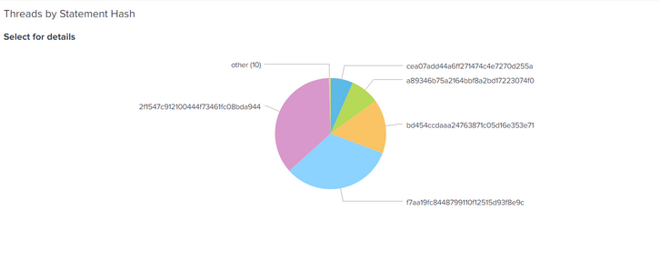
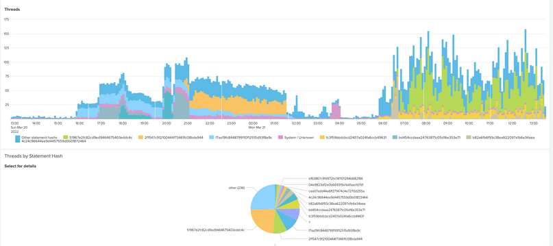
We have several cases, where we relate the data between panels. On the example screenshots below, we have:
1/ Chart with the number of database threads in time, and the sum of threads per time unit involved in the execution of the particular SQL statement (SQL hash) - represented by the different colors:
2/ Pie chart showing the portion of the particular SQL statement / hash in the given time span:
Is there any easy way to keep the colors for the same SQL statements/hashes between the two panels?
Kind Regards, Kamil
- Mark as New
- Bookmark Message
- Subscribe to Message
- Mute Message
- Subscribe to RSS Feed
- Permalink
- Report Inappropriate Content
Apply some sort of sort so that the series (names) are in the same order.
- Mark as New
- Bookmark Message
- Subscribe to Message
- Mute Message
- Subscribe to RSS Feed
- Permalink
- Report Inappropriate Content
Unfortunately even after sorting both the same order, see the screenshot below, the colors assigned to both panels are different:
- Mark as New
- Bookmark Message
- Subscribe to Message
- Mute Message
- Subscribe to RSS Feed
- Permalink
- Report Inappropriate Content
That's because they aren't sorted in the same order (you can see that from the legends) - how have you done the sorting?
- Mark as New
- Bookmark Message
- Subscribe to Message
- Mute Message
- Subscribe to RSS Feed
- Permalink
- Report Inappropriate Content
You are right of course.
I managed to match it, but now the issue is, that the stacked column chart displays like 9 different SQL hashes + others and the pie chart way more of them + others. The not quite nice consequence is, that the color for "others" does not match.
Would you know a chart option for both, stacked column and pie chart to restrict the number of displayed values say to 7 + "others"?
I could not find it in the visualization options, so I guess this is some more advanced parameter I would use in the xml.
- Mark as New
- Bookmark Message
- Subscribe to Message
- Mute Message
- Subscribe to RSS Feed
- Permalink
- Report Inappropriate Content
Probably the way to do this is to implement the "other" stat as part of the SPL, that way you have control - so long as it was under the number of series supported by the pie chart.
- Mark as New
- Bookmark Message
- Subscribe to Message
- Mute Message
- Subscribe to RSS Feed
- Permalink
- Report Inappropriate Content
Apply some sort of sort so that the series (names) are in the same order.


