- Mark as New
- Bookmark Message
- Subscribe to Message
- Mute Message
- Subscribe to RSS Feed
- Permalink
- Report Inappropriate Content
Is there a way to make a trend line for scatter plot?
Hi!
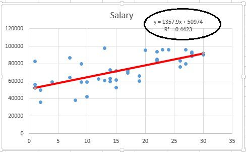
Is there any way to make trend line for scatter plot like this:
Scatter plot matrix has this option, but I need single chart. Also I found article about implementation of linear regression for splunk (https://wiki.splunk.com/Community:Plotting_a_linear_trendline) but actual data in it looks like regular line chart - not scatter
- Mark as New
- Bookmark Message
- Subscribe to Message
- Mute Message
- Subscribe to RSS Feed
- Permalink
- Report Inappropriate Content
@yurykiselev, install Machine Learning Toolkit App from Splunkbase (https://splunkbase.splunk.com/app/2890/), this will add a lot of custom visualizations including Scatter Line chart which you need in this case. Refer to documentation: https://docs.splunk.com/Documentation/MLApp/latest/User/Customvisualizations#Scatter_Line_Chart_.28S...
Based on the sample data provided I was able to plot the following graph:
| makeresults
| eval data="3.03,3.03;3.97,0.94;5.99,2.02;52.79,4.33;56.24,3.45;57.57,1.33;"
| makemv delim=";" data
| mvexpand data
| eval data=split(data,",")
| eval TIME=mvindex(data,0)
| eval RT=mvindex(data,1)
| table TIME RT

I was also able to plot the the same using predict command using run anywhere search based on Splunk _internal index which you can try out:
index="_internal" sourcetype=splunkd log_level="INFO"
| timechart count as INFO
| predict INFO
| table INFO "prediction(INFO)"

| makeresults | eval message= "Happy Splunking!!!"
- Mark as New
- Bookmark Message
- Subscribe to Message
- Mute Message
- Subscribe to RSS Feed
- Permalink
- Report Inappropriate Content
Thank you for reply! I installed ML toolkit and now scatter line chart is available.
... | table TIME RT
TIME    RT
3.03    3.03
3.97    0.94
5.99    2.02
...
52.79   4.33
56.24   3.45
57.57   1.33
It's reaction time of patient during some one minute long medical test. Regular line chart for this data looks like:
https://preview.ibb.co/iP6TB5/28_09_2017_10_54_29.png
But regression looks strange:
https://preview.ibb.co/gj0zJk/28_09_2017_10_54_58.png
It seems regression is based on only first X-Y values. If I'm inverting X and Y ( ... | table RT TIME) nothing changes:
https://preview.ibb.co/i23rW5/28_09_2017_10_55_24.png
- Mark as New
- Bookmark Message
- Subscribe to Message
- Mute Message
- Subscribe to RSS Feed
- Permalink
- Report Inappropriate Content
Sorry, it was an additional x=y line. No line is drawing while I'm disable this option:
http://oi66.tinypic.com/2dl7rq8.jpg
- Mark as New
- Bookmark Message
- Subscribe to Message
- Mute Message
- Subscribe to RSS Feed
- Permalink
- Report Inappropriate Content
@yurykiselev, I was able to generate scatter line chart with sample data as well as run anywhere search with predict command. Please see the updated answer and confirm.
PS: Based on the sample data mock query has been created it can be used for testing by changing sample data comma separated for TIME and RT and semicolon separated for each event. Replace with your actual query.
The reason why your Scatter points are off your line is because TIME field seems to increase on incremental basis but RT remains almost similar throughout. You might need to include the logic for fields TIME and RT for us to assist better.
If you need to use RT for plotting both Scatter and Line,
Option 1) You can use the following search with predict command instead (please change statistical function max() as per your need) :
<YourBaseSearch>
| timechart max(RT) as RT
| predict RT
| rename "prediction(RT)" as prediction
| table RT prediction
PS: timechart and hence predict command requires _time to be present. Refer to documentation that it works on time-series data. (https://docs.splunk.com/Documentation/Splunk/latest/SearchReference/Predict)
Option 2) Make RT cumulative using accum command:
<YourBaseSearch>
| accum RT as RT
| table TIME RT
PS: Not sure if this is the right approach. Refer to documentation for accum command: https://docs.splunk.com/Documentation/Splunk/latest/SearchReference/Accum
| makeresults | eval message= "Happy Splunking!!!"

