- Find Answers
- :
- Using Splunk
- :
- Dashboards & Visualizations
- :
- How to visualize a work schedule as well as events...
- Subscribe to RSS Feed
- Mark Topic as New
- Mark Topic as Read
- Float this Topic for Current User
- Bookmark Topic
- Subscribe to Topic
- Mute Topic
- Printer Friendly Page
- Mark as New
- Bookmark Message
- Subscribe to Message
- Mute Message
- Subscribe to RSS Feed
- Permalink
- Report Inappropriate Content
Hi all,
I would like to visualize a person's schedule as well as show the moment of when events took place. The visualization is to make apparent whether the events took place within or outside the person's working hours. I'm stumped at how to tackle this.
Anyone know which visualization type to use? Perhaps also any pointers on how to prepare the data?
Data example:
EmployeeID work_from work_until event_timestamp
123 08:00 17:00 16:30
123 08:00 17:00 01:00
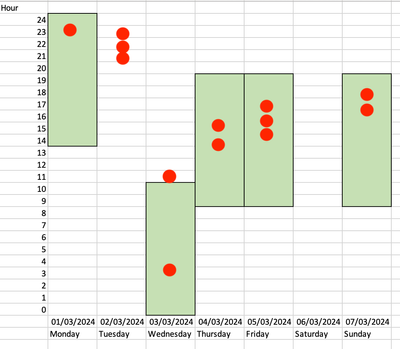
Below is a quick sketch of what I would like to end up with. The green bars show the working hours, so on Monday this person is working from 14:00 - 24:00 and has an event at 23:00. On Tuesday the person is not working but still has 3 events.
- Mark as New
- Bookmark Message
- Subscribe to Message
- Mute Message
- Subscribe to RSS Feed
- Permalink
- Report Inappropriate Content
Hi @Intidev,
I've achieved something similar in the past using a column chart with overlays.
Hours are represented by two series, one for the hours before start of day (slack hours) and another for working hours. Events are represented by further series, with no more than one event per series; the overlays will render single events as points rather than lines.
Building on @Richfez's example with mock data:
| makeresults format=csv data="day_of_week,slack_hours,work_hours,event01,event02,event03,event04,event05,event06,event07,event08,event09,event10,event11,event12,event13
2024-03-04,14,11,23,,,,,,,,,,,,
2024-03-05,0,0,,21,22,23,,,,,,,,,
2024-03-06,0,11,,,,,3,11,,,,,,,
2024-03-07,9,11,,,,,,,13,15,,,,,
2024-03-08,9,11,,,,,,,,,14,15,16,,
2024-03-09,0,0,,,,,,,,,,,,,
2024-03-10,9,11,,,,,,,,,,,,16,17"
| eval _time=strptime(day_of_week, "%F")
| chart values(slack_hours) as slack_hours values(work_hours) as work_hours values(event*) as event* over _time
we can save a column chart into a classic dashboard with the following configuration:
<dashboard version="1.1" theme="light">
  <label>intidev_chart</label>
  <row>
    <panel>
      <html>
        <style>
#columnChart1 .ui-resizable {
  width: 500px !important;
}
#columnChart1 .highcharts-series.highcharts-series-1.highcharts-column-series {
  opacity: 0 !important;
}
        </style>
      </html>
      <chart id="columnChart1">
        <search>
          <query>| makeresults format=csv data="day_of_week,slack_hours,work_hours,event01,event02,event03,event04,event05,event06,event07,event08,event09,event10,event11,event12,event13
2024-03-04,14,11,23,,,,,,,,,,,,
2024-03-05,0,0,,21,22,23,,,,,,,,,
2024-03-06,0,11,,,,,3,11,,,,,,,
2024-03-07,9,11,,,,,,,13,15,,,,,
2024-03-08,9,11,,,,,,,,,14,15,16,,
2024-03-09,0,0,,,,,,,,,,,,,
2024-03-10,9,11,,,,,,,,,,,,16,17"
| eval _time=strptime(day_of_week, "%F")
| chart values(work_hours) as work_hours values(slack_hours) as slack_hours values(event*) as event* over _time</query>
          <earliest>-24h@h</earliest>
          <latest>now</latest>
          <sampleRatio>1</sampleRatio>
        </search>
        <option name="charting.axisLabelsY.majorTickVisibility">show</option>
        <option name="charting.axisLabelsY.majorUnit">1</option>
        <option name="charting.axisLabelsY.minorTickVisibility">hide</option>
        <option name="charting.axisTitleX.visibility">collapsed</option>
        <option name="charting.axisTitleY.text">Hour</option>
        <option name="charting.axisTitleY.visibility">visible</option>
        <option name="charting.axisX.abbreviation">none</option>
        <option name="charting.axisX.scale">linear</option>
        <option name="charting.axisY.abbreviation">none</option>
        <option name="charting.axisY.includeZero">1</option>
        <option name="charting.axisY.maximumNumber">24</option>
        <option name="charting.axisY.minimumNumber">0</option>
        <option name="charting.axisY.scale">linear</option>
        <option name="charting.chart">column</option>
        <option name="charting.chart.markerSize">16</option>
        <option name="charting.chart.nullValueMode">gaps</option>
        <option name="charting.chart.overlayFields">event01,event02,event03,event04,event05,event06,event07,event08,event09,event10,event11,event12,event13</option>
        <option name="charting.chart.stackMode">stacked</option>
        <option name="charting.drilldown">none</option>
        <option name="charting.layout.splitSeries">0</option>
        <option name="charting.layout.splitSeries.allowIndependentYRanges">0</option>
        <option name="charting.legend.placement">none</option>
        <option name="charting.fieldColors">{"work_hours": 0xc6e0b4}</option>
        <option name="height">500</option>
      </chart>
    </panel>
  </row>
</dashboard>
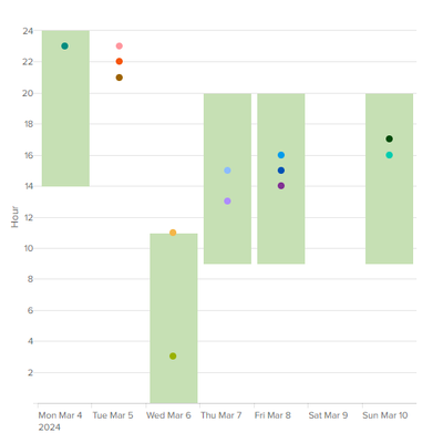
This gives us a dashboard similar to this:
We can further manipulate the layout and colors with CSS and JavaScript (if available to us) and creative use of dashboard tokens.
- Mark as New
- Bookmark Message
- Subscribe to Message
- Mute Message
- Subscribe to RSS Feed
- Permalink
- Report Inappropriate Content
Thank you @Richfez and @tscroggins for your solutions! For my use case the one given by @tscroggins suits best though.
If I understand correctly, in order to be able to display the data this way, it is a must that the data is ordered so that there is one record per workday with each event timestamp in it's own column.
In your data example, the timestamps are each in a new column. So when we would have a 100 events in 7 days, it means 100 different columns. Is it doable to manipulate the data so that for each day, the timestamps are inserted starting at event01?
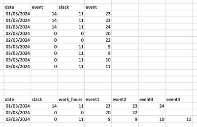
Below is an example of what the data looks like, followed by how I would like it to be. Any suggestions on how to achieve this?
For others reading along, I use dashboard studio and was able to replicate the visualization by adding this to the visualization code:
"overlayFields": "event01, event02, event03, event04, event05, event06, event07, event08, event09, event10, event11, event12"
- Mark as New
- Bookmark Message
- Subscribe to Message
- Mute Message
- Subscribe to RSS Feed
- Permalink
- Report Inappropriate Content
Yes, in a classic dashboard column chart, the fields will be stacked top-down based on their table order, left-to-right, so work_hours is stacked on top of slack_hours to give the effect of a vertical offset from 0. If we want to use a classic trellis layout to split by employee ID as shown below, we'll need to cheat by giving fields names that can be lexicographically sorted in our preferred order.
To generate eventNN fields from event data, we can count events with streamstats and generate a field name from the count. The exact numbering and ordering of the eventNN field doesn't matter; the fields just need to be unique:
| streamstats count
| eval event{count}=value
Let's normalize and extend the sample data in your chart by employee_id and separate work schedules from events, where date is an epoch date and start_time and end_time are epoch date and times in a schedule lookup named intidev_work_schedules.csv:
employee_id,date,start_time,end_time
123,1709510400,1709560800,1709596800
123,1709683200,1709683200,1709722800
123,1709769600,1709802000,1709841600
123,1709856000,1709888400,1709928000
123,1710028800,1710061200,1710100800
456,1709596800,1709625600,1709658000
456,1709683200,1709712000,1709744400
456,1709769600,1709798400,1709830800
456,1709856000,1709884800,1709917200
456,1709942400,1709971200,1710003600
and _time is an epoch date and time in event data with varying employee_id values:
| makeresults format=csv data="_time,employee_id,message
1709593200,123,Lorem ipsum
1709672400,123,dolor sit amet
1709676000,456,onsectetur adipiscing elit
1709679600,123,sed do eiusmod
1709694000,456,tempor incididunt
1709722800,123,ut labore et dolore
1709816400,123,Ut enim ad minim veniam
1709823600,456,quis nostrud exercitation
1709906400,123,ullamco laboris nisi
1709910000,456,ut aliquip ex ea
1709913600,123,commodo consequat
1710086400,123,Duis aute irure
1710090000,456,dolor in reprehenderit"
| streamstats count
| eval date=86400*floor(_time/86400), event{count}=(_time-date)/3600
| lookup intidev_work_schedules.csv employee_id date
| inputlookup append=t intidev_work_schedules.csv
| eval slack_hours=(start_time-date)/3600, work_hours=(end_time-start_time)/3600, _time=coalesce(_time, start_time)
| chart values(work_hours) as "00_work_hours" values(slack_hours) as "01_slack_hours" values(event*) as "02_event*" over _time span=1d by employee_id
Work schedules could be imported from an ERP, WFM, or related system. Event data can come from any source, e.g. badge scanners, call managers, Windows security event logs, etc.
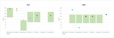
Visualized in a classic dashboard:
<dashboard version="1.1" theme="light">
<label>intidev_trellis_schedule</label>
<search id="base">
<query>| makeresults format=csv data="_time,employee_id,message
1709593200,123,Lorem ipsum
1709672400,123,dolor sit amet
1709676000,456,onsectetur adipiscing elit
1709679600,123,sed do eiusmod
1709694000,456,tempor incididunt
1709722800,123,ut labore et dolore
1709816400,123,Ut enim ad minim veniam
1709823600,456,quis nostrud exercitation
1709906400,123,ullamco laboris nisi
1709910000,456,ut aliquip ex ea
1709913600,123,commodo consequat
1710086400,123,Duis aute irure
1710090000,456,dolor in reprehenderit"
| streamstats count
| eval date=86400*floor(_time/86400), event{count}=(_time-date)/3600
| lookup intidev_work_schedules.csv employee_id date
| inputlookup append=t intidev_work_schedules.csv
| eval slack_hours=(start_time-date)/3600, work_hours=(end_time-start_time)/3600, _time=coalesce(_time, start_time)
| chart values(work_hours) as "00_work_hours" values(slack_hours) as "01_slack_hours" values(event*) as "02_event*" over _time span=1d by employee_id</query>
<earliest>-24h@h</earliest>
<latest>now</latest>
<sampleRatio>1</sampleRatio>
</search>
<search base="base">
<query>| fieldsummary
| fields field
| search field=02_*
| rex field=field "(?<field>[^:]+)"
| mvcombine field
| eval field=mvjoin(field, ",")
</query>
<done>
<set token="overlayFields">$result.field$</set>
</done>
</search>
<row>
<panel>
<html>
<style>
#columnChart1 .highcharts-series.highcharts-series-1.highcharts-column-series {
opacity: 0 !important;
}
</style>
</html>
<chart id="columnChart1">
<search base="base"/>
<option name="charting.axisLabelsY.majorTickVisibility">show</option>
<option name="charting.axisLabelsY.majorUnit">1</option>
<option name="charting.axisLabelsY.minorTickVisibility">hide</option>
<option name="charting.axisTitleX.visibility">collapsed</option>
<option name="charting.axisTitleY.text">Hour</option>
<option name="charting.axisTitleY.visibility">visible</option>
<option name="charting.axisX.abbreviation">none</option>
<option name="charting.axisX.scale">linear</option>
<option name="charting.axisY.abbreviation">none</option>
<option name="charting.axisY.includeZero">1</option>
<option name="charting.axisY.maximumNumber">24</option>
<option name="charting.axisY.minimumNumber">0</option>
<option name="charting.axisY.scale">linear</option>
<option name="charting.chart">column</option>
<option name="charting.chart.nullValueMode">gaps</option>
<option name="charting.chart.overlayFields">$overlayFields$</option>
<option name="charting.chart.stackMode">stacked</option>
<option name="charting.drilldown">none</option>
<option name="charting.fieldColors">{"00_work_hours": 0xc6e0b4}</option>
<option name="charting.layout.splitSeries">0</option>
<option name="charting.layout.splitSeries.allowIndependentYRanges">0</option>
<option name="charting.legend.placement">none</option>
<option name="trellis.enabled">1</option>
<option name="trellis.scales.shared">1</option>
<option name="trellis.size">large</option>
<option name="trellis.splitBy">employee_id</option>
</chart>
</panel>
</row>
</dashboard>I've used a post-process search and event handler to define a token named $overlayFields$ that will dynamically set the charting.chart.overlayFields option.
Note that I haven't correctly handled schedules that cross day boundaries. @Richfez's timeline example handles this nicely, but when using a column chart, you'll need to calculate boundaries and new events in SPL using e.g. eval and mvexpand.
I don't use Dashboard Studio as often as I use Simple XML. Trellis mode and inline CSS overrides have limited or no support in Dashboard Studio, and feature parity between Splunk Cloud and Splunk Enterprise varies.
- Mark as New
- Bookmark Message
- Subscribe to Message
- Mute Message
- Subscribe to RSS Feed
- Permalink
- Report Inappropriate Content
Hi @Intidev,
I've achieved something similar in the past using a column chart with overlays.
Hours are represented by two series, one for the hours before start of day (slack hours) and another for working hours. Events are represented by further series, with no more than one event per series; the overlays will render single events as points rather than lines.
Building on @Richfez's example with mock data:
| makeresults format=csv data="day_of_week,slack_hours,work_hours,event01,event02,event03,event04,event05,event06,event07,event08,event09,event10,event11,event12,event13
2024-03-04,14,11,23,,,,,,,,,,,,
2024-03-05,0,0,,21,22,23,,,,,,,,,
2024-03-06,0,11,,,,,3,11,,,,,,,
2024-03-07,9,11,,,,,,,13,15,,,,,
2024-03-08,9,11,,,,,,,,,14,15,16,,
2024-03-09,0,0,,,,,,,,,,,,,
2024-03-10,9,11,,,,,,,,,,,,16,17"
| eval _time=strptime(day_of_week, "%F")
| chart values(slack_hours) as slack_hours values(work_hours) as work_hours values(event*) as event* over _time
we can save a column chart into a classic dashboard with the following configuration:
<dashboard version="1.1" theme="light">
  <label>intidev_chart</label>
  <row>
    <panel>
      <html>
        <style>
#columnChart1 .ui-resizable {
  width: 500px !important;
}
#columnChart1 .highcharts-series.highcharts-series-1.highcharts-column-series {
  opacity: 0 !important;
}
        </style>
      </html>
      <chart id="columnChart1">
        <search>
          <query>| makeresults format=csv data="day_of_week,slack_hours,work_hours,event01,event02,event03,event04,event05,event06,event07,event08,event09,event10,event11,event12,event13
2024-03-04,14,11,23,,,,,,,,,,,,
2024-03-05,0,0,,21,22,23,,,,,,,,,
2024-03-06,0,11,,,,,3,11,,,,,,,
2024-03-07,9,11,,,,,,,13,15,,,,,
2024-03-08,9,11,,,,,,,,,14,15,16,,
2024-03-09,0,0,,,,,,,,,,,,,
2024-03-10,9,11,,,,,,,,,,,,16,17"
| eval _time=strptime(day_of_week, "%F")
| chart values(work_hours) as work_hours values(slack_hours) as slack_hours values(event*) as event* over _time</query>
          <earliest>-24h@h</earliest>
          <latest>now</latest>
          <sampleRatio>1</sampleRatio>
        </search>
        <option name="charting.axisLabelsY.majorTickVisibility">show</option>
        <option name="charting.axisLabelsY.majorUnit">1</option>
        <option name="charting.axisLabelsY.minorTickVisibility">hide</option>
        <option name="charting.axisTitleX.visibility">collapsed</option>
        <option name="charting.axisTitleY.text">Hour</option>
        <option name="charting.axisTitleY.visibility">visible</option>
        <option name="charting.axisX.abbreviation">none</option>
        <option name="charting.axisX.scale">linear</option>
        <option name="charting.axisY.abbreviation">none</option>
        <option name="charting.axisY.includeZero">1</option>
        <option name="charting.axisY.maximumNumber">24</option>
        <option name="charting.axisY.minimumNumber">0</option>
        <option name="charting.axisY.scale">linear</option>
        <option name="charting.chart">column</option>
        <option name="charting.chart.markerSize">16</option>
        <option name="charting.chart.nullValueMode">gaps</option>
        <option name="charting.chart.overlayFields">event01,event02,event03,event04,event05,event06,event07,event08,event09,event10,event11,event12,event13</option>
        <option name="charting.chart.stackMode">stacked</option>
        <option name="charting.drilldown">none</option>
        <option name="charting.layout.splitSeries">0</option>
        <option name="charting.layout.splitSeries.allowIndependentYRanges">0</option>
        <option name="charting.legend.placement">none</option>
        <option name="charting.fieldColors">{"work_hours": 0xc6e0b4}</option>
        <option name="height">500</option>
      </chart>
    </panel>
  </row>
</dashboard>
This gives us a dashboard similar to this:
We can further manipulate the layout and colors with CSS and JavaScript (if available to us) and creative use of dashboard tokens.
- Mark as New
- Bookmark Message
- Subscribe to Message
- Mute Message
- Subscribe to RSS Feed
- Permalink
- Report Inappropriate Content
I have some ideas about this.
First, you'll need your dates/times in datetime format, convertible to unix epoch time.
Here's my mockup that I'm working with - run this and take a close look at the output.
| makeresults format=csv data="time_start, time_end, person
2024-03-07T07:00:00-0600, 2024-03-07T11:00:00-0600, Rich
2024-03-08T07:30:00-0600, 2024-03-08T15:00:00-0600, Rich"
| eval _time = strptime(time_start, "%Y-%m-%dT%H:%M:%S%Z"), time_end_unix = strptime(time_end, "%Y-%m-%dT%H:%M:%S%Z")
| append
    [| makeresults format=csv data="incident_time, incident
    2024-03-07T06:50:00-0600, blizzard
    2024-03-07T11:23:00-0600, hurricane
    2024-03-08T13:44:00-0600, tornado
    2024-03-08T18:03:00-0600, dust_storm"
    | eval _time = strptime(incident_time, "%Y-%m-%dT%H:%M:%S%Z") ]
I'm just making it up though - hopefully your search will look more like
(index=timetracking (sourcetype="user:clockin" OR sourcetype="user:clockout") OR index=incidents)
| eval end_time_unix = strptime(<my time format string>, <my end time field>)
You'll need to install the Timeline visualization from https://splunkbase.splunk.com/app/3120
Now that we have that data, the Time viz requires a specific format of data, so let's do a little work...
You need a duration, right? (And it has to be in milliseconds, so in most sane environments you'll just want to multiply the "seconds" by 1000). So to the end of the above search, add this:
| eval duration = if(time_end_unix>0, (time_end_unix - _time) * 1000, 0)Now, take a look at those results. The important fields are _time, duration, and incident and person.
But incident and person are two different things and the visualization won't like that a lot. So let's put them together. Add to the end of *that* ...
| eval item = coalesce(person, incident)Now, added to the output is "item" with either "Rich" or some random weather event.
Good enough! At least for pass #1. Let's add a table command to the end of *that*...
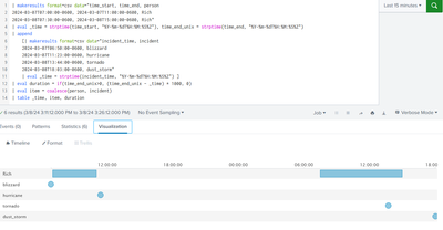
| table _time, item, durationThe click the visualization tab, change it to the Timeline, and ... well it's close! Unfortunately, I don't like the blizzard, hurricane, tornado and dust_storm all being on their own lines like in this screenshot.
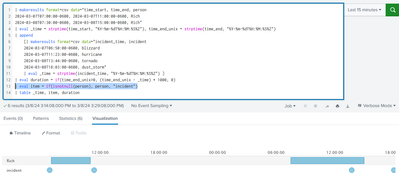
How can we fix that? Well, one way would be to make all the incident's "names" just be "incident" so it'd show up on its own line. To do that, change the "eval item =..." line to
| eval item = if(isnotnull(person), person, "incident")and leave the ending | table command. Now it looks like this
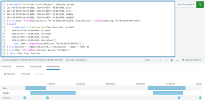
I honestly think that as long as you may have multiple people's schedules, this is as good as you can get. Example with another person added in:
But if you absolutely know there will never be another person, you could make them sit on top of each other by any mechanism to just make "person" always be "Rich". Here I use a fillnull command
Anyway, my suggestion is to play with my examples until you understand them. Once you do, you might be able to make your own data work like this. But if you still have difficulties after all that, post back and we'll see if we can help!
Also it's entirely possible someone else will come up with a completely different type of answer. I don't know, it'll be interesting if they do - there's a lot of smart folks around here and we don't all think alike!
Happy Splunking,
Rich
