Are you a member of the Splunk Community?
- Find Answers
- :
- Using Splunk
- :
- Dashboards & Visualizations
- :
- Re: How to select all existing values for multiple...
- Subscribe to RSS Feed
- Mark Topic as New
- Mark Topic as Read
- Float this Topic for Current User
- Bookmark Topic
- Subscribe to Topic
- Mute Topic
- Printer Friendly Page
- Mark as New
- Bookmark Message
- Subscribe to Message
- Mute Message
- Subscribe to RSS Feed
- Permalink
- Report Inappropriate Content
Hi all,
I have a set of log data like this below:
How do I plot all available data for all these fields over LogTime?
Thanks.
- Mark as New
- Bookmark Message
- Subscribe to Message
- Mute Message
- Subscribe to RSS Feed
- Permalink
- Report Inappropriate Content
hi dyude @beetaj ,
You can try this
Your index | chart list(Fiield1) as Field1 list(Field2) as Field2 list(Field3) as Field3 list(Field4) as Field4 list(Field5) as Field5 by LogTime
- Mark as New
- Bookmark Message
- Subscribe to Message
- Mute Message
- Subscribe to RSS Feed
- Permalink
- Report Inappropriate Content
Hi @beetaj
You can use the "LogTime" to plot a timechart.
basesearch|eval _time=strptime(LogTime,"%d/%m/%Y %H:%M:%S")| timechart values(Field*) by Field*
- Mark as New
- Bookmark Message
- Subscribe to Message
- Mute Message
- Subscribe to RSS Feed
- Permalink
- Report Inappropriate Content
hi dyude @beetaj ,
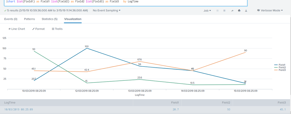
Iam able to see the chart wrt your values.!
sorry for the typo mistake in the above query..
Your index | chart list(Field1) as Field1..... *
- Mark as New
- Bookmark Message
- Subscribe to Message
- Mute Message
- Subscribe to RSS Feed
- Permalink
- Report Inappropriate Content
Thanks @vinod94 ,
I am really puzzled why I am not getting any graphs! The only difference to the above data is that I have too many more events. However I do it the scale on Y-Axis stays 0-100, but according to the attached values of f1 goes well beyond 100.
- Mark as New
- Bookmark Message
- Subscribe to Message
- Mute Message
- Subscribe to RSS Feed
- Permalink
- Report Inappropriate Content
try running this search .. ive kept some different values
| makeresults
| eval Field1="20.7,100,56,45,400"
| makemv delim="," Field1
| mvexpand Field1
| appendcols
    [| makeresults
    | eval Field2="93,15,23.6,10.5,11"
    | makemv delim="," Field2
    | mvexpand Field2]
|appendcols
    [| makeresults
    | eval Field3="45.1,42.4,67.6,45,90"
    | makemv delim="," Field3
    | mvexpand Field3]
|appendcols
    [| makeresults
    | eval LogTime="10/03/2019 08:25:09,12/03/2019 08:25:09,13/03/2019 08:25:09,14/03/2019 08:25:09,15/03/2019 08:25:09"
    | makemv delim="," LogTime
    | mvexpand LogTime]
|chart list(Field1) as Field1 list(Field2) as Field2 list(Field3) as Field3   by LogTime
- Mark as New
- Bookmark Message
- Subscribe to Message
- Mute Message
- Subscribe to RSS Feed
- Permalink
- Report Inappropriate Content
Thanks @vinod94 ,
I accept your response as Answer, and I am able to plot the expected graphs when I test it with some controlled dataset. But when I apply to my real data, I get no graph. Real data volume is high but it shouldn't matter as I filter it down to one second which I have only few events, still no graph is produced!
I had attached screenshots unfortunately not moderated yet!
- Mark as New
- Bookmark Message
- Subscribe to Message
- Mute Message
- Subscribe to RSS Feed
- Permalink
- Report Inappropriate Content
@beetaj,
Can u post a screenshot ? Mostly it shouldn't effect.
- Mark as New
- Bookmark Message
- Subscribe to Message
- Mute Message
- Subscribe to RSS Feed
- Permalink
- Report Inappropriate Content
If you have a basesearch that gives you exactly the table you provided above you can simply do:
basesearch | timechart values(Field*) by Field*
- Mark as New
- Bookmark Message
- Subscribe to Message
- Mute Message
- Subscribe to RSS Feed
- Permalink
- Report Inappropriate Content
Thanks @damann ,
timechart is not particularly helpful as it works based on the event time (index time), where the LogTime above is an indexed field extracted from my log data. Therefore I need a query/function combination that works based on LogTime
- Mark as New
- Bookmark Message
- Subscribe to Message
- Mute Message
- Subscribe to RSS Feed
- Permalink
- Report Inappropriate Content
hi dyude @beetaj ,
You can try this
Your index | chart list(Fiield1) as Field1 list(Field2) as Field2 list(Field3) as Field3 list(Field4) as Field4 list(Field5) as Field5 by LogTime
- Mark as New
- Bookmark Message
- Subscribe to Message
- Mute Message
- Subscribe to RSS Feed
- Permalink
- Report Inappropriate Content
thanks @vinod94 ,
It helped with the statistics/tabular view, but the visualisation doesn't plot anything, tried different graphs, apparently they plot by count, I want the exact data to be dotted on the graph. so that I can see the pattern.
How do I fix the graph?


