Are you a member of the Splunk Community?
- Find Answers
- :
- Using Splunk
- :
- Dashboards & Visualizations
- :
- How to plot a trellis chart showing the average ti...
- Subscribe to RSS Feed
- Mark Topic as New
- Mark Topic as Read
- Float this Topic for Current User
- Bookmark Topic
- Subscribe to Topic
- Mute Topic
- Printer Friendly Page
- Mark as New
- Bookmark Message
- Subscribe to Message
- Mute Message
- Subscribe to RSS Feed
- Permalink
- Report Inappropriate Content
How to plot a trellis chart showing the average time spent on a website?
Hi Community,
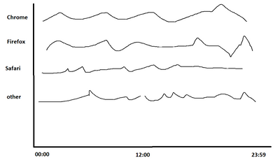
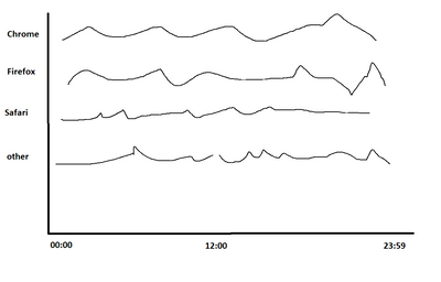
If i need Plot a trellis chart showing the average time spent on a website for each user session by browser
what's the best approach for this ?
- Mark as New
- Bookmark Message
- Subscribe to Message
- Mute Message
- Subscribe to RSS Feed
- Permalink
- Report Inappropriate Content
Hi @splunkis0927,
everything in Splunk is a search, so you have to create a search to have the result that you need, then you can choose the way to show your results (e.g. Trellis).
At first you have to find the results to aggregate and then aggregate them using some stremeing command like stats, something like this:
index=your_index sourcetype=your_sourcetype
| stats count BY session_id
when you have the results as a table, you can use the gui fetures of Splunk to choose the chart you like and the Trellis.
But As I said, Trellins and chart type is a secondary issue: secondary for importance and scheduling.
Ciao.
Giuseppe
- Mark as New
- Bookmark Message
- Subscribe to Message
- Mute Message
- Subscribe to RSS Feed
- Permalink
- Report Inappropriate Content
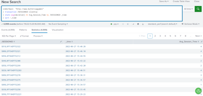
thanks for the help. here is the output I am going to try, but atm i am not sure how to aggregate these browsers in a table
- Mark as New
- Bookmark Message
- Subscribe to Message
- Mute Message
- Subscribe to RSS Feed
- Permalink
- Report Inappropriate Content
Hi @splunkis0927,
the search you used is without sense!
you have to choose to use transaction ( I use it only when I don't have any other solution because it's a very slow command!) or stats.
In addition, you could also use timechart but only if you have one field for grouping (e.g. only JSESSIONID or clientip).
Then if you use _time in stats, you have also to use bin otherwise in this way you have groups that differs for a second.
try something like this:
index=main "http://www.buttercupgames"
| bin span=1h _time
| stats count BY SESSIONID clientip _time
Ciao.
Giuseppe
- Mark as New
- Bookmark Message
- Subscribe to Message
- Mute Message
- Subscribe to RSS Feed
- Permalink
- Report Inappropriate Content
Thank you so much !!
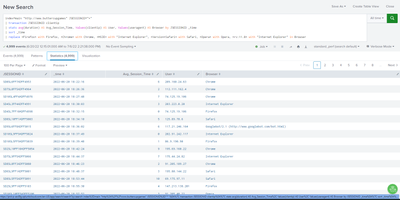
I think I have the data now, but not sure how to Plot a trellis chart showing the average time for
each user session by browser
