- Find Answers
- :
- Using Splunk
- :
- Dashboards & Visualizations
- :
- How to make a custom heat map (choropleth like set...
- Subscribe to RSS Feed
- Mark Topic as New
- Mark Topic as Read
- Float this Topic for Current User
- Bookmark Topic
- Subscribe to Topic
- Mute Topic
- Printer Friendly Page
- Mark as New
- Bookmark Message
- Subscribe to Message
- Mute Message
- Subscribe to RSS Feed
- Permalink
- Report Inappropriate Content
How to make a custom heat map (choropleth like setting for grid/table) - NFL Statistics
I've been playing around a bit with some NFL statistical data (source data is from http://nflsavant.com/about.php). Each passing play has a field called PassType where the six possible values are short left, short middle, short right and deep left, deep middle, and deep right.
I'd like to make a choropleth style heat map or table to visualize the data.
The visualization would be two rows and three columns. Deep passes on top, short passes on bottom with left right and middle where you'd expect. Is the best way to visualize this data with a cloropleth map? Is there something easier/better?
EDIT:
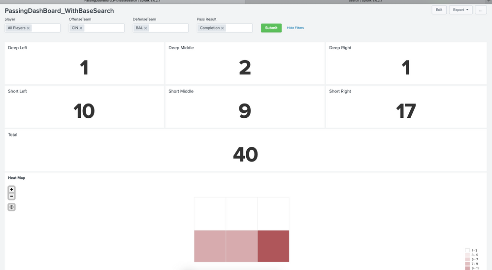
I've kind of worked through this. First I started by getting my data into single number visualizations where they are organized is a logical manner (deep passes on top, short on bottom, left, right and middle respectively). Then I kind of figured out how to do custom placemarks in a kml file to do the heat map. This was quite the mental exercise but I think I'm kind of there - the end result isn't as pretty as I was hoping, but it is fun to play with the data.
- Mark as New
- Bookmark Message
- Subscribe to Message
- Mute Message
- Subscribe to RSS Feed
- Permalink
- Report Inappropriate Content
First you'll need a custom lookup table with coordinates then you'll need field values in Splunk to link to those lookup coordinates. Once you got that, it's as simple as using the geom command to reference the lookup
- Mark as New
- Bookmark Message
- Subscribe to Message
- Mute Message
- Subscribe to RSS Feed
- Permalink
- Report Inappropriate Content
When I started looking into Splunk Docs, most things were pointing to GIS and actual map data. Are you aware of any examples that I can mimic or Splunk Docs that I may have just missed?
- Mark as New
- Bookmark Message
- Subscribe to Message
- Mute Message
- Subscribe to RSS Feed
- Permalink
- Report Inappropriate Content
@danielransell would you be able to provide a mock screenshot or whiteboard image of what you need as output?
| makeresults | eval message= "Happy Splunking!!!"
- Mark as New
- Bookmark Message
- Subscribe to Message
- Mute Message
- Subscribe to RSS Feed
- Permalink
- Report Inappropriate Content
The result of my search right now is a chart with a row for each quarterback (I don't know if I can actually insert a table, but an excerpt of the data is below). I have applied a heatmap overlay over the entire chart, which is nice - but I'd like to make it more intuitive visually.
My Search:
index=nfl IsPass=1 |chart count over player by PassType usenull=f
My Outputplayer DEEP LEFT DEEP MIDDLE DEEP RIGHT SHORT LEFT SHORT MIDDLE SHORT RIGHT
1-C.NEWTON 4 1 9 30 11 36
1-K.MURRAY 31 19 44 166 81 179
2-A.MCCARRON 0 0 0 0 1 0
2-B.ALLEN 6 4 8 22 15 36
2-B.HOYER 8 2 8 10 15 23
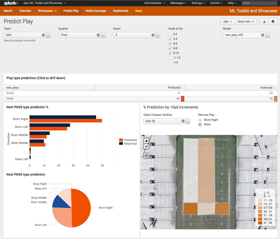
Splunk actually did something similar a few years ago 
I'm not looking to overlay it on a football field like the splunk example. I'm just trying to format the three deep pass categories as row 1, and the three short pass categories as row 2. Currently I'm only picturing this as one output - so I can either specify a single player earlier in the search pipeline or run the stats against all or a set of players.
- Mark as New
- Bookmark Message
- Subscribe to Message
- Mute Message
- Subscribe to RSS Feed
- Permalink
- Report Inappropriate Content
@danielransell I think you referred to the following Splunk blog: https://www.splunk.com/en_us/blog/tips-and-tricks/dashboard-digest-series-episode-4.html
However, I am still not clear on exactly what is your requirement. As per the blog you can use the Shapester app for drawing required polygon in you want heatmap overlaid on field. If you want heatmap within table that is also possible through Table Cell Formatting and Coloring option.
Please let me know which option are you interested in. A hand drawn sketch of final output is also fine.
Also, would like you to check out Splunk Dashboard App (Beta) for you to try out your use case: https://splunkbase.splunk.com/app/4710/
Or Heat Map viz app from Splunkbase: https://splunkbase.splunk.com/app/4460/
| makeresults | eval message= "Happy Splunking!!!"
- Mark as New
- Bookmark Message
- Subscribe to Message
- Mute Message
- Subscribe to RSS Feed
- Permalink
- Report Inappropriate Content
I tried installing the Shapester App on my home setup and can't seem to get it to load properly. I'm running 8.0.2 and supported versions for the Shapester app are limited to 6.3 to 6.6.
- Mark as New
- Bookmark Message
- Subscribe to Message
- Mute Message
- Subscribe to RSS Feed
- Permalink
- Report Inappropriate Content
I am thinking Image Overlay with token range based token values should still do the trick.
Something on the lines of https://wiki.splunk.com/User_talk:Niketnilay#Topic_1:_Image_Overlay_with_Icons_Example:_Extends_Imag...
May I know what determines the height of each heatmap overlay in the above image? For example white section is longer rectangle and brown section is smaller square?
| makeresults | eval message= "Happy Splunking!!!"
- Mark as New
- Bookmark Message
- Subscribe to Message
- Mute Message
- Subscribe to RSS Feed
- Permalink
- Report Inappropriate Content
Image overlay could probably work. I think more than anything I was looking for a way to organize the data differently than I could with a chart or stats command where all the values are returned in a single row.
I wish I could attach an image here rather than just hyperlink to sites - I've put together a functional option using a dashboard and 6 Single Visualization panels each representing an area (short and deep, left middle and right). Currently the dashboard is driven by user selectable dropdowns where a player, offense, defense, and/or pass result (complete, incomplete, touchdown, interception, 2 pt try) can be used to filter the data.
I can assign colors to the visualization based on value - to do it dynamically, I can probably convert the raw count of passes to a ratio of passes based on target (e.g. short middle) and color based on ranges.
- Mark as New
- Bookmark Message
- Subscribe to Message
- Mute Message
- Subscribe to RSS Feed
- Permalink
- Report Inappropriate Content
Cool project. Is this your personal project or does your work want you to model this and make play predictions?
- Mark as New
- Bookmark Message
- Subscribe to Message
- Mute Message
- Subscribe to RSS Feed
- Permalink
- Report Inappropriate Content
I'm actually just referencing the project Splunk did a few years ago to market Machine Learning capabilities. My project is a combination of personal interests, NFL and Splunk. I use Splunk at work, but not for playing around with NFL stats.

