- Find Answers
- :
- Using Splunk
- :
- Dashboards & Visualizations
- :
- How to get multiple overlays on panel, by time
- Subscribe to RSS Feed
- Mark Topic as New
- Mark Topic as Read
- Float this Topic for Current User
- Bookmark Topic
- Subscribe to Topic
- Mute Topic
- Printer Friendly Page
- Mark as New
- Bookmark Message
- Subscribe to Message
- Mute Message
- Subscribe to RSS Feed
- Permalink
- Report Inappropriate Content
How to get multiple overlays on panel, by time
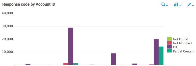
Hi, so currently I have the following panel and code:
index=origin sourcetype=access_combined (AccountID!="test" AND AccountID!="server") $AccountIDtoken$ | eval AccountID=if(isnum(AccountID), tag, AccountID) | chart count by AccountID, status_description
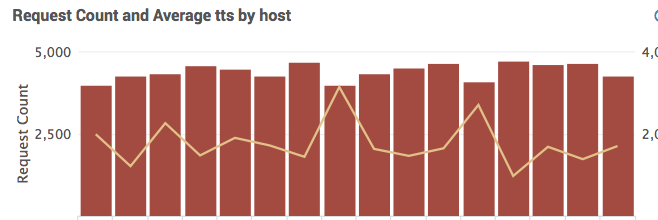
But what I WANT is for it to look kinda like this...
...With FOUR overlay lines (one for each response code total count). One axis would be account IDs (probably stacked), the other axis would be time slots. I have pickers for Timeframe (token=field1) and AccountID (token=AccountIDtoken) and timespan (token=span) in place.
That way I could see variation in response codes over time, per account. Any thoughts?
- Mark as New
- Bookmark Message
- Subscribe to Message
- Mute Message
- Subscribe to RSS Feed
- Permalink
- Report Inappropriate Content
index=origin sourcetype=access_combined (AccountID!="test" AND AccountID!="server") $AccountIDtoken$ | eval AccountID=if(isnum(AccountID), tag, AccountID) | chart count by AccountID, status_description | addtotals | fields status_description, Totals
Now , go to the chart format and select all status_description as overlay
- Mark as New
- Bookmark Message
- Subscribe to Message
- Mute Message
- Subscribe to RSS Feed
- Permalink
- Report Inappropriate Content
I'm afraid that search comes up as blank, even when running it in a search bar with the token removed. If I run it with just the "addtotals," it looks identical to before. The last pipe is stripping all the data for some reason.
- Mark as New
- Bookmark Message
- Subscribe to Message
- Mute Message
- Subscribe to RSS Feed
- Permalink
- Report Inappropriate Content
have you explored streamstats ???


