- Find Answers
- :
- Using Splunk
- :
- Dashboards & Visualizations
- :
- How to create an interactive dashboard proper desi...
- Subscribe to RSS Feed
- Mark Topic as New
- Mark Topic as Read
- Float this Topic for Current User
- Bookmark Topic
- Subscribe to Topic
- Mute Topic
- Printer Friendly Page
- Mark as New
- Bookmark Message
- Subscribe to Message
- Mute Message
- Subscribe to RSS Feed
- Permalink
- Report Inappropriate Content
How to create an interactive dashboard proper design?
hi
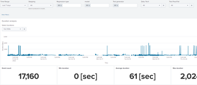
I have made an interactive dashboard that allow users to filter our data according the main interesting parameters, however it seems to me that I could do better, here are my questions:
1) all the panels in the dashboard use the token from the time range picker. I would like some of the panels (the single values below for example) to re-calculate based on changing the zoom in the time chart above them. how can I implement it?
2) all the panels use the same base search and add on it. for example <base search> | table something, <base search>| get specific single value, etc. how can I save this common base search and use it properly in all the panels?
3) moreover - at the moment, for each panel a new search is being performed, quite a waste... is there a way to optimize it to run once and get the results for each panel from this search?
4) is there an option to add specific "interesting" single value or other data on top of a chart? adding a different panel for each value is annoying, wasting additional searches and in my opinion presents it in a lesser way (GUI-wise)
5) any good way to let users filter out specific anomaly events from the chart?
thanks,
noam
- Mark as New
- Bookmark Message
- Subscribe to Message
- Mute Message
- Subscribe to RSS Feed
- Permalink
- Report Inappropriate Content
- You can use the selection handler to determine the range selected Event Handler Reference - Splunk Documentation
- Split your "base" search so it does the bulk of the work, the post-process the results in the panels
- You can use the done handler in your "base" search to set a token based on the $job.sid$ and then use loadjob to load the results rather than using base=
- Not sure I understand the requirement here - please expand, perhaps with a more concrete example
- Not sure I understand the requirement here - please expand, perhaps with a more concrete example
- Mark as New
- Bookmark Message
- Subscribe to Message
- Mute Message
- Subscribe to RSS Feed
- Permalink
- Report Inappropriate Content
thanks for the prompt reply
1. tried it, it works but then I cannot zoom in, just select - any way around it?
2. can give a specific example/reference on how to do it?
3. didnt get to it, lets start with #1/2 🙂
4. explanation - I'd imagine it as having some "legend" on the chart itself with certain statistics I choose to show like average/min/max/other instead of adding a new panel just for a single number. not a must, mainly for how it looks and how easy it is for me to build such things in the future.
5.explanation - looking for a way for a user to filter out anomalies so it it will be easier to understand the graph. for example - right click on a point in the chart and select to remove it. for example - if most of the points range 0-100, and there is one at 15000, you cant get anything from the graph without zooming (and I didnt find a way to only zoom on the y axis)

