Turn on suggestions
Auto-suggest helps you quickly narrow down your search results by suggesting possible matches as you type.
Showing results for
Dashboards & Visualizations
Turn on suggestions
Auto-suggest helps you quickly narrow down your search results by suggesting possible matches as you type.
Showing results for
- Splunk Answers
- :
- Using Splunk
- :
- Dashboards & Visualizations
- :
- How do I create Punchcard that sorts bins with col...
Options
- Subscribe to RSS Feed
- Mark Topic as New
- Mark Topic as Read
- Float this Topic for Current User
- Bookmark Topic
- Subscribe to Topic
- Mute Topic
- Printer Friendly Page
- Mark as New
- Bookmark Message
- Subscribe to Message
- Mute Message
- Subscribe to RSS Feed
- Permalink
- Report Inappropriate Content
splunkman
Engager
08-05-2022
05:59 AM
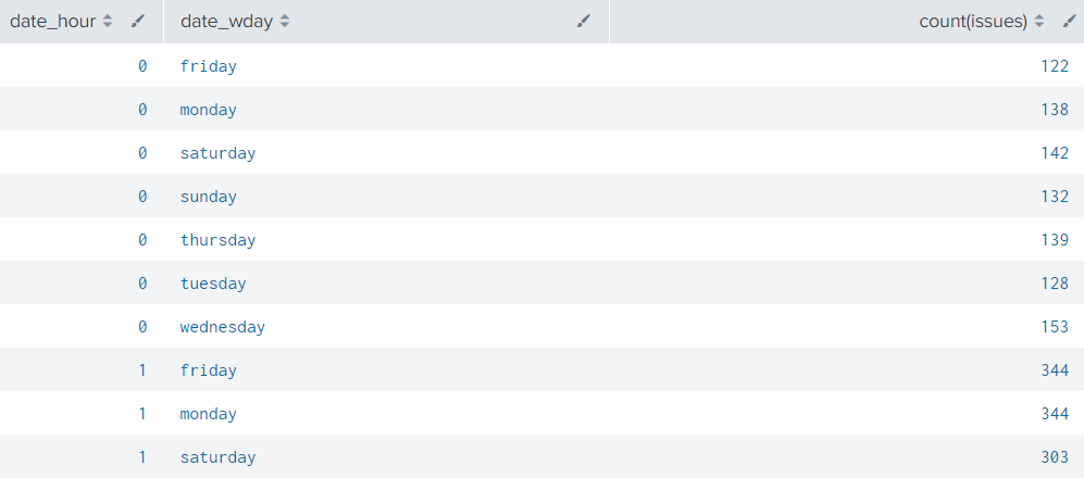
Im trying to make a punchcard to visualize incoming issues per hour in the prvious week.
This is the result i get with the following code:
| eval issues="Issue Priority"
| stats count(issues) by date_hour date_wday
I really want to get more bins like on the right side so that i can assign values with color. E.g. 0<10 = green, 11<70 = yellow, 71<150=red.
Something i need to include?
1 Solution
- Mark as New
- Bookmark Message
- Subscribe to Message
- Mute Message
- Subscribe to RSS Feed
- Permalink
- Report Inappropriate Content
ITWhisperer

SplunkTrust
08-05-2022
06:24 AM
I haven't used that viz before but it looks like (from the documentation) that you just need to eval another field
| eval issues="Issue Priority"
| stats count(issues) as count by date_hour date_wday
| eval range=case(count < 11, "Green", count < 70, "Yellow", count < 150, "Red")- Mark as New
- Bookmark Message
- Subscribe to Message
- Mute Message
- Subscribe to RSS Feed
- Permalink
- Report Inappropriate Content
splunkman
Engager
08-05-2022
06:40 AM
Thank you!
It worked with the Categorical color mode.
- Mark as New
- Bookmark Message
- Subscribe to Message
- Mute Message
- Subscribe to RSS Feed
- Permalink
- Report Inappropriate Content
ITWhisperer

SplunkTrust
08-05-2022
06:24 AM
I haven't used that viz before but it looks like (from the documentation) that you just need to eval another field
| eval issues="Issue Priority"
| stats count(issues) as count by date_hour date_wday
| eval range=case(count < 11, "Green", count < 70, "Yellow", count < 150, "Red")
Get Updates on the Splunk Community!
Introducing the Splunk Community Dashboard Challenge!
Welcome to Splunk Community Dashboard Challenge! This is your chance to showcase your skills in creating ...
Built-in Service Level Objectives Management to Bridge the Gap Between Service & ...
Wednesday, May 29, 2024 | 11AM PST / 2PM ESTRegister now and join us to learn more about how you can ...
Get Your Exclusive Splunk Certified Cybersecurity Defense Engineer Certification at ...
We’re excited to announce a new Splunk certification exam being released at .conf24! If you’re headed to Vegas ...


