Turn on suggestions
Auto-suggest helps you quickly narrow down your search results by suggesting possible matches as you type.
Dashboards & Visualizations
×
Are you a member of the Splunk Community?
Sign in or Register with your Splunk account to get your questions answered, access valuable resources and connect with experts!
Turn on suggestions
Auto-suggest helps you quickly narrow down your search results by suggesting possible matches as you type.
- Find Answers
- :
- Using Splunk
- :
- Dashboards & Visualizations
- :
- How do I create Punchcard that sorts bins with col...
Options
- Subscribe to RSS Feed
- Mark Topic as New
- Mark Topic as Read
- Float this Topic for Current User
- Bookmark Topic
- Subscribe to Topic
- Mute Topic
- Printer Friendly Page
- Mark as New
- Bookmark Message
- Subscribe to Message
- Mute Message
- Subscribe to RSS Feed
- Permalink
- Report Inappropriate Content
splunkman
Engager
08-05-2022
05:59 AM
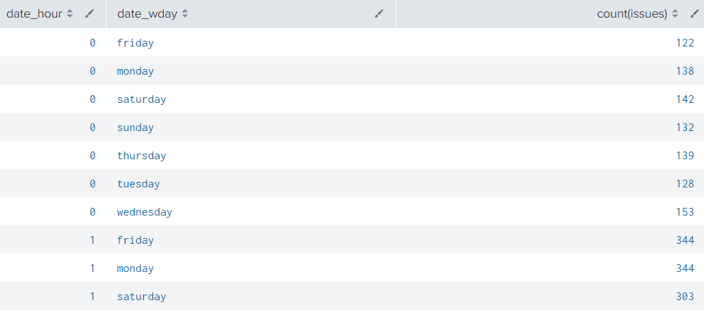
Im trying to make a punchcard to visualize incoming issues per hour in the prvious week.
This is the result i get with the following code:
| eval issues="Issue Priority"
| stats count(issues) by date_hour date_wday
I really want to get more bins like on the right side so that i can assign values with color. E.g. 0<10 = green, 11<70 = yellow, 71<150=red.
Something i need to include?
1 Solution
- Mark as New
- Bookmark Message
- Subscribe to Message
- Mute Message
- Subscribe to RSS Feed
- Permalink
- Report Inappropriate Content
ITWhisperer

SplunkTrust
08-05-2022
06:24 AM
I haven't used that viz before but it looks like (from the documentation) that you just need to eval another field
| eval issues="Issue Priority"
| stats count(issues) as count by date_hour date_wday
| eval range=case(count < 11, "Green", count < 70, "Yellow", count < 150, "Red")- Mark as New
- Bookmark Message
- Subscribe to Message
- Mute Message
- Subscribe to RSS Feed
- Permalink
- Report Inappropriate Content
splunkman
Engager
08-05-2022
06:40 AM
Thank you!
It worked with the Categorical color mode.
- Mark as New
- Bookmark Message
- Subscribe to Message
- Mute Message
- Subscribe to RSS Feed
- Permalink
- Report Inappropriate Content
ITWhisperer

SplunkTrust
08-05-2022
06:24 AM
I haven't used that viz before but it looks like (from the documentation) that you just need to eval another field
| eval issues="Issue Priority"
| stats count(issues) as count by date_hour date_wday
| eval range=case(count < 11, "Green", count < 70, "Yellow", count < 150, "Red")
Get Updates on the Splunk Community!
Observe and Secure All Apps with Splunk
Join Us for Our Next Tech Talk: Observe and Secure All Apps with SplunkAs organizations continue to innovate ...
Splunk Decoded: Business Transactions vs Business IQ
It’s the morning of Black Friday, and your e-commerce site is handling 10x normal traffic. Orders are flowing, ...
Fastest way to demo Observability
I’ve been having a lot of fun learning about Kubernetes and Observability. I set myself an interesting ...


