Turn on suggestions
Auto-suggest helps you quickly narrow down your search results by suggesting possible matches as you type.
Dashboards & Visualizations
×
Are you a member of the Splunk Community?
Sign in or Register with your Splunk account to get your questions answered, access valuable resources and connect with experts!
Turn on suggestions
Auto-suggest helps you quickly narrow down your search results by suggesting possible matches as you type.
- Find Answers
- :
- Using Splunk
- :
- Dashboards & Visualizations
- :
- How do I create Punchcard that sorts bins with col...
Options
- Subscribe to RSS Feed
- Mark Topic as New
- Mark Topic as Read
- Float this Topic for Current User
- Bookmark Topic
- Subscribe to Topic
- Mute Topic
- Printer Friendly Page
- Mark as New
- Bookmark Message
- Subscribe to Message
- Mute Message
- Subscribe to RSS Feed
- Permalink
- Report Inappropriate Content
splunkman
Engager
08-05-2022
05:59 AM
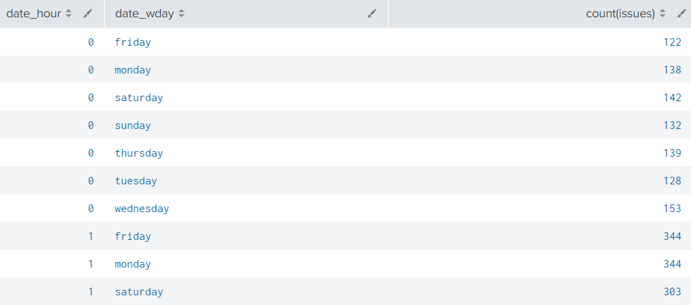
Im trying to make a punchcard to visualize incoming issues per hour in the prvious week.
This is the result i get with the following code:
| eval issues="Issue Priority"
| stats count(issues) by date_hour date_wday
I really want to get more bins like on the right side so that i can assign values with color. E.g. 0<10 = green, 11<70 = yellow, 71<150=red.
Something i need to include?
1 Solution
- Mark as New
- Bookmark Message
- Subscribe to Message
- Mute Message
- Subscribe to RSS Feed
- Permalink
- Report Inappropriate Content
ITWhisperer

SplunkTrust
08-05-2022
06:24 AM
I haven't used that viz before but it looks like (from the documentation) that you just need to eval another field
| eval issues="Issue Priority"
| stats count(issues) as count by date_hour date_wday
| eval range=case(count < 11, "Green", count < 70, "Yellow", count < 150, "Red")- Mark as New
- Bookmark Message
- Subscribe to Message
- Mute Message
- Subscribe to RSS Feed
- Permalink
- Report Inappropriate Content
splunkman
Engager
08-05-2022
06:40 AM
Thank you!
It worked with the Categorical color mode.
- Mark as New
- Bookmark Message
- Subscribe to Message
- Mute Message
- Subscribe to RSS Feed
- Permalink
- Report Inappropriate Content
ITWhisperer

SplunkTrust
08-05-2022
06:24 AM
I haven't used that viz before but it looks like (from the documentation) that you just need to eval another field
| eval issues="Issue Priority"
| stats count(issues) as count by date_hour date_wday
| eval range=case(count < 11, "Green", count < 70, "Yellow", count < 150, "Red")Career Survey
First 500 qualified respondents will receive a $20 gift card! Tell us about your professional Splunk journey.
Get Updates on the Splunk Community!
Observe and Secure All Apps with Splunk
Join Us for Our Next Tech Talk: Observe and Secure All Apps with SplunkAs organizations continue to innovate ...
What's New in Splunk Observability - August 2025
What's New We are excited to announce the latest enhancements to Splunk Observability Cloud as well as what is ...
Introduction to Splunk AI
How are you using AI in Splunk? Whether you see AI as a threat or opportunity, AI is here to stay. Lucky for ...


