Turn on suggestions
Auto-suggest helps you quickly narrow down your search results by suggesting possible matches as you type.
Showing results for
Dashboards & Visualizations
Turn on suggestions
Auto-suggest helps you quickly narrow down your search results by suggesting possible matches as you type.
Showing results for
- Splunk Answers
- :
- Using Splunk
- :
- Dashboards & Visualizations
- :
- How do I create Punchcard that sorts bins with col...
Options
- Subscribe to RSS Feed
- Mark Topic as New
- Mark Topic as Read
- Float this Topic for Current User
- Bookmark Topic
- Subscribe to Topic
- Mute Topic
- Printer Friendly Page
- Mark as New
- Bookmark Message
- Subscribe to Message
- Mute Message
- Subscribe to RSS Feed
- Permalink
- Report Inappropriate Content
splunkman
Engager
08-05-2022
05:59 AM
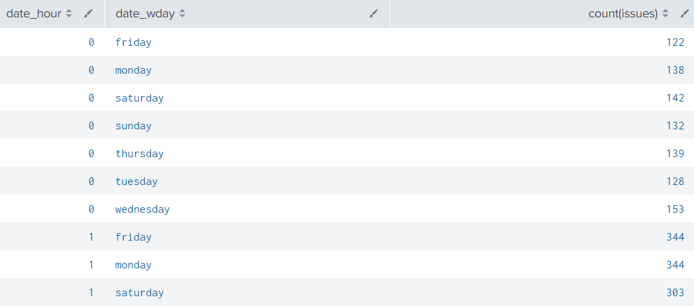
Im trying to make a punchcard to visualize incoming issues per hour in the prvious week.
This is the result i get with the following code:
| eval issues="Issue Priority"
| stats count(issues) by date_hour date_wday
I really want to get more bins like on the right side so that i can assign values with color. E.g. 0<10 = green, 11<70 = yellow, 71<150=red.
Something i need to include?
1 Solution
- Mark as New
- Bookmark Message
- Subscribe to Message
- Mute Message
- Subscribe to RSS Feed
- Permalink
- Report Inappropriate Content
ITWhisperer

SplunkTrust
08-05-2022
06:24 AM
I haven't used that viz before but it looks like (from the documentation) that you just need to eval another field
| eval issues="Issue Priority"
| stats count(issues) as count by date_hour date_wday
| eval range=case(count < 11, "Green", count < 70, "Yellow", count < 150, "Red")- Mark as New
- Bookmark Message
- Subscribe to Message
- Mute Message
- Subscribe to RSS Feed
- Permalink
- Report Inappropriate Content
splunkman
Engager
08-05-2022
06:40 AM
Thank you!
It worked with the Categorical color mode.
- Mark as New
- Bookmark Message
- Subscribe to Message
- Mute Message
- Subscribe to RSS Feed
- Permalink
- Report Inappropriate Content
ITWhisperer

SplunkTrust
08-05-2022
06:24 AM
I haven't used that viz before but it looks like (from the documentation) that you just need to eval another field
| eval issues="Issue Priority"
| stats count(issues) as count by date_hour date_wday
| eval range=case(count < 11, "Green", count < 70, "Yellow", count < 150, "Red")
Get Updates on the Splunk Community!
Enhance Security Visibility with Splunk Enterprise Security 7.1 through Threat ...
(view in My Videos)Struggling with alert fatigue, lack of context, and prioritization around security ...
Troubleshooting the OpenTelemetry Collector
In this tech talk, you’ll learn how to troubleshoot the OpenTelemetry collector - from checking the ...
Adoption of Infrastructure Monitoring at Splunk
Splunk's Growth Engineering team showcases one of their first Splunk product adoption-Splunk Infrastructure ...


