Are you a member of the Splunk Community?
- Find Answers
- :
- Using Splunk
- :
- Dashboards & Visualizations
- :
- How can I change in the Y-Axis the count number fo...
- Subscribe to RSS Feed
- Mark Topic as New
- Mark Topic as Read
- Float this Topic for Current User
- Bookmark Topic
- Subscribe to Topic
- Mute Topic
- Printer Friendly Page
- Mark as New
- Bookmark Message
- Subscribe to Message
- Mute Message
- Subscribe to RSS Feed
- Permalink
- Report Inappropriate Content
How can I change in the Y-Axis the count number for values with hours in timechart
Hello Everyone!
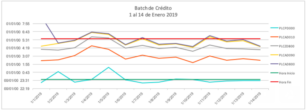
We want to make a timechart similar to this one that we made in excel.
In Splunk I tried everything but I can't change the Y-axis values the only thing that I achieve is the next visualization
How can I put the hours of execution in the Y-axis
This is my search
index="controlm"
|eval fecha=strftime(_time,"%Y-%m-%d")
|timechart span=1h count by job_member_name  limit=4 useother=f
- Mark as New
- Bookmark Message
- Subscribe to Message
- Mute Message
- Subscribe to RSS Feed
- Permalink
- Report Inappropriate Content
Hi @danielgp89
Please check the suggestion given by @niketnilay here
https://answers.splunk.com/answers/661288/time-on-y-axis-and-date-on-x-axis.html
- Mark as New
- Bookmark Message
- Subscribe to Message
- Mute Message
- Subscribe to RSS Feed
- Permalink
- Report Inappropriate Content
It is not clear what you mean.
- Mark as New
- Bookmark Message
- Subscribe to Message
- Mute Message
- Subscribe to RSS Feed
- Permalink
- Report Inappropriate Content
In the Y-axis I want to represent the hours instead of how many events happen!
For example in the Y-axis: I want the hours and in the X-axis we want the date!
We want to represent in a chart like the first one at what time of day by date there were more activity with some tasks.
- Mark as New
- Bookmark Message
- Subscribe to Message
- Mute Message
- Subscribe to RSS Feed
- Permalink
- Report Inappropriate Content
What in the world do you mean by hours? Show me some sample events and how hours would be calculated for one timeslice.


