Turn on suggestions
Auto-suggest helps you quickly narrow down your search results by suggesting possible matches as you type.
Dashboards & Visualizations
×
Are you a member of the Splunk Community?
Sign in or Register with your Splunk account to get your questions answered, access valuable resources and connect with experts!
Turn on suggestions
Auto-suggest helps you quickly narrow down your search results by suggesting possible matches as you type.
- Find Answers
- :
- Using Splunk
- :
- Dashboards & Visualizations
- :
- Heat Map that Displays Average Values per Hour Gro...
Options
- Subscribe to RSS Feed
- Mark Topic as New
- Mark Topic as Read
- Float this Topic for Current User
- Bookmark Topic
- Subscribe to Topic
- Mute Topic
- Printer Friendly Page
- Mark as New
- Bookmark Message
- Subscribe to Message
- Mute Message
- Subscribe to RSS Feed
- Permalink
- Report Inappropriate Content
Heat Map that Displays Average Values per Hour Grouped per Day over a Week
nicosteff
Loves-to-Learn Lots
10-18-2021
08:08 AM
Hey Splunkers,
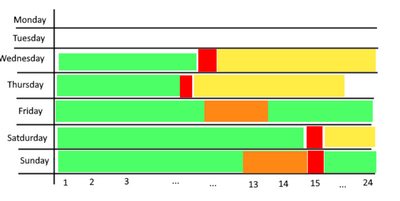
I am quite new to Splunk and want to create a heat map that displays average values per Hour grouped per day over a week. Below you can see what i got so far.
My problem is that the columns and rows seem to be inverted and that the current y-axis shows values from 6 to ohter instead of 1 to 24 hours. Can anyone lend me a hand with this?
Thanks in advance
Nico
EDIT:
What i am looking for should look somewhat like this:
Get Updates on the Splunk Community!
Observe and Secure All Apps with Splunk
Join Us for Our Next Tech Talk: Observe and Secure All Apps with SplunkAs organizations continue to innovate ...
Splunk Decoded: Business Transactions vs Business IQ
It’s the morning of Black Friday, and your e-commerce site is handling 10x normal traffic. Orders are flowing, ...
Fastest way to demo Observability
I’ve been having a lot of fun learning about Kubernetes and Observability. I set myself an interesting ...


