Turn on suggestions
Auto-suggest helps you quickly narrow down your search results by suggesting possible matches as you type.
Dashboards & Visualizations
×
Join the Conversation
Without signing in, you're just watching from the sidelines. Sign in or Register to connect, share, and be part of the Splunk Community.
- Find Answers
- :
- Using Splunk
- :
- Dashboards & Visualizations
- :
- Heat Map that Displays Average Values per Hour Gro...
Options
- Subscribe to RSS Feed
- Mark Topic as New
- Mark Topic as Read
- Float this Topic for Current User
- Bookmark Topic
- Subscribe to Topic
- Mute Topic
- Printer Friendly Page
- Mark as New
- Bookmark Message
- Subscribe to Message
- Mute Message
- Subscribe to RSS Feed
- Permalink
- Report Inappropriate Content
Heat Map that Displays Average Values per Hour Grouped per Day over a Week
nicosteff
Loves-to-Learn Lots
10-18-2021
08:08 AM
Hey Splunkers,
I am quite new to Splunk and want to create a heat map that displays average values per Hour grouped per day over a week. Below you can see what i got so far.
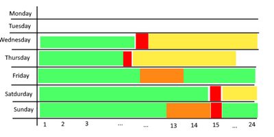
My problem is that the columns and rows seem to be inverted and that the current y-axis shows values from 6 to ohter instead of 1 to 24 hours. Can anyone lend me a hand with this?
Thanks in advance
Nico
EDIT:
What i am looking for should look somewhat like this:
Got questions? Get answers!
Join the Splunk Community Slack to learn, troubleshoot, and make connections with fellow Splunk practitioners in real time!
Meet up IRL or virtually!
Join Splunk User Groups to connect and learn in-person by region or remotely by topic or industry.
Get Updates on the Splunk Community!
Index This | What travels the world but is also stuck in place?
April 2026 Edition
Hayyy Splunk Education Enthusiasts and the Eternally Curious!
We’re back with this ...
Discover New Use Cases: Unlock Greater Value from Your Existing Splunk Data
Realizing the full potential of your Splunk investment requires more than just understanding current usage; it ...
Continue Your Journey: Join Session 2 of the Data Management and Federation Bootcamp ...
As data volumes continue to grow and environments become more distributed, managing and optimizing data ...


