- Find Answers
- :
- Using Splunk
- :
- Dashboards & Visualizations
- :
- GEOSTATS display bubbles on map instead of pie cha...
- Subscribe to RSS Feed
- Mark Topic as New
- Mark Topic as Read
- Float this Topic for Current User
- Bookmark Topic
- Subscribe to Topic
- Mute Topic
- Printer Friendly Page
- Mark as New
- Bookmark Message
- Subscribe to Message
- Mute Message
- Subscribe to RSS Feed
- Permalink
- Report Inappropriate Content
I was working with a customer today who wanted to plot firewall connections on a map with a bubble chart-style visualization. The visualization would meet the following requirements:
- Utilize simple XML dashboard panels
- "Bubbles" plotted on the map should increase in size based on the # of firewall connections at that lat./long.
- "Bubbles" should change in color from Green, to Yellow, to Red based on a range mapping
The initial pass at this used the following command:
index=firewall | iplocation clientip | geostats count as TOTAL
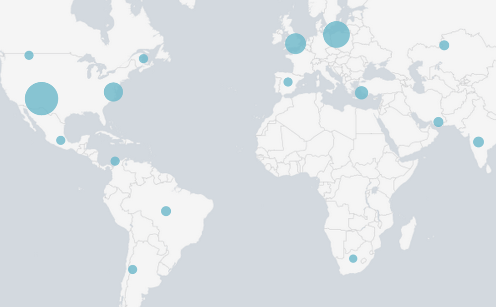
and the resulting map looked like this:
The simple XML map visualization only supports plotting summary statistics from "| geostats" using pie charts. However, by using "| geostats count as TOTAL", the customer was able to effectively create bubbles by plotting pie charts for a single series (no slices in the pie). This got them 90% of the way towards their goal, we just needed to apply the range mapping and set colors.
- Mark as New
- Bookmark Message
- Subscribe to Message
- Mute Message
- Subscribe to RSS Feed
- Permalink
- Report Inappropriate Content
In order to sole this issue, we needed to do the following:
- Break the geostats count into multiple series based on the count of firewall connections for each lat./long.
- Plot our new series on the map and assign custom colors
The search to accomplish this looked like this:
index=firewall | iplocation clientip | geostats count as TOTAL | eval redCount = if(TOTAL >= 250,TOTAL,0) | eval yellowCount = if((TOTAL >= 100 AND TOTAL < 250),TOTAL,0) | eval greenCount = if(TOTAL < 100,TOTAL,0) | fields - TOTAL
Explanation:
Get the location data for each IP
| iplocation clientip
Count the total number of firewall connections for each lat/long and store the count in a new field called TOTAL
| geostats count as TOTAL
Apply Rangemap...
Create a new field for each lat/long called redCount. If the value of the TOTAL field is greater than or equal to 250, set redCount to the value in the TOTAL field. Otherwise, set it to 0.
| eval redCount = if(TOTAL >= 250,TOTAL,0)
Create a new field for each lat/long called yellowCount. If the value of the TOTAL field is greater than or equal to 100 and less than 250, set yellowCount to the value in the TOTAL field. Otherwise, set it to 0.
| eval yellowCount = if((TOTAL >= 100 AND TOTAL < 250),TOTAL,0)
Create a new field for each lat/long called greenCount. If the value of the TOTAL field is less than 100, set greenCount to the value in the TOTAL field. Otherwise, set it to 0.
| eval greenCount = if(TOTAL < 100,TOTAL,0)
Remove the TOTAL field, as we want to plot the greenCount, yellowCount, and redCount series on our map...not a single total.
| fields - TOTAL
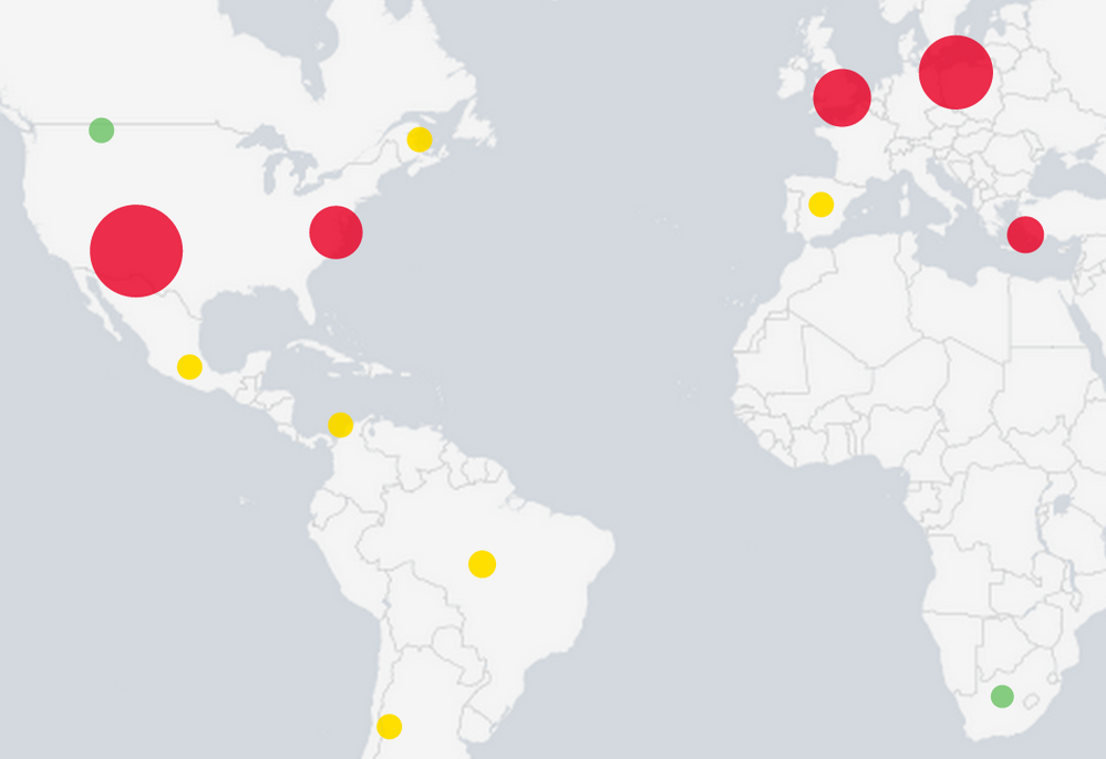
We now have a data set with 6 columns, geobin, latitude, longitude, redCount, yellowCount, and greenCount. The last 3 columns only have a value greater than zero if the total firewall connections (stored in the TOTAL field we removed) for that geobin fell into the corresponding range. This will cause only a single series (redCount, yellowCount, greenCount) to be plotted as a pie chart over a specific location on the map....resulting in a "bubble". The pie chart will grow based on firewall connections because we assigned the TOTAL field value to the appropriate series.
To assign specific colors to the ranges, we can utilize the mapping.fieldColors property of the SimpleXML map.
http://docs.splunk.com/Documentation/Splunk/6.2.2/Viz/PanelreferenceforSimplifiedXML#map
<option name="mapping.fieldColors">{greenCount:0x6dc066,yellowCount:0xffd700,redCount:0xe60026}</option>
The final result looks like this:
- Mark as New
- Bookmark Message
- Subscribe to Message
- Mute Message
- Subscribe to RSS Feed
- Permalink
- Report Inappropriate Content
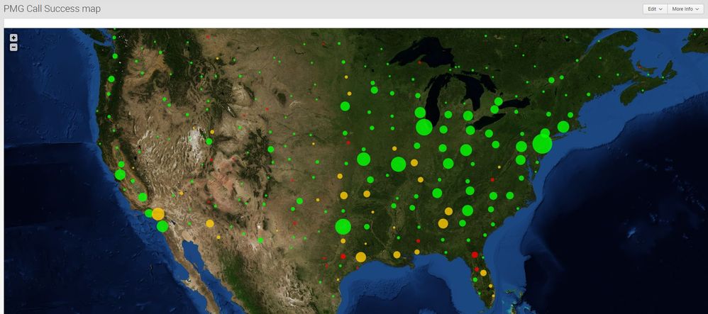
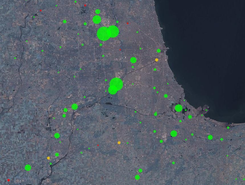
This idea (bubble instead of a pie chart) fascinated me. I've a lot of moving mobile devices recording their ability to "phone home" as dispositions and need to know (with Splunk) when issues occur geographically. My evals post the geostats command are quite different and I'm by no means a Splunk expert, and I hope this, and the oxford comma are received well:
<dashboard>
  <label>PMG Call Success map</label>
  <row>
    <panel>
      <map>
        <search>
          <query>sourcetype=pmgCallRecs
earliest=-4h
| eval lat=latitude/10000000
| eval lon= longitude/10000000
| search lat > 10
| geostats count(eval(disposition=0)) as Successful, count(eval(disposition!=0)) as Failed
| eval Percent=round((Successful/(Successful + Failed)* 100),0)
| eval redCount    = if(Percent <= 80,Successful + Failed,0)
| eval yellowCount = if((Percent > 80 AND Percent < 90),Successful + Failed,0)
| eval greenCount  = if(Percent >=90,Successful + Failed,0)
| Fields - Successful - Failed - Percent</query>
          <earliest>0</earliest>
          <latest></latest>
        </search>
        <option name="mapping.data.maxClusters">1500</option>
        <option name="height">750</option>
        <option name="mapping.drilldown">all</option>
        <option name="mapping.map.center">(45.92,-92.5)</option>
        <option name="mapping.map.zoom">4</option>
        <option name="mapping.tileLayer.url">http://otile1.mqcdn.com/tiles/1.0.0/sat/{z}/{x}/{y}.jpg</option>
        <option name="mapping.tileLayer.subdomains">[http://otile2.mqcdn.com/tiles/1.0.0/sat/{z}/{x}/{y}.jpg,http://otile3.mqcdn.com/tiles/1.0.0/sat/{z}/{x}/{y}.jpg,http://otile4.mqcdn.com/tiles/1.0.0/sat/{z}/{x}/{y}.jpg]</option>
        <option name="mapping.markerLayer.markerMaxSize">50</option>
        <option name="mapping.markerLayer.markerMinSize">5</option>
        <option name="mapping.markerLayer.markerOpacity">0.8</option>
        <option name="mapping.tileLayer.maxZoom">30</option>
        <option name="mapping.tileLayer.minZoom">0</option>
        <option name="mapping.fieldColors">{greenCount:0x00FF00,yellowCount:0xFFCC00,redCount:0xFF0000}</option>
      </map>
    </panel>
  </row>
</dashboard>
- Mark as New
- Bookmark Message
- Subscribe to Message
- Mute Message
- Subscribe to RSS Feed
- Permalink
- Report Inappropriate Content
This is a great example, instead of IP address I have Lat, Long based on Country, Zip. And also I have other attribute called STATUS, which can have values such as 'Active', 'InActive', 'Pending', depending on the Value , I want to display Geo marker dots , Green for 'Active', Red for 'InActive' and 'Orange' for Pending. How can I achieve that. Any help appreciated.
- Mark as New
- Bookmark Message
- Subscribe to Message
- Mute Message
- Subscribe to RSS Feed
- Permalink
- Report Inappropriate Content
In order to sole this issue, we needed to do the following:
- Break the geostats count into multiple series based on the count of firewall connections for each lat./long.
- Plot our new series on the map and assign custom colors
The search to accomplish this looked like this:
index=firewall | iplocation clientip | geostats count as TOTAL | eval redCount = if(TOTAL >= 250,TOTAL,0) | eval yellowCount = if((TOTAL >= 100 AND TOTAL < 250),TOTAL,0) | eval greenCount = if(TOTAL < 100,TOTAL,0) | fields - TOTAL
Explanation:
Get the location data for each IP
| iplocation clientip
Count the total number of firewall connections for each lat/long and store the count in a new field called TOTAL
| geostats count as TOTAL
Apply Rangemap...
Create a new field for each lat/long called redCount. If the value of the TOTAL field is greater than or equal to 250, set redCount to the value in the TOTAL field. Otherwise, set it to 0.
| eval redCount = if(TOTAL >= 250,TOTAL,0)
Create a new field for each lat/long called yellowCount. If the value of the TOTAL field is greater than or equal to 100 and less than 250, set yellowCount to the value in the TOTAL field. Otherwise, set it to 0.
| eval yellowCount = if((TOTAL >= 100 AND TOTAL < 250),TOTAL,0)
Create a new field for each lat/long called greenCount. If the value of the TOTAL field is less than 100, set greenCount to the value in the TOTAL field. Otherwise, set it to 0.
| eval greenCount = if(TOTAL < 100,TOTAL,0)
Remove the TOTAL field, as we want to plot the greenCount, yellowCount, and redCount series on our map...not a single total.
| fields - TOTAL
We now have a data set with 6 columns, geobin, latitude, longitude, redCount, yellowCount, and greenCount. The last 3 columns only have a value greater than zero if the total firewall connections (stored in the TOTAL field we removed) for that geobin fell into the corresponding range. This will cause only a single series (redCount, yellowCount, greenCount) to be plotted as a pie chart over a specific location on the map....resulting in a "bubble". The pie chart will grow based on firewall connections because we assigned the TOTAL field value to the appropriate series.
To assign specific colors to the ranges, we can utilize the mapping.fieldColors property of the SimpleXML map.
http://docs.splunk.com/Documentation/Splunk/6.2.2/Viz/PanelreferenceforSimplifiedXML#map
<option name="mapping.fieldColors">{greenCount:0x6dc066,yellowCount:0xffd700,redCount:0xe60026}</option>
The final result looks like this:
- Mark as New
- Bookmark Message
- Subscribe to Message
- Mute Message
- Subscribe to RSS Feed
- Permalink
- Report Inappropriate Content
Hi just wondering, how do i do conditional formatting like the one above but i also want to keep the values of each bubble (eg i dont want it just display redCount, i want to see the original ID).
Thanks 🙂
- Mark as New
- Bookmark Message
- Subscribe to Message
- Mute Message
- Subscribe to RSS Feed
- Permalink
- Report Inappropriate Content
@qiaojing You can call you groups whatever you'd like when you do |eval. I chose to call them redCount, yellowCount, and greenCount because those are the colors I chose to use. However, there is no reason you couldn't call them something else.
- Mark as New
- Bookmark Message
- Subscribe to Message
- Mute Message
- Subscribe to RSS Feed
- Permalink
- Report Inappropriate Content
@jchampagne_splunk I understand that. My original search string was ...| geostats count by CPK_ID and hence it displays all the carparks coordinates in pie chart form with the CPK_ID displayed. However, I wish to color code it by count instead of using the default colors and I also want the CPK_ID to be displayed instead of just the count number. It's not possible for me to rename the "redCount" for every ID cause there're 1000+.
Hope you can understand my problem here.
Thank you very much 🙂
- Mark as New
- Bookmark Message
- Subscribe to Message
- Mute Message
- Subscribe to RSS Feed
- Permalink
- Report Inappropriate Content
@qiaojing Ok, thats a different use case than what I was doing in this example. If you're counting by CPK_ID, you'll get pie charts when there are multiple values for CPK_ID at the same lat/long. If there were only one CPK_ID at the lat/long, you would see a full pie or "bubble" like I have in my example above.
It isn't clear to me exactly what you're trying to accomplish. Do you want to customize the color of each CPK_ID pie slice? Regardless, I think you're probably better off posting what you want as a different question, as it isn't the same scenario that is covered here.
- Mark as New
- Bookmark Message
- Subscribe to Message
- Mute Message
- Subscribe to RSS Feed
- Permalink
- Report Inappropriate Content
@jchampagne_splunk Hi, I posted my problem as a different question here,
https://answers.splunk.com/answers/409788/how-to-do-conditional-formatting-with-geostats-to.html
And yes i'm trying to change the colours of the pie slice based on specific ranges of values.
Hope you can help me out. Thank you very much.


