- Splunk Answers
- :
- Using Splunk
- :
- Dashboards & Visualizations
- :
- Re: Colour-coded columns from stats avg by field
- Subscribe to RSS Feed
- Mark Topic as New
- Mark Topic as Read
- Float this Topic for Current User
- Bookmark Topic
- Subscribe to Topic
- Mute Topic
- Printer Friendly Page
- Mark as New
- Bookmark Message
- Subscribe to Message
- Mute Message
- Subscribe to RSS Feed
- Permalink
- Report Inappropriate Content
Colour-coded columns from stats avg by field
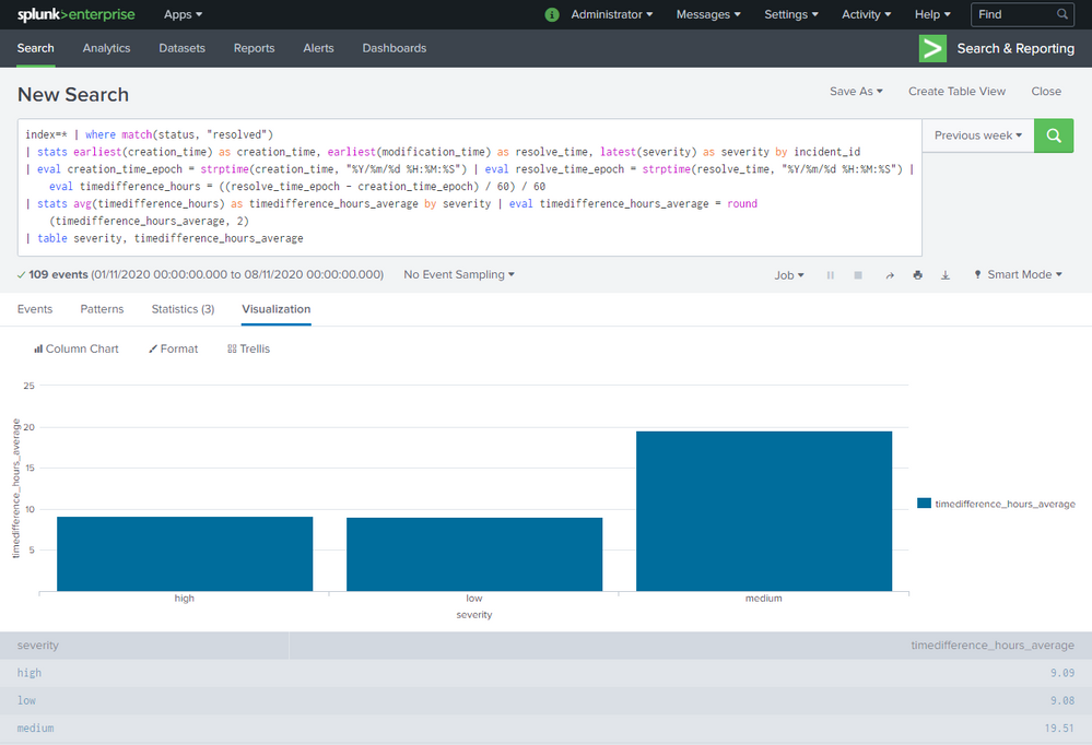
I want to have a colour-coded column chart for the average amount of time that an incident has been open by its severity.
So far, I think I have achieved most of this with the following search query:
index=* | where match(status, "resolved")
| stats earliest(creation_time) as creation_time, earliest(modification_time) as resolve_time, latest(severity) as severity by incident_id
| eval creation_time_epoch = strptime(creation_time, "%Y/%m/%d %H:%M:%S") | eval resolve_time_epoch = strptime(resolve_time, "%Y/%m/%d %H:%M:%S") | eval timedifference_hours = ((resolve_time_epoch - creation_time_epoch) / 60) / 60
| stats avg(timedifference_hours) as timedifference_hours_average by severity | eval timedifference_hours_average = round(timedifference_hours_average, 2)
| table severity, timedifference_hours_average
The problem is that, probably due to a flaw with my search query, the legend is not per severity and, seemingly as a result, the dashboard XML <option name="charting.fieldColors">{"low": 0x3391FF, "medium": 0xF8BE34, "high": 0xDF4D58}</option> is not applying.
Can anyone point me in the right direction?
Thanks.
- Mark as New
- Bookmark Message
- Subscribe to Message
- Mute Message
- Subscribe to RSS Feed
- Permalink
- Report Inappropriate Content
work around:
| makeresults
| eval _raw="severity,time_diff_avg
high,9.09
low,9.08
medium,19.51"
| multikv forceheader=1
| table severity time_diff_avg
| rex "(?<comment>(?# the logic))"
| xyseries severity severity time_diff_avg
| table severity high medium low
It's the only way to be satisfied with everything you want to do.
- Mark as New
- Bookmark Message
- Subscribe to Message
- Mute Message
- Subscribe to RSS Feed
- Permalink
- Report Inappropriate Content
sample:
<dashboard>
  <label>chart color</label>
  <row>
    <panel>
      <chart>
        <search>
          <query>| makeresults
| eval _raw="severity,time_diff_avg
high,9.09
low,9.08
medium,19.51"
| multikv forceheader=1
| table severity time_diff_avg
| eval severities="severity"
| xyseries  severities severity time_diff_avg</query>
          <earliest>-24h@h</earliest>
          <latest>now</latest>
          <sampleRatio>1</sampleRatio>
        </search>
        <option name="charting.axisTitleX.visibility">collapsed</option>
        <option name="charting.chart">column</option>
        <option name="charting.drilldown">all</option>
        <option name="charting.fieldColors">{"low": 0x3391FF, "medium": 0xF8BE34, "high": 0xDF4D58}</option>
      </chart>
    </panel>
  </row>
</dashboard>- Mark as New
- Bookmark Message
- Subscribe to Message
- Mute Message
- Subscribe to RSS Feed
- Permalink
- Report Inappropriate Content
Hi @to4kawa ,
Thanks for that. It's very promising.
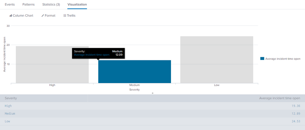
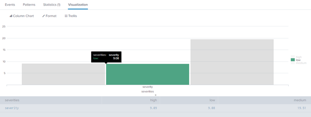
Is there any way to preserve the following aspects of my method with yours?
- Display the severity under each column.
- Preserve sort order of severity.
- Display the following in the hover element:
"severity: <severity>
timedifference_hours_average: <number>"
How it currently looks using my method:
How it currently looks using your method:
Thanks.


