Turn on suggestions
Auto-suggest helps you quickly narrow down your search results by suggesting possible matches as you type.
Showing results for
Dashboards & Visualizations
Turn on suggestions
Auto-suggest helps you quickly narrow down your search results by suggesting possible matches as you type.
Showing results for
- Splunk Answers
- :
- Using Splunk
- :
- Dashboards & Visualizations
- :
- Can the font color of the values reflected in a "s...
Options
- Subscribe to RSS Feed
- Mark Topic as New
- Mark Topic as Read
- Float this Topic for Current User
- Bookmark Topic
- Subscribe to Topic
- Mute Topic
- Printer Friendly Page
- Mark as New
- Bookmark Message
- Subscribe to Message
- Mute Message
- Subscribe to RSS Feed
- Permalink
- Report Inappropriate Content
beetlegeuse
Path Finder
11-14-2022
01:11 PM
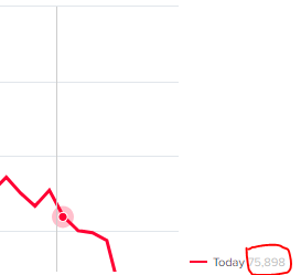
I have a line chart panel in my dashboard that's comparing two series of datapoints, and I have "charting.legend.mode" set to "seriesCompare" to see the values next to the appropriate series name in the legend. Trouble is, the font color used for those values is very light and difficult to see.
Can an adjustment be made to change the font color of those compare values? I've circled the value in the screen capture below:
1 Solution
- Mark as New
- Bookmark Message
- Subscribe to Message
- Mute Message
- Subscribe to RSS Feed
- Permalink
- Report Inappropriate Content
ITWhisperer

SplunkTrust
11-15-2022
02:26 AM
Give your panel an id and then add this CSS in a style block of a hidden HTML panel
    <panel depends="$stayhidden$">
      <html>
        <style>
          #linechart svg g.highcharts-legend-item text tspan:nth-child(2) {
            fill: red !important;
          }
        </style>
      </html>
    </panel>
    <panel id="linechart">
<chart>- Mark as New
- Bookmark Message
- Subscribe to Message
- Mute Message
- Subscribe to RSS Feed
- Permalink
- Report Inappropriate Content
ITWhisperer

SplunkTrust
11-15-2022
02:26 AM
Give your panel an id and then add this CSS in a style block of a hidden HTML panel
    <panel depends="$stayhidden$">
      <html>
        <style>
          #linechart svg g.highcharts-legend-item text tspan:nth-child(2) {
            fill: red !important;
          }
        </style>
      </html>
    </panel>
    <panel id="linechart">
<chart>- Mark as New
- Bookmark Message
- Subscribe to Message
- Mute Message
- Subscribe to RSS Feed
- Permalink
- Report Inappropriate Content
beetlegeuse
Path Finder
11-15-2022
10:33 AM
Works like a charm...thank you!
Get Updates on the Splunk Community!
.conf24 | Day 0
Hello Splunk Community!
My name is Chris, and I'm based in Canberra, Australia's capital, and I travelled for ...
Enhance Security Visibility with Splunk Enterprise Security 7.1 through Threat ...
(view in My Videos)Struggling with alert fatigue, lack of context, and prioritization around security ...
Troubleshooting the OpenTelemetry Collector
In this tech talk, you’ll learn how to troubleshoot the OpenTelemetry collector - from checking the ...

