Turn on suggestions
Auto-suggest helps you quickly narrow down your search results by suggesting possible matches as you type.
Dashboards & Visualizations
×
Are you a member of the Splunk Community?
Sign in or Register with your Splunk account to get your questions answered, access valuable resources and connect with experts!
Turn on suggestions
Auto-suggest helps you quickly narrow down your search results by suggesting possible matches as you type.
- Find Answers
- :
- Using Splunk
- :
- Dashboards & Visualizations
- :
- Can anyone suggest another visualization in Splunk...
Options
- Subscribe to RSS Feed
- Mark Topic as New
- Mark Topic as Read
- Float this Topic for Current User
- Bookmark Topic
- Subscribe to Topic
- Mute Topic
- Printer Friendly Page
- Mark as New
- Bookmark Message
- Subscribe to Message
- Mute Message
- Subscribe to RSS Feed
- Permalink
- Report Inappropriate Content
Can anyone suggest another visualization in Splunk similar to what is being requested?
POR160893
Builder
05-03-2022
03:00 AM
Hi,
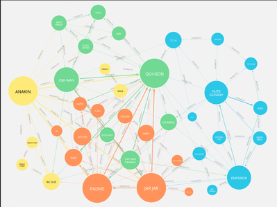
I have been asked to created a web-like visualization to capture webpages being hit over a time period.
The following is an example of what the stakeholder has requested (similar to a Neo4j graph):
I have tried using the network viz but it does not really compliment the time element to my data.
Can anyone suggest another visualization in Splunk similar to what is being requested?
Many thanks,
P
Get Updates on the Splunk Community!
Index This | Why did the turkey cross the road?
November 2025 Edition
Hayyy Splunk Education Enthusiasts and the Eternally Curious!
We’re back with this ...
Enter the Agentic Era with Splunk AI Assistant for SPL 1.4
🚀 Your data just got a serious AI upgrade — are you ready?
Say hello to the Agentic Era with the ...
Feel the Splunk Love: Real Stories from Real Customers
Hello Splunk Community,
What’s the best part of hearing how our customers use Splunk? Easy: the positive ...

