Turn on suggestions
Auto-suggest helps you quickly narrow down your search results by suggesting possible matches as you type.
Dashboards & Visualizations
×
Are you a member of the Splunk Community?
Sign in or Register with your Splunk account to get your questions answered, access valuable resources and connect with experts!
Turn on suggestions
Auto-suggest helps you quickly narrow down your search results by suggesting possible matches as you type.
- Find Answers
- :
- Using Splunk
- :
- Dashboards & Visualizations
- :
- Assign colors to trellis based on status
Options
- Subscribe to RSS Feed
- Mark Topic as New
- Mark Topic as Read
- Float this Topic for Current User
- Bookmark Topic
- Subscribe to Topic
- Mute Topic
- Printer Friendly Page
- Mark as New
- Bookmark Message
- Subscribe to Message
- Mute Message
- Subscribe to RSS Feed
- Permalink
- Report Inappropriate Content
Assign colors to trellis based on status
schou87
Path Finder
05-21-2021
08:04 AM
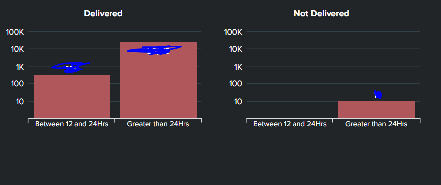
Hi, I have a column chart trellis split into two parts basis status - Delivered and Not Delivered. How do I go ahead and color the two charts differently based on status? I have attached the snapshot of trellis.
Regards
- Mark as New
- Bookmark Message
- Subscribe to Message
- Mute Message
- Subscribe to RSS Feed
- Permalink
- Report Inappropriate Content
kamlesh_vaghela

SplunkTrust
05-21-2021
09:38 AM
Can you please try this sample code?
<dashboard>
  <label>Trellis Column</label>
  <row>
    <panel>
       <html depends="$alwaysHideCSS$">
        <style>
          #columnchart1 #facet-viz_splitby_field_Status_splitby_value_Delivered #column .highcharts-graph {
            fill:#00ff00;
          }
          #columnchart1 #facet-viz_splitby_field_Status_splitby_value_Not_Delivered #column .highcharts-graph {
            fill:#ff0000;
          }

        </style>
      </html>
      <chart id="columnchart1">
        <search>
          <query>| makeresults count=10
| eval c=1
| accum c
| eval A=case((c%3)==0,"Between 12 and 24 Hrs",1=1,"Greater Than 24 Hrs"),Status=case((c%2)==0,"Not Delivered",1=1,"Delivered")
| xyseries A Status c</query>
          <earliest>-24h@h</earliest>
          <latest>now</latest>
          <sampleRatio>1</sampleRatio>
        </search>
        <option name="charting.axisLabelsX.majorLabelStyle.overflowMode">ellipsisNone</option>
        <option name="charting.axisLabelsX.majorLabelStyle.rotation">0</option>
        <option name="charting.axisTitleX.visibility">collapsed</option>
        <option name="charting.axisTitleY.visibility">collapsed</option>
        <option name="charting.axisTitleY2.visibility">collapsed</option>
        <option name="charting.axisX.abbreviation">none</option>
        <option name="charting.axisX.scale">linear</option>
        <option name="charting.axisY.abbreviation">none</option>
        <option name="charting.axisY.scale">linear</option>
        <option name="charting.axisY2.abbreviation">none</option>
        <option name="charting.axisY2.enabled">0</option>
        <option name="charting.axisY2.scale">inherit</option>
        <option name="charting.chart">column</option>
        <option name="charting.chart.bubbleMaximumSize">50</option>
        <option name="charting.chart.bubbleMinimumSize">10</option>
        <option name="charting.chart.bubbleSizeBy">area</option>
        <option name="charting.chart.nullValueMode">gaps</option>
        <option name="charting.chart.showDataLabels">none</option>
        <option name="charting.chart.sliceCollapsingThreshold">0.01</option>
        <option name="charting.chart.stackMode">default</option>
        <option name="charting.chart.style">shiny</option>
        <option name="charting.drilldown">none</option>
        <option name="charting.layout.splitSeries">0</option>
        <option name="charting.layout.splitSeries.allowIndependentYRanges">0</option>
        <option name="charting.legend.labelStyle.overflowMode">ellipsisMiddle</option>
        <option name="charting.legend.mode">standard</option>
        <option name="charting.legend.placement">none</option>
        <option name="charting.lineWidth">2</option>
        <option name="trellis.enabled">1</option>
        <option name="trellis.scales.shared">1</option>
        <option name="trellis.size">medium</option>
      </chart>
    </panel>
  </row>
</dashboard>
Thanks
KV
▄︻̷̿┻̿═━一
If this reply helps you, an upvote would be appreciated.
Get Updates on the Splunk Community!
Fastest way to demo Observability
I’ve been having a lot of fun learning about Kubernetes and Observability. I set myself an interesting ...
September Community Champions: A Shoutout to Our Contributors!
As we close the books on another fantastic month, we want to take a moment to celebrate the people who are the ...
Splunk Decoded: Service Maps vs Service Analyzer Tree View vs Flow Maps
It’s Monday morning, and your phone is buzzing with alert escalations – your customer-facing portal is running ...
