Join the Conversation
- Find Answers
- :
- Using Splunk
- :
- Dashboards & Visualizations
- :
- Apply color to the values in pie chart
- Subscribe to RSS Feed
- Mark Topic as New
- Mark Topic as Read
- Float this Topic for Current User
- Bookmark Topic
- Subscribe to Topic
- Mute Topic
- Printer Friendly Page
- Mark as New
- Bookmark Message
- Subscribe to Message
- Mute Message
- Subscribe to RSS Feed
- Permalink
- Report Inappropriate Content
Apply color to the values in pie chart
Hi ,
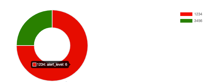
Need help to provide the color to the avg(alert_level) to pie chart.
Spl: index=xxx | stats avg(alert_level) by id.
Sample Data:
alert_level , id
6,1234
2,3456
Condition: If alert_level is 6, then the id should show the red color in pie chart, if the alert_level is 2 , then the id should show the green color in pie chart.
kindly help.
- Mark as New
- Bookmark Message
- Subscribe to Message
- Mute Message
- Subscribe to RSS Feed
- Permalink
- Report Inappropriate Content
@Lakshman can you try out Semicircle Donut Chart viz Custom Visualization from Splunkbase, for your use case which will allow you to color the slices based on the SLA field.
Following is a run anywhere example based on the sample data and use case provided.
<dashboard>
  <label>Color Slice by Value</label>
  <row>
    <panel>
      <title>Semicircle Donut</title>
      <viz type="semicircle_donut.semicircle_donut">
        <search>
          <query>| makeresults
| eval data="6,1234;2,3456"
| makemv data delim=";"
| mvexpand data
| makemv data delim=","
| eval alert_level=mvindex(data,0), id=mvindex(data,1), color=case(alert_level==6,"red",alert_level==2,"green",true(),"grey")
| table id alert_level color</query>
          <earliest>-24h@h</earliest>
          <latest>now</latest>
          <sampleRatio>1</sampleRatio>
        </search>
        <option name="drilldown">none</option>
        <option name="semicircle_donut.semicircle_donut.colorField">color</option>
        <option name="semicircle_donut.semicircle_donut.cutoutPercentage">50</option>
        <option name="semicircle_donut.semicircle_donut.legendPosition">right</option>
        <option name="semicircle_donut.semicircle_donut.type">full</option>
        <option name="trellis.enabled">0</option>
        <option name="trellis.scales.shared">1</option>
        <option name="trellis.size">medium</option>
      </viz>
    </panel>
  </row>
</dashboard>
Please try out and confirm!
| makeresults | eval message= "Happy Splunking!!!"
- Mark as New
- Bookmark Message
- Subscribe to Message
- Mute Message
- Subscribe to RSS Feed
- Permalink
- Report Inappropriate Content
Hi Niket,
Thanks for your message. The solution is good . Here I want to update on the requirement is the alert levels will keep change (6 ,2,3,4,5,1) and the id's are around 200 . Could you please help how can we achieve this.
Thanks in advance!
- Mark as New
- Bookmark Message
- Subscribe to Message
- Mute Message
- Subscribe to RSS Feed
- Permalink
- Report Inappropriate Content
@Lakshman Sorry I did not get the new requirement. As far as you are showing slices in your pie by alert level you can use pie or donut representation. However, for over 200 ids to be represented across various alert levels you may need Bar, Line chart or something else depending on what exactly you need to plot.
Your new request seems SPL challenge that should be posted in Search help with your data sample current Splunk Search and issue you are running into with expected result for addressing the issue better.
Do up vote the answers and accept if your issue posted is resolved!
| makeresults | eval message= "Happy Splunking!!!"

