Are you a member of the Splunk Community?
- Find Answers
- :
- Using Splunk
- :
- Dashboards & Visualizations
- :
- After upgrade to 8.25: inconsistent data in timeli...
- Subscribe to RSS Feed
- Mark Topic as New
- Mark Topic as Read
- Float this Topic for Current User
- Bookmark Topic
- Subscribe to Topic
- Mute Topic
- Printer Friendly Page
- Mark as New
- Bookmark Message
- Subscribe to Message
- Mute Message
- Subscribe to RSS Feed
- Permalink
- Report Inappropriate Content
After upgrade to 8.25: inconsistent data in timeline (after some time)
After upgrade to 8.2.5 we suffer from another issue with visualliation and showing dramatic wrong data...
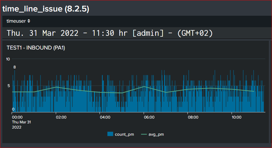
built this morning at 11:30
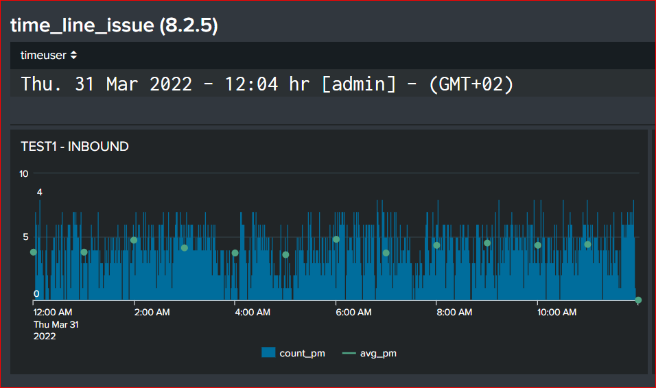
Dashboard/panel shows after some time (here ca 30m) completely different avg-visual but more concerning completely wrong data for 'count_pm' metric :
Please see attached my xml code, what do I miss here?
- Mark as New
- Bookmark Message
- Subscribe to Message
- Mute Message
- Subscribe to RSS Feed
- Permalink
- Report Inappropriate Content
XML code belonging to post:
<form theme="dark">
<label>time_line_issue (8.2.5)</label>
<row depends="$hide$">
<panel>
<html>
<style>
//<!--this makes table have a bigger fint and colleor-->{}
#usertime td:nth-child(1) {
color: white !important;
text-align: left !important;
font-size: 25px !important;
}
</style>
</html>
</panel>
</row>
<row>
<panel id="usertime">
<table>
<search>
<query>index=* earliest=-1h@h
| stats max(_time) as mtime
| eval stime=strftime(mtime, "%a. %d %b %Y - %H:%M hr")
| table stime mtime
| appendcols
[| rest /services/authentication/current-context
| table username *]
| eval tZtime=strftime(mtime, "%Z") , tztime=substr(strftime(mtime, "%z"),0,3) ,
TZ=tZtime." (".tztime.")" , timeuser=stime." [".username."] - (GMT".tztime.")"
| table timeuser</query>
<earliest>-15m</earliest>
<latest>now</latest>
<refresh>1m</refresh>
<refreshType>delay</refreshType>
</search>
<option name="drilldown">none</option>
<option name="link.exportResults.visible">0</option>
<option name="link.inspectSearch.visible">0</option>
<option name="link.openPivot.visible">0</option>
<option name="link.openSearch.search">false</option>
<option name="link.visible">0</option>
<option name="refresh.display">none</option>
<option name="refresh.link.visible">1</option>
</table>
</panel>
</row>
<row>
<panel>
<title>TEST1 - INBOUND</title>
<chart>
<search>
<query>index=bostb AND MachineID=BB_PA1 AND Value!=0 AND Tag="*GVL_Hmi.Equipment.Sts.CurrState.Inbound[x].Inbound[1].ArrivedID[x].ArrivedID[1]"
AND Value>10
| timechart span=1min dc(Value) as count_pm
| appendpipe
[| timechart span=1h avg(count_pm) as avg_pm]
| appendpipe
[ stats count
| where count=0]
| eval count_pm=if(count=0, "0", count_pm), avg_pm=if(count=0, "0", round(avg_pm,1) )
| fields - count</query>
<earliest>@d</earliest>
<latest>now</latest>
<refresh>5m</refresh>
<refreshType>delay</refreshType>
</search>
<option name="charting.axisTitleX.visibility">collapsed</option>
<option name="charting.axisTitleY.visibility">collapsed</option>
<option name="charting.chart">column</option>
<option name="charting.chart.nullValueMode">gaps</option>
<option name="charting.chart.overlayFields">avg_pm</option>
<option name="charting.chart.showDataLabels">minmax</option>
<option name="charting.chart.stackMode">default</option>
<option name="charting.drilldown">all</option>
<option name="charting.layout.splitSeries">0</option>
<option name="charting.legend.placement">bottom</option>
<option name="refresh.display">progressbar</option>
</chart>
</panel>
<panel>
<title>TEST2 - INBOUND</title>
<chart>
<search>
<query>index=bostb AND MachineID=BB_PA1 AND Value!=0 AND Tag="*GVL_Hmi.Equipment.Sts.CurrState.Inbound[x].Inbound[1].ArrivedID[x].ArrivedID[1]"
AND Value>10
| timechart span=1min dc(Value) as count_pm
| append
[ search index=bostb AND MachineID=BB_PA1 AND Value!=0 AND Tag="*GVL_Hmi.Equipment.Sts.CurrState.Inbound[x].Inbound[1].ArrivedID[x].ArrivedID[1]"
AND Value>10
| timechart span=1min dc(Value) as count_pm
| timechart span=1h avg(count_pm) as avg_pm]</query>
<earliest>@d</earliest>
<latest>now</latest>
<refresh>5m</refresh>
<refreshType>delay</refreshType>
</search>
<option name="charting.axisTitleX.visibility">collapsed</option>
<option name="charting.axisTitleY.visibility">collapsed</option>
<option name="charting.chart">column</option>
<option name="charting.chart.overlayFields">avg_pm</option>
<option name="charting.chart.showDataLabels">minmax</option>
<option name="charting.drilldown">none</option>
<option name="charting.legend.placement">bottom</option>
<option name="refresh.display">progressbar</option>
</chart>
</panel>
</row>
</form>
- Mark as New
- Bookmark Message
- Subscribe to Message
- Mute Message
- Subscribe to RSS Feed
- Permalink
- Report Inappropriate Content
I can't see your XML code attached - just the image (again). Apart from the points in the line not being joined up, where is the "dramatic" difference between these charts?
- Mark as New
- Bookmark Message
- Subscribe to Message
- Mute Message
- Subscribe to RSS Feed
- Permalink
- Report Inappropriate Content
Hi ITWhisperer,
Thanks.
Yes, please note the max value 8 in first image and then the 4 value in second image . Have added the xml code in a seperate reply post.
The maximum value (8) is suddenly divided by 2 (4)...which is a disturbing difference from the reality probably caused by the timeline visualization panel


