Join the Conversation
- Find Answers
- :
- Apps & Add-ons
- :
- All Apps and Add-ons
- :
- Using timeline visulations can i get the colors to...
- Subscribe to RSS Feed
- Mark Topic as New
- Mark Topic as Read
- Float this Topic for Current User
- Bookmark Topic
- Subscribe to Topic
- Mute Topic
- Printer Friendly Page
- Mark as New
- Bookmark Message
- Subscribe to Message
- Mute Message
- Subscribe to RSS Feed
- Permalink
- Report Inappropriate Content
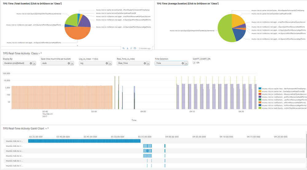
Below is an image of my dashboard, I have multiple graphs been drawn and they all use the same colors automatically.
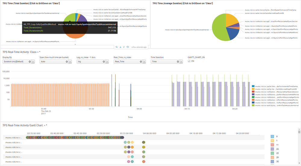
However when i add in a timeline i can only get blue, when i turn on the colors i get the second graphs, not very nice.
Is there any way to get timeline to take the colors that have been picked allready?
- Mark as New
- Bookmark Message
- Subscribe to Message
- Mute Message
- Subscribe to RSS Feed
- Permalink
- Report Inappropriate Content
Got this working with help from @niketnilay answer
eventtype=mlc sourcetype=tps host=TimeSeries | eval foo="ON" | eval foo1="true" | eval foo2="ON" | eval duration = endTime - startTime | search name = "" operationIdentity=* | eval fullyQualifiedMethod = name."#".operationIdentity |sort - duration | eval fullyQualifiedMethod2 = name."#".operationIdentity | table _time fullyQualifiedMethod fullyQualifiedMethod2 duration
- Mark as New
- Bookmark Message
- Subscribe to Message
- Mute Message
- Subscribe to RSS Feed
- Permalink
- Report Inappropriate Content
Splunk Charts applies series colors to all charts. In fact if the series names are same, that is how all series will pick same color.
If you notice in your screenshot, when you choose Categorical colors for the Timeline visualization, the Legends in the same sequence have the same colors as compared to other charts i.e. First color in your timechart as well TimeLine visualization is blue(0x1e93c6) and second is orange(0xf2b827)... and so on.
Following are default series colors picked up by Splunk charts (charting.seriesColors😞
[0x1e93c6, 0xf2b827, 0xd6563c, 0x6a5c9e, 0x31a35f, 0xed8440, 0x3863a0, 0xa2cc3e, 0xcc5068, 0x73427f, 0x11a88b, 0xea9600, 0x0e776d, 0xffb380, 0xaa3977, 0x91af27, 0x4453aa, 0x99712b, 0x553577, 0x97bc71, 0xd35c2d, 0x314d5b, 0x99962b, 0x844539, 0x00b290, 0xe2c188, 0xa34a41, 0x44416d, 0xe29847, 0x8c8910, 0x0b416d, 0x774772, 0x3d9988, 0xbdbd5e, 0x5f7396, 0x844539]
| makeresults | eval message= "Happy Splunking!!!"
- Mark as New
- Bookmark Message
- Subscribe to Message
- Mute Message
- Subscribe to RSS Feed
- Permalink
- Report Inappropriate Content
Hi. Thanks for looking at this for me. I agree the colors are the same sequence in Categorical graph.
But this issue is they are changing over and over even do the series name is the same ( Lots of round circles). what i really would love is to have long blocks from the first image with the same colors.
So a user can look at the colors of a series in the pie and its the same in thr gantt.
- Mark as New
- Bookmark Message
- Subscribe to Message
- Mute Message
- Subscribe to RSS Feed
- Permalink
- Report Inappropriate Content
Hi, In fact by adding in an extra column this is now working.
eventtype=mlc sourcetype=tps host=TimeSeries | eval foo="ON" | eval foo1="true" | eval foo2="ON" | eval duration = endTime - startTime | search name = "" operationIdentity=* | eval fullyQualifiedMethod = name."#".operationIdentity |sort - duration | eval fullyQualifiedMethod2 = name."#".operationIdentity | table _time fullyQualifiedMethod fullyQualifiedMethod2 duration
- Mark as New
- Bookmark Message
- Subscribe to Message
- Mute Message
- Subscribe to RSS Feed
- Permalink
- Report Inappropriate Content
@robertlynch2020 ... You can convert your previous comment as an answer and vote the same. However, this goes back to my point that same label name across the dashboard will pick same color because default series colors are predefined.
| makeresults | eval message= "Happy Splunking!!!"
- Mark as New
- Bookmark Message
- Subscribe to Message
- Mute Message
- Subscribe to RSS Feed
- Permalink
- Report Inappropriate Content
Will do. Thanks for your help 🙂


