Turn on suggestions
Auto-suggest helps you quickly narrow down your search results by suggesting possible matches as you type.
All Apps and Add-ons
×
Are you a member of the Splunk Community?
Sign in or Register with your Splunk account to get your questions answered, access valuable resources and connect with experts!
Turn on suggestions
Auto-suggest helps you quickly narrow down your search results by suggesting possible matches as you type.
- Find Answers
- :
- Apps & Add-ons
- :
- All Apps and Add-ons
- :
- I have created a pie chart visualization in splunk...
Options
- Subscribe to RSS Feed
- Mark Topic as New
- Mark Topic as Read
- Float this Topic for Current User
- Bookmark Topic
- Subscribe to Topic
- Mute Topic
- Printer Friendly Page
- Mark as New
- Bookmark Message
- Subscribe to Message
- Mute Message
- Subscribe to RSS Feed
- Permalink
- Report Inappropriate Content
I have created a pie chart visualization in splunk, I want to change it to doughnut visualization.
cadrija
Path Finder
12-20-2021
12:15 AM
My current panel looks like this
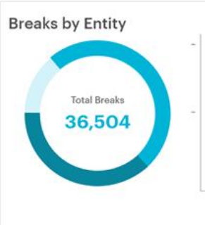
How to make it look like doughnut like below
With the total inside the hollow center like this
Is there any way to do this, please let me know.
- Mark as New
- Bookmark Message
- Subscribe to Message
- Mute Message
- Subscribe to RSS Feed
- Permalink
- Report Inappropriate Content
PickleRick

SplunkTrust
12-20-2021
12:25 AM
Not with built-in visualizations as far as I know. You have to look for custom visualization apps. Maybe "Custom Chart Viz"?
Get Updates on the Splunk Community!
September Community Champions: A Shoutout to Our Contributors!
As we close the books on another fantastic month, we want to take a moment to celebrate the people who are the ...
Splunk Decoded: Service Maps vs Service Analyzer Tree View vs Flow Maps
It’s Monday morning, and your phone is buzzing with alert escalations – your customer-facing portal is running ...
What’s New in Splunk Observability – September 2025
What's NewWe are excited to announce the latest enhancements to Splunk Observability, designed to help ITOps ...


