Join the Conversation
- Find Answers
- :
- Apps & Add-ons
- :
- All Apps and Add-ons
- :
- All Apps and Add-ons
- :
- Re: Heatmap - Tool, Query, and visualization optio...
- Subscribe to RSS Feed
- Mark Topic as New
- Mark Topic as Read
- Float this Topic for Current User
- Bookmark Topic
- Subscribe to Topic
- Mute Topic
- Printer Friendly Page
- Mark as New
- Bookmark Message
- Subscribe to Message
- Mute Message
- Subscribe to RSS Feed
- Permalink
- Report Inappropriate Content
Heatmap - Tool, Query, and visualization options.
I currently have a sample data table as below. I want to put it into a heatmap, where Date, TimeWindow, Sum as X, Y, and Z in the heatmap.
Date            TimeWindow       Sum

3/1/2018    20:20:00—20:40:00 5

3/3/2018    14:40:00—15:00:00 3

3/9/2018    23:20:00—23:40:00 0

3/23/2018   00:40:00—01:00:00 1
I downloaded this heatmap: https://splunkbase.splunk.com/app/3159/
Query I used: source blabla | table Date TimeWindow Sum
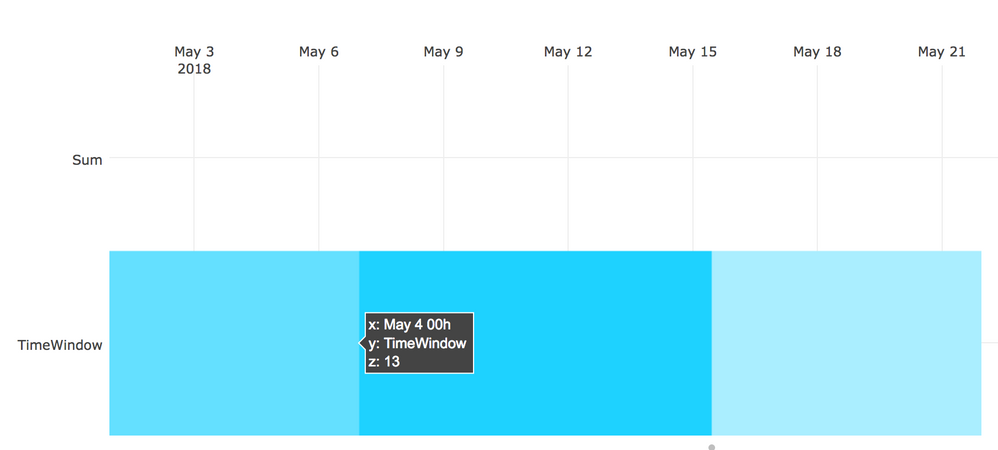
The heatmap I got was weird.
I looked at its sample data from "| inputlookup marx_counts.csv", the input data structure looks completely diffirent.
I think my query is wrong, but I couldn't find examples to refer to. Am I using the right Heatmap app, or would anyone suggest me changing to another Heatwave, or change my input data models...?
Thank you.
- Mark as New
- Bookmark Message
- Subscribe to Message
- Mute Message
- Subscribe to RSS Feed
- Permalink
- Report Inappropriate Content
Hello @h52huang,
Indeed, you need to do a bit more formatting before the heatmap will work. It sounds like you have 3 columns you want to use. Two of those columns need to be treated as categorical fields (in the sense that they are the row separations and the column separations). The third column, should be numeric of course.
Thankfully, you simply need to use the timechart command to get it into the right format.
index=_internal
| timechart span=10m count by component
Gives me a visualization like:
So in your situation, like you only need something like:
... base search
| chart sum(something) by Date TimeWindow
or something like
... base search
| chart first(sum) by Date TimeWindow
- Mark as New
- Bookmark Message
- Subscribe to Message
- Mute Message
- Subscribe to RSS Feed
- Permalink
- Report Inappropriate Content
Hi @aljohnson 🙂
Thanks a lot for helping. I have a few more questions please.
I tried with both
... base search

 | chart sum(something) by Date TimeWindow
and
... base search

 | chart sum(something) by TimeWindow, Date
The results are totally different for axis values.
by TimeWindow Date gave me:
x: 01:00:00-01:20:00
y: April 2006 (The value is weird, I suspect it was calculated and converted from my 2018-05-07
z: 12
while by Date TimeWindow gave me:
x: May 7 12h
y: 01:00:00-01:20:00
z: 12
I checked how the values look like in a table, they are completely ok. but I don't know why Y axis date string is automatically calculated and then into a date.
Is there a way for me to:
- Remove 12h in the Date field, and reserve Y axis field please?
Thank you so much
- Mark as New
- Bookmark Message
- Subscribe to Message
- Mute Message
- Subscribe to RSS Feed
- Permalink
- Report Inappropriate Content
Hi @h52huang
Yes, you are correct, that the ordering of the fields with the chart command matters, and will produce different output. You can read more about the chart command here: http://docs.splunk.com/Documentation/Splunk/7.1.1/SearchReference/Chart
Sound like Splunk might be automatically formatting a detected date? You can try adding some string to the beginning of the date to ensure that it isn't formatted, e.g.
| eval Date = "Date: ".Date or you can rename it to a different field possibly?
- Mark as New
- Bookmark Message
- Subscribe to Message
- Mute Message
- Subscribe to RSS Feed
- Permalink
- Report Inappropriate Content
@aljohnson 🙂
| makeresults | eval message= "Happy Splunking!!!"


