Join the Conversation
- Find Answers
- :
- Using Splunk
- :
- Other Using Splunk
- :
- Alerting
- :
- How to set status color from xyseries values?
- Subscribe to RSS Feed
- Mark Topic as New
- Mark Topic as Read
- Float this Topic for Current User
- Bookmark Topic
- Subscribe to Topic
- Mute Topic
- Printer Friendly Page
- Mark as New
- Bookmark Message
- Subscribe to Message
- Mute Message
- Subscribe to RSS Feed
- Permalink
- Report Inappropriate Content
How to set status color from xyseries values?
index=xx* app_name="xxx" OR cf_app_name="yyy*" OR app_name="ccc"
|bucket _time span=1d |eval dayweek=strftime(_time,"%H")
|convert timeformat="%m-%d-%y" ctime(_time) as c_time
|eval Job = case(like(msg, "%first%"), "first Job", like(msg, "%second%"), "second Job", like(msg, "%third%"), "third job",like(msg, "%fourth%"), "fourth job")| stats count(eval(like(msg, "%All feed is completed%") OR like(msg, "%Success:%") OR like(msg, "%Success: %") OR like(msg, "%Finished success%"))) as Successcount count(eval(like(msg, "%Fatal Error: %") OR like(msg, "%Fatal Error:%") OR like(msg, "%Job raised exception%") AND like(msg, "% job error%"))) as failurecount by Job c_time dayweek
|eval status=case((Job="fourth job") AND (dayweek=="Saturday" OR dayweek=="Sunday"),"NA",Successcount>0,"Success",failurecount>0,"Failure")
| xyseries Job c_time status
My result :
| Job | date1 | date2 | date3 |
| first | Success | Success | Failure |
| second | Success | Success | Success |
Set status color success as green and failure as red but its comes from xyseries c_time so i cant able to set color.
- Mark as New
- Bookmark Message
- Subscribe to Message
- Mute Message
- Subscribe to RSS Feed
- Permalink
- Report Inappropriate Content
Actually I just figured it out. The key is using nothing in the field value:
<format type="color" field="">
   <colorPalette type="minMidMax" maxColor="#31A35F" midColor="#A2CC3E" minColor="#FFFFFF"></colorPalette>
   <scale type="minMidMax" maxType="percentile" maxValue="100" midType="percentile" midValue="50" minType="percentile" minValue="0"></scale>
</format>
Then reformatting the left most column back to default in the panel:
      <html depends="$alwaysHideCSSStyle$">
        <style>
            #YOURTABLEID tbody td[data-cell-index="0"] {
               background-color: #e1e6eb !important;
               color: #000000 !important;
            }
        </style>
    </html>
However, this isn't perfect because the heat coloring only compares itself to other items in their respective column. Not any value throughout the entire table.
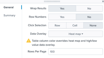
Edit: Ignore the first part above and just set this in your xyseries table in your dashboard.
If your left most column are number values and are being counted in the heatmap, go add the html piece above to fix that, or eval some strings onto the front or back of it. I can't tell if the heatmap is considering those values in it's auto gradient calculation or not.
- Mark as New
- Bookmark Message
- Subscribe to Message
- Mute Message
- Subscribe to RSS Feed
- Permalink
- Report Inappropriate Content
I would also like to know. If you can color the values, suddenly it's a heatmap.

