Are you a member of the Splunk Community?
- Find Answers
- :
- Using Splunk
- :
- Dashboards & Visualizations
- :
- Re: Force multiple colour per category in Pie Char...
- Subscribe to RSS Feed
- Mark Topic as New
- Mark Topic as Read
- Float this Topic for Current User
- Bookmark Topic
- Subscribe to Topic
- Mute Topic
- Printer Friendly Page
- Mark as New
- Bookmark Message
- Subscribe to Message
- Mute Message
- Subscribe to RSS Feed
- Permalink
- Report Inappropriate Content
Hi,
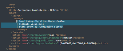
I need to create a pie chart .... however, the query sets all BOTH categories the SAME colour.
How can I make them different?
Thanks
- Mark as New
- Bookmark Message
- Subscribe to Message
- Mute Message
- Subscribe to RSS Feed
- Permalink
- Report Inappropriate Content
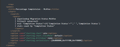
You have a Completion Status value of an empty string - this is not the same as a null value nor just a space. Convert the empty string to a space (or some other more useful value).
| eval "Completion Status"=if('Completion Status'=""," ",'Completion Status')- Mark as New
- Bookmark Message
- Subscribe to Message
- Mute Message
- Subscribe to RSS Feed
- Permalink
- Report Inappropriate Content
This worked 🙂
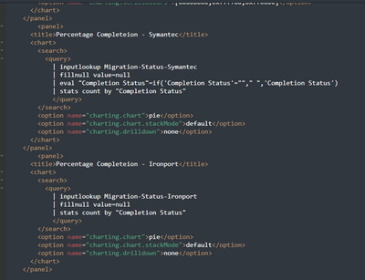
But, how can I standardize the 3 pie charts to have the same color scheme as the pie chart on the right:
The following is my code:
Many thanks as always and I have given you Karma again 🙂
- Mark as New
- Bookmark Message
- Subscribe to Message
- Mute Message
- Subscribe to RSS Feed
- Permalink
- Report Inappropriate Content
Include the same charting.seriesColors option in all three charts.


