Join the Conversation
- Find Answers
- :
- Apps & Add-ons
- :
- All Apps and Add-ons
- :
- Customize Sankey Visualization With Single Value V...
- Subscribe to RSS Feed
- Mark Topic as New
- Mark Topic as Read
- Float this Topic for Current User
- Bookmark Topic
- Subscribe to Topic
- Mute Topic
- Printer Friendly Page
- Mark as New
- Bookmark Message
- Subscribe to Message
- Mute Message
- Subscribe to RSS Feed
- Permalink
- Report Inappropriate Content
Customize Sankey Visualization With Single Value Visualizations
Hello All,
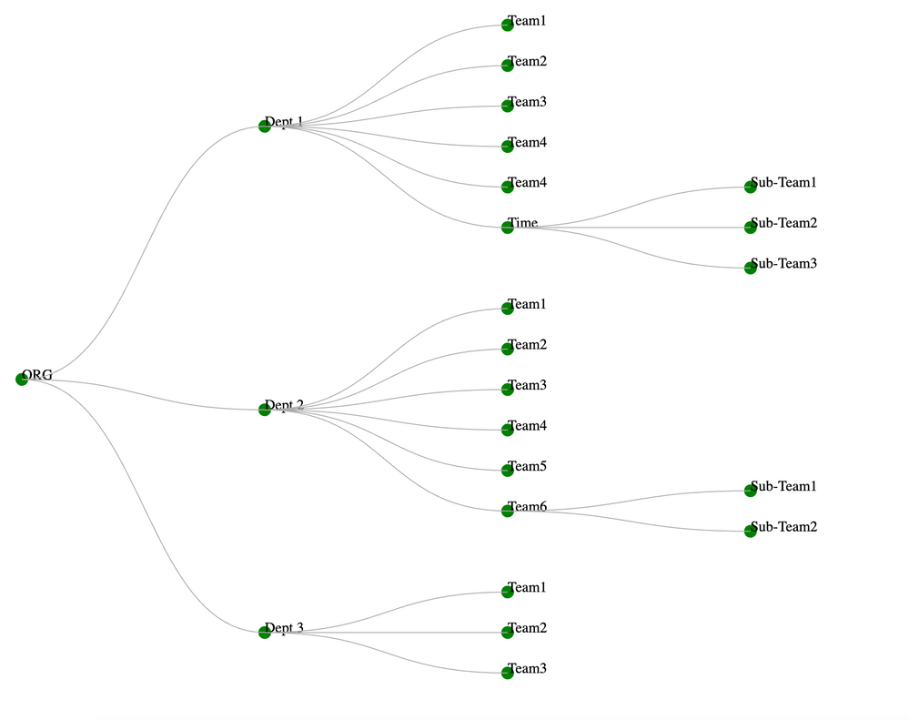
we need to create a DASHBOARD, which has a tree-like layout to represent various departments in our Org.
Installing the Sankey diagram app has helped us with the layout.
The real trouble comes here, the Splunk DASHBOARD, at each & every endpoint must represent a Single Value Viz (Indicating Green OR RED OR GREY) to indicate the health status of that particular team. (the value comes from ALERTS getting fired for that specific team's service desk queue)
The sample must must look like this.
Here the GREEN represents a HEALTHY status
RED must represent something must be WRONG.
How can we achieve this with Sankey & Single Value Viz ?
Or
Is there a new approach, any idea's are WELCOME.
It would be great, if i can solve this problem from this platform.
Thanks In Advance
Sai Marlakunta

