Turn on suggestions
Auto-suggest helps you quickly narrow down your search results by suggesting possible matches as you type.
Showing results for
Splunk Search
Turn on suggestions
Auto-suggest helps you quickly narrow down your search results by suggesting possible matches as you type.
Showing results for
- Splunk Answers
- :
- Using Splunk
- :
- Splunk Search
- :
- Move or add Y axis to the right of multi-series li...
Options
- Subscribe to RSS Feed
- Mark Topic as New
- Mark Topic as Read
- Float this Topic for Current User
- Bookmark Topic
- Subscribe to Topic
- Mute Topic
- Printer Friendly Page
- Mark as New
- Bookmark Message
- Subscribe to Message
- Mute Message
- Subscribe to RSS Feed
- Permalink
- Report Inappropriate Content
Move or add Y axis to the right of multi-series line chart
benhooper
Communicator
08-20-2020
07:37 AM
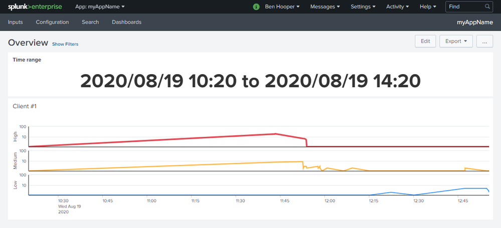
I've made the following multi-series line chart (details) where it makes much more sense to have the Y axis on the right-hand side as that's where the most recent values are charted:
Unfortunately, I can't see a way to do this. The most common recommendation that I've found is to use an overlay but it seems that that's incompatible with multi-series mode.
Can anyone help?
Get Updates on the Splunk Community!
Introducing the 2024 SplunkTrust!
Hello, Splunk Community! We are beyond thrilled to announce our newest group of SplunkTrust members!
The ...
Introducing the 2024 Splunk MVPs!
We are excited to announce the 2024 cohort of the Splunk MVP program. Splunk MVPs are passionate members of ...
Splunk Custom Visualizations App End of Life
The Splunk Custom Visualizations apps End of Life for SimpleXML will reach end of support on Dec 21, 2024, ...

