- Splunk Answers
- :
- Using Splunk
- :
- Splunk Search
- :
- Is conditional background coloring possible in Spl...
- Subscribe to RSS Feed
- Mark Topic as New
- Mark Topic as Read
- Float this Topic for Current User
- Bookmark Topic
- Subscribe to Topic
- Mute Topic
- Printer Friendly Page
- Mark as New
- Bookmark Message
- Subscribe to Message
- Mute Message
- Subscribe to RSS Feed
- Permalink
- Report Inappropriate Content
Hi Team,
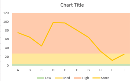
Can any one help me to know if conditional coloring is possible in Splunk Charts as shown in the below image?
Basically, the background color will be horizontal divisions on basis of condition defined, like for the below chart,
0-5 -> Low - Green Colour
6-25-> Medium - Yellow Colour
more than 25 -> High - Amber Colour

Please guide how such chart can be made in Splunk Dashboard.
Update
If not colouring, atleast can we add additional graph lines, perhaps dotted across the graph to show the threshold boundaries?
Anyone who can help on pointers on this?
- Mark as New
- Bookmark Message
- Subscribe to Message
- Mute Message
- Subscribe to RSS Feed
- Permalink
- Report Inappropriate Content
If not colouring, atleast can we add additional graph lines, perhaps dotted across the graph to show the threshold boundaries?
That you can be done simply enough.
eval threshold1 = 100 ; eval threshold2 = 200 ; eval threshold1 = 500
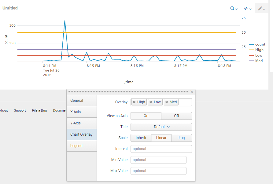
Then just select each of those in the visualization panel as a new axis.
Example search : index=_internal | timechart count | eval Low=10, Med=20, High=50
Those numbers could be calculated in your search dynamically aswell.
And what it looks like

