Turn on suggestions
Auto-suggest helps you quickly narrow down your search results by suggesting possible matches as you type.
Showing results for
Splunk Search
Turn on suggestions
Auto-suggest helps you quickly narrow down your search results by suggesting possible matches as you type.
Showing results for
- Splunk Answers
- :
- Using Splunk
- :
- Splunk Search
- :
- Re: How to plot a line graph to display state chan...
Options
- Subscribe to RSS Feed
- Mark Topic as New
- Mark Topic as Read
- Float this Topic for Current User
- Bookmark Topic
- Subscribe to Topic
- Mute Topic
- Printer Friendly Page
- Mark as New
- Bookmark Message
- Subscribe to Message
- Mute Message
- Subscribe to RSS Feed
- Permalink
- Report Inappropriate Content
rakes568
Explorer
07-11-2017
12:37 PM
We have a list of machines in our system with their state change as On or Off along with timestamp.
2017-07-11 12:39:01 M1  Up
2017-07-11 12:25:39 M2  Down
2017-07-11 10:58:27 M1  Down
2017-07-11 10:44:32 M3  Down
2017-07-11 10:27:33 M3  Up
2017-07-11 09:47:52 M3  Down
Is there a way to plot a line graph of state change for all machines based on their timestamp?
I tried following query using timechart, but it displays dotted values with 0 and 1, instead of a continuous linechart.
mysearch| eval State=if(state="Up",1,0) | timechart span=5m max(State) by machine
1 Solution
- Mark as New
- Bookmark Message
- Subscribe to Message
- Mute Message
- Subscribe to RSS Feed
- Permalink
- Report Inappropriate Content
s2_splunk

Splunk Employee
07-11-2017
01:24 PM
- Mark as New
- Bookmark Message
- Subscribe to Message
- Mute Message
- Subscribe to RSS Feed
- Permalink
- Report Inappropriate Content
s2_splunk

Splunk Employee
07-11-2017
01:24 PM
- Mark as New
- Bookmark Message
- Subscribe to Message
- Mute Message
- Subscribe to RSS Feed
- Permalink
- Report Inappropriate Content
s2_splunk

Splunk Employee
07-11-2017
01:08 PM
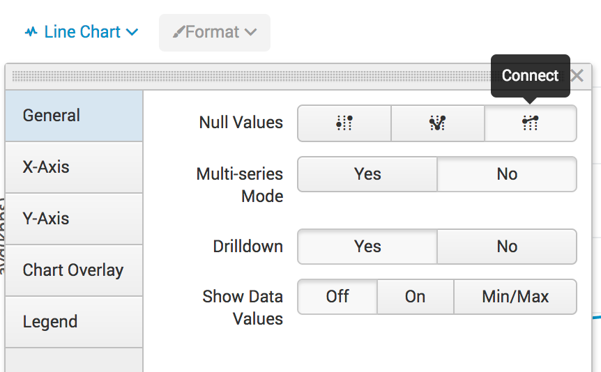
You can specify the formatting options for the line chart in the UI such that the dots are connected for missing values, have you tried that?
Get Updates on the Splunk Community!
Introducing the 2024 SplunkTrust!
Hello, Splunk Community! We are beyond thrilled to announce our newest group of SplunkTrust members!
The ...
Introducing the 2024 Splunk MVPs!
We are excited to announce the 2024 cohort of the Splunk MVP program. Splunk MVPs are passionate members of ...
Splunk Custom Visualizations App End of Life
The Splunk Custom Visualizations apps End of Life for SimpleXML will reach end of support on Dec 21, 2024, ...

