- Splunk Answers
- :
- Using Splunk
- :
- Splunk Search
- :
- How to make Graphic display of a delta between two...
- Subscribe to RSS Feed
- Mark Topic as New
- Mark Topic as Read
- Float this Topic for Current User
- Bookmark Topic
- Subscribe to Topic
- Mute Topic
- Printer Friendly Page
- Mark as New
- Bookmark Message
- Subscribe to Message
- Mute Message
- Subscribe to RSS Feed
- Permalink
- Report Inappropriate Content
Hello community,
I apologize in advance, I don't speak English so my writing won't be perfect.
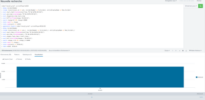
I have a problem with a comparison. I want to compare a number of acknowledgments on a number of alerts over a period of X minutes (example: the number of acknowledgments between 0 and 5 min VS the number of resolved alerts between 0 and 5 min). I use Splunk OnCall and I think I found the right search for it but I don't know why, I can't make a clean graph for it. I would like a bar with padding to indicate the delta between my acknowledged alerts and the total alerts. Here is what my search yields:
Do you know how to force display it to show the delta in question?
Best regards,
- Mark as New
- Bookmark Message
- Subscribe to Message
- Mute Message
- Subscribe to RSS Feed
- Permalink
- Report Inappropriate Content
If you have just two fields, Splunk is going to graph one value against the other.
You need a third field which will work as series differentiator.
If you do just
| makeresults
| eval a=10,b=20
| table a b
And try to graph that. You'll get yourself a nice little rectangle like you did with your search.
But if you leave the _time field
| makeresults
| eval a=10,b=20
| table _time a b
Or even create some phony field on your own
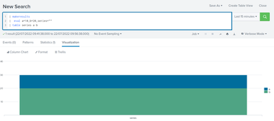
| makeresults
| eval a=10,b=20,series=""
| table series a b
You can now go to visualization, chose column chart with proper stacking and will get something like this:
Notice however, that the values are stacked so if one is 10 and the other is 20 they add up to the "big bar" which has a height of 30. You'd have to do some substraction to make it add up to the bigger value but I'm sure you'll manage that 😉
- Mark as New
- Bookmark Message
- Subscribe to Message
- Mute Message
- Subscribe to RSS Feed
- Permalink
- Report Inappropriate Content
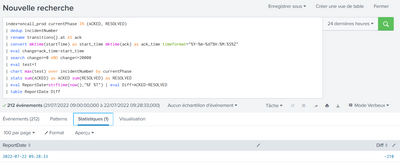
Hi @somesoni2, thank you very much for your help and research. Here is the result :
The info is interesting because it displays the delta directly with the generation date, I think to use it for a report instead.
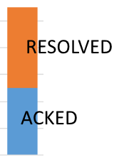
However, in my case, I need both infos (ACKED VS RESOLVED) for my dashboard and it's the display that gives me problem because I can't make a cumulative display (something like this):
Do you know what is wrong with my search to display this kind of graph?
Best regards,
Rajaion
- Mark as New
- Bookmark Message
- Subscribe to Message
- Mute Message
- Subscribe to RSS Feed
- Permalink
- Report Inappropriate Content
If you have just two fields, Splunk is going to graph one value against the other.
You need a third field which will work as series differentiator.
If you do just
| makeresults
| eval a=10,b=20
| table a b
And try to graph that. You'll get yourself a nice little rectangle like you did with your search.
But if you leave the _time field
| makeresults
| eval a=10,b=20
| table _time a b
Or even create some phony field on your own
| makeresults
| eval a=10,b=20,series=""
| table series a b
You can now go to visualization, chose column chart with proper stacking and will get something like this:
Notice however, that the values are stacked so if one is 10 and the other is 20 they add up to the "big bar" which has a height of 30. You'd have to do some substraction to make it add up to the bigger value but I'm sure you'll manage that 😉
- Mark as New
- Bookmark Message
- Subscribe to Message
- Mute Message
- Subscribe to RSS Feed
- Permalink
- Report Inappropriate Content
Hi @PickleRick,
Thank you for your solution, it's exactly what I needed, and with the little subtraction that goes well, I have exactly the result I want.
Thanks also to @ITWhisperer who agrees with the same idea of better managing fields.
I learned a lot about this problem, thanks again.
Best regards,
Rajaion
- Mark as New
- Bookmark Message
- Subscribe to Message
- Mute Message
- Subscribe to RSS Feed
- Permalink
- Report Inappropriate Content
Short answer - Remove the last 3 lines
Longer answer - the two bars in your graphic would be represented as two series in the chart; each series is effectively a different field or column in the statistics table; the chart command you already have in your search gives you these fields / columns, you just need to visualise them and format to use stacked columns.
- Mark as New
- Bookmark Message
- Subscribe to Message
- Mute Message
- Subscribe to RSS Feed
- Permalink
- Report Inappropriate Content
I would do something like this
index=oncall_prod currentPhase IN (ACKED, RESOLVED)
| rename transitions{}.at AS ack
| convert mktime(startTime) as start_time mktime(ack) as ack_time timeformat="%Y-%m-%dT%H:%M:%S%Z"
| eval change=ack_time-start_time
| search change>=0 AND change<=20000
| eval test=1
| chart max(test) over incidentNumber by currentPhase
| stats sum(ACKED) as ACKED sum(RESOLVED) as RESOLVED
| eval ReportDate=strftime(now(),"%F %T") | eval Diff=ACKED-RESOLVED
| table ReportDate Diff
If you just want to show


