Join the Conversation
- Find Answers
- :
- Using Splunk
- :
- Splunk Search
- :
- Re: How do you get events time interval as 15 minu...
- Subscribe to RSS Feed
- Mark Topic as New
- Mark Topic as Read
- Float this Topic for Current User
- Bookmark Topic
- Subscribe to Topic
- Mute Topic
- Printer Friendly Page
- Mark as New
- Bookmark Message
- Subscribe to Message
- Mute Message
- Subscribe to RSS Feed
- Permalink
- Report Inappropriate Content
How do you get events time interval as 15 minutes on timechart x-axis?
Hi one and all,
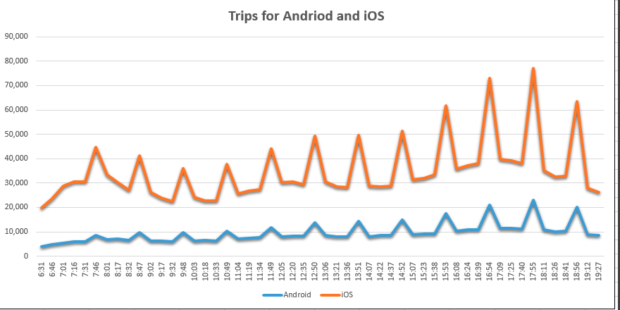
I have my log data as below for every 15min interval.
2018-08-23,16:16,11230,37393,49019
2018-08-23,16:16,11631,37943,49973
2018-08-23,16:47,17014,55890,73450
This is how i have data for 24 hrs. When i do 'timechart` the graph bins automatically showing with 4 hrs gap on scale. But i wanted 15m wise points on graph along with the time on x-axis.
please see the below picture for expected output
what i am getting is below from timechart command
I want 15m scale on x-axis.can some one help on this?
Thanks in advance.
- Mark as New
- Bookmark Message
- Subscribe to Message
- Mute Message
- Subscribe to RSS Feed
- Permalink
- Report Inappropriate Content
Can you show the "statistics tab" with _time and values that would be helpful
- Mark as New
- Bookmark Message
- Subscribe to Message
- Mute Message
- Subscribe to RSS Feed
- Permalink
- Report Inappropriate Content
Hi @prathapkcsc,
this might help you.
https://answers.splunk.com/answers/91717/timechart-x-axis.html
so for your search that should look like this
...| timechart span=15m fixedrange=true ...
you need to edit the SimpleXML options of the chart on the dashboard, adding the following:
<option name="charting.scaleX">1</option>
<option name="charting.axisLabelsX.majorUnit">P0Y0M0DT0H15M0S</option>
- Mark as New
- Bookmark Message
- Subscribe to Message
- Mute Message
- Subscribe to RSS Feed
- Permalink
- Report Inappropriate Content
I tried this. It didn't work with my dash board.


