Turn on suggestions
Auto-suggest helps you quickly narrow down your search results by suggesting possible matches as you type.
Showing results for
Splunk Search
Turn on suggestions
Auto-suggest helps you quickly narrow down your search results by suggesting possible matches as you type.
Showing results for
- Splunk Answers
- :
- Using Splunk
- :
- Splunk Search
- :
- How can I make a stacked Column chart?
Options
- Subscribe to RSS Feed
- Mark Topic as New
- Mark Topic as Read
- Float this Topic for Current User
- Bookmark Topic
- Subscribe to Topic
- Mute Topic
- Printer Friendly Page
- Mark as New
- Bookmark Message
- Subscribe to Message
- Mute Message
- Subscribe to RSS Feed
- Permalink
- Report Inappropriate Content
Edwin1471
Path Finder
08-04-2022
01:41 AM
Hi,
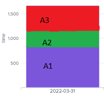
how can I make a stacked column chart . Currently the Purple area displays how long it took for all processes combined to execute. How could I modify my spl query so that it would display how long each individual process took to complete in a column chart. (A1, A2, A3 - process names)
| rex field=PROCESS_NAME ":(?<Process>[^\"]+)"
| eval finish_time_epoch = strftime(strptime(FINISH_TIME, "%Y-%m-%d %H:%M:%S"),"%Y-%m-%d %H:%M:%S")
| eval start_time_epoch = strftime(strptime(START_TIME, "%Y-%m-%d %H:%M:%S"),"%Y-%m-%d %H:%M:%S")
| eval duration_s = strptime(FINISH_TIME, "%Y-%m-%d %H:%M:%S") - strptime(START_TIME, "%Y-%m-%d %H:%M:%S")
| eval duration_min = round(duration_s / 60, 2)
| chart sum(duration_min) as "time" by G_DT
1 Solution
- Mark as New
- Bookmark Message
- Subscribe to Message
- Mute Message
- Subscribe to RSS Feed
- Permalink
- Report Inappropriate Content
ITWhisperer

SplunkTrust
08-04-2022
02:12 AM
- Mark as New
- Bookmark Message
- Subscribe to Message
- Mute Message
- Subscribe to RSS Feed
- Permalink
- Report Inappropriate Content
dglauche
Engager
08-04-2022
02:18 AM
Hi,
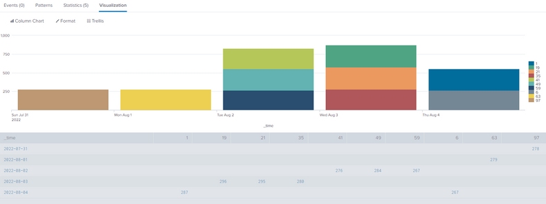
not sure whats the content of your G_DT field but in general you can create a stacked chart like this:
| makeresults count=100
| streamstats count as pid
| eval _time=_time-(pid*3600), duration=random()%300
| timechart span=1d useother=f sum(duration) by pid
- Mark as New
- Bookmark Message
- Subscribe to Message
- Mute Message
- Subscribe to RSS Feed
- Permalink
- Report Inappropriate Content
ITWhisperer

SplunkTrust
08-04-2022
02:12 AM
| chart sum(duration_min) as "time" by G_DT Process
Get Updates on the Splunk Community!
Webinar Recap | Revolutionizing IT Operations: The Transformative Power of AI and ML ...
The Transformative Power of AI and ML in Enhancing Observability
In the realm of IT operations, the ...
.conf24 | Registration Open!
Hello, hello! I come bearing good news: Registration for .conf24 is now open!
conf is Splunk’s rad annual ...
ICYMI - Check out the latest releases of Splunk Edge Processor
Splunk is pleased to announce the latest enhancements to Splunk Edge Processor.
HEC Receiver authorization ...


