Turn on suggestions
Auto-suggest helps you quickly narrow down your search results by suggesting possible matches as you type.
Showing results for
Splunk Search
Turn on suggestions
Auto-suggest helps you quickly narrow down your search results by suggesting possible matches as you type.
Showing results for
- Splunk Answers
- :
- Using Splunk
- :
- Splunk Search
- :
- How can I make a stacked Column chart?
Options
- Subscribe to RSS Feed
- Mark Topic as New
- Mark Topic as Read
- Float this Topic for Current User
- Bookmark Topic
- Subscribe to Topic
- Mute Topic
- Printer Friendly Page
- Mark as New
- Bookmark Message
- Subscribe to Message
- Mute Message
- Subscribe to RSS Feed
- Permalink
- Report Inappropriate Content
Edwin1471
Path Finder
08-04-2022
01:41 AM
Hi,
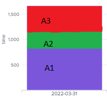
how can I make a stacked column chart . Currently the Purple area displays how long it took for all processes combined to execute. How could I modify my spl query so that it would display how long each individual process took to complete in a column chart. (A1, A2, A3 - process names)
| rex field=PROCESS_NAME ":(?<Process>[^\"]+)"
| eval finish_time_epoch = strftime(strptime(FINISH_TIME, "%Y-%m-%d %H:%M:%S"),"%Y-%m-%d %H:%M:%S")
| eval start_time_epoch = strftime(strptime(START_TIME, "%Y-%m-%d %H:%M:%S"),"%Y-%m-%d %H:%M:%S")
| eval duration_s = strptime(FINISH_TIME, "%Y-%m-%d %H:%M:%S") - strptime(START_TIME, "%Y-%m-%d %H:%M:%S")
| eval duration_min = round(duration_s / 60, 2)
| chart sum(duration_min) as "time" by G_DT
1 Solution
- Mark as New
- Bookmark Message
- Subscribe to Message
- Mute Message
- Subscribe to RSS Feed
- Permalink
- Report Inappropriate Content
ITWhisperer

SplunkTrust
08-04-2022
02:12 AM
- Mark as New
- Bookmark Message
- Subscribe to Message
- Mute Message
- Subscribe to RSS Feed
- Permalink
- Report Inappropriate Content
dglauche
Engager
08-04-2022
02:18 AM
Hi,
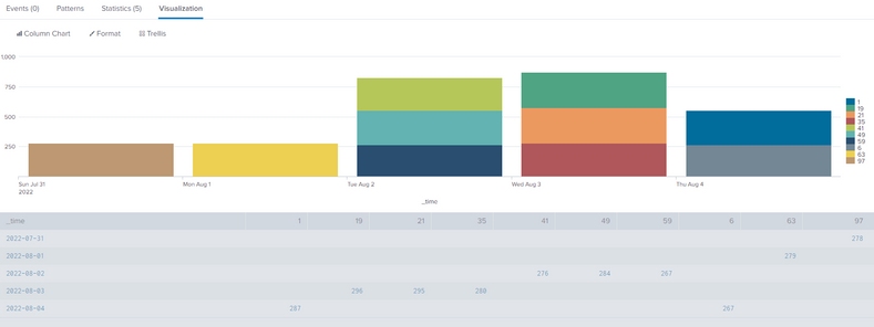
not sure whats the content of your G_DT field but in general you can create a stacked chart like this:
| makeresults count=100
| streamstats count as pid
| eval _time=_time-(pid*3600), duration=random()%300
| timechart span=1d useother=f sum(duration) by pid
- Mark as New
- Bookmark Message
- Subscribe to Message
- Mute Message
- Subscribe to RSS Feed
- Permalink
- Report Inappropriate Content
ITWhisperer

SplunkTrust
08-04-2022
02:12 AM
| chart sum(duration_min) as "time" by G_DT Process
Get Updates on the Splunk Community!
Extending Observability Content to Splunk Cloud
Watch Now!
In this Extending Observability Content to Splunk Cloud Tech Talk, you'll see how to leverage ...
More Control Over Your Monitoring Costs with Archived Metrics!
What if there was a way you could keep all the metrics data you need while saving on storage costs?This is now ...
New in Observability Cloud - Explicit Bucket Histograms
Splunk introduces native support for histograms as a metric data type within Observability Cloud with Explicit ...


