- Splunk Answers
- :
- Using Splunk
- :
- Splunk Search
- :
- Can I have a chart overlay with 2 series stacked i...
- Subscribe to RSS Feed
- Mark Topic as New
- Mark Topic as Read
- Float this Topic for Current User
- Bookmark Topic
- Subscribe to Topic
- Mute Topic
- Printer Friendly Page
- Mark as New
- Bookmark Message
- Subscribe to Message
- Mute Message
- Subscribe to RSS Feed
- Permalink
- Report Inappropriate Content
I have a chart with 4 series and what I am wondering is "can I have a chart overlay with 2 series stacked in a Splunk graph"?
For example can I get the 2 lines(red and purple) in the below graph stacked in the chart overlay
this is what I am trying to achieve in excel
- Mark as New
- Bookmark Message
- Subscribe to Message
- Mute Message
- Subscribe to RSS Feed
- Permalink
- Report Inappropriate Content
Can I have a chart overlay with 2 series stacked in a Splunk graph?
thanks to @martin_mueller in the above comments. this is the answer.
Chart overlays are not stacked, on purpose.
With a bit of postprocessing you could compute the height of the stacked bars for each row, and add this offset to the overlay fields to emulate this behaviour.
- Mark as New
- Bookmark Message
- Subscribe to Message
- Mute Message
- Subscribe to RSS Feed
- Permalink
- Report Inappropriate Content
- Mark as New
- Bookmark Message
- Subscribe to Message
- Mute Message
- Subscribe to RSS Feed
- Permalink
- Report Inappropriate Content
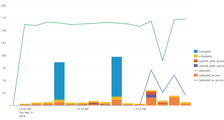
Like this:
index=_internal |timechart span=1m count by sourcetype | addtotals | eval splunkd_ui_access = Total - splunkd | eval splunkd = Total | fields - Total

Note how the mongod bar bumps up both lines, and how the splunkd_ui_access line bumps up the splunkd line towards the right. Alter the arithmetic if that's not what you're looking for.
- Mark as New
- Bookmark Message
- Subscribe to Message
- Mute Message
- Subscribe to RSS Feed
- Permalink
- Report Inappropriate Content
tks, kind of but slightly different. have got mie sorted for now.
- Mark as New
- Bookmark Message
- Subscribe to Message
- Mute Message
- Subscribe to RSS Feed
- Permalink
- Report Inappropriate Content
Chart overlays are not stacked, on purpose.
With a bit of postprocessing you could compute the height of the stacked bars for each row, and add this offset to the overlay fields to emulate this behaviour.
- Mark as New
- Bookmark Message
- Subscribe to Message
- Mute Message
- Subscribe to RSS Feed
- Permalink
- Report Inappropriate Content
why didn't you say so 🙂 tks. Ill look at doing some preprcessing or as I like to call it fiddling 🙂 But I do think it would be good as an option to be able to stack the chartoverlay, in my case here I am trying to do it on the 2nd y axis, my 2 cents.
- Mark as New
- Bookmark Message
- Subscribe to Message
- Mute Message
- Subscribe to RSS Feed
- Permalink
- Report Inappropriate Content
The search is index=_internal |timechart count by sourcetype, the entire chart configuration is described above already.
- Mark as New
- Bookmark Message
- Subscribe to Message
- Mute Message
- Subscribe to RSS Feed
- Permalink
- Report Inappropriate Content
checked that with my different data set and pretty sure they are not stacked. hard to confim with my dataset,
In your example above I think splunkd and splunkd_ui_access are not stacked.I am not sure but if they were splunkd(the green line) would jump up when splunkd_ui_access jumps up(around 10.55pm). thoughts?
- Mark as New
- Bookmark Message
- Subscribe to Message
- Mute Message
- Subscribe to RSS Feed
- Permalink
- Report Inappropriate Content
thats what I thought. not working on my data. can I just confirm that you know that splunkd and splunkd_ui_access are stacked there? Can I have the search to see if i can reproduce at my end? tks


