Turn on suggestions
Auto-suggest helps you quickly narrow down your search results by suggesting possible matches as you type.
Showing results for
Splunk Enterprise
Turn on suggestions
Auto-suggest helps you quickly narrow down your search results by suggesting possible matches as you type.
Showing results for
- Splunk Answers
- :
- Splunk Platform Products
- :
- Splunk Enterprise
- :
- Area Chart color is different shade of the same co...
Options
- Subscribe to RSS Feed
- Mark Topic as New
- Mark Topic as Read
- Float this Topic for Current User
- Bookmark Topic
- Subscribe to Topic
- Mute Topic
- Printer Friendly Page
- Mark as New
- Bookmark Message
- Subscribe to Message
- Mute Message
- Subscribe to RSS Feed
- Permalink
- Report Inappropriate Content
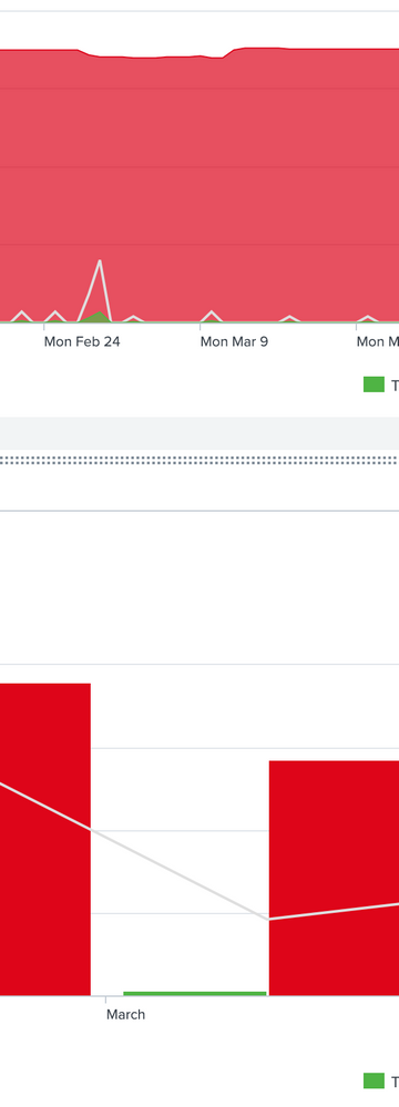
Area Chart color is different shade of the same color than Bar Chart...How do I fix this?
Username1
Path Finder
07-29-2020
08:54 AM
As the title suggest I am using the same color codes for red/grey/green for both of the graphs but the Bar Chart is how the color looks, and the Area chart makes it...more transparent looking and a lighter tint. How do I get the Area Chart color to be identical to the Bar Chart? Thanks in advance
Get Updates on the Splunk Community!
Updated Team Landing Page in Splunk Observability
We’re making some changes to the team landing page in Splunk Observability, based on your feedback. The ...
New! Splunk Observability Search Enhancements for Splunk APM Services/Traces and ...
Regardless of where you are in Splunk Observability, you can search for relevant APM targets including service ...
Webinar Recap | Revolutionizing IT Operations: The Transformative Power of AI and ML ...
The Transformative Power of AI and ML in Enhancing Observability
In the realm of IT operations, the ...

