Turn on suggestions
Auto-suggest helps you quickly narrow down your search results by suggesting possible matches as you type.
Dashboards & Visualizations
×
Are you a member of the Splunk Community?
Sign in or Register with your Splunk account to get your questions answered, access valuable resources and connect with experts!
Turn on suggestions
Auto-suggest helps you quickly narrow down your search results by suggesting possible matches as you type.
- Find Answers
- :
- Using Splunk
- :
- Dashboards & Visualizations
- :
- Re: Two y Axis
Options
- Subscribe to RSS Feed
- Mark Topic as New
- Mark Topic as Read
- Float this Topic for Current User
- Bookmark Topic
- Subscribe to Topic
- Mute Topic
- Printer Friendly Page
- Mark as New
- Bookmark Message
- Subscribe to Message
- Mute Message
- Subscribe to RSS Feed
- Permalink
- Report Inappropriate Content
Two y Axis
corematrix
New Member
07-18-2018
01:27 PM
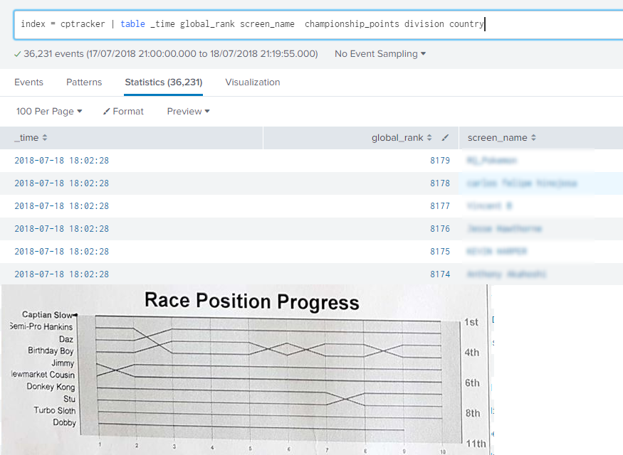
I have a very simple index which tracks a competitive game. Over the course of the year, people earn points for the top 16 positions switch places. In a CSV I track their Name, rank, score at regular intervals.
Below is a screenshot of my data in a simple table and an example of the kinda of the graph I wish to build.
How would I go about making this?
Name on the right > < Rank on the left
> time along the bottom <
- Mark as New
- Bookmark Message
- Subscribe to Message
- Mute Message
- Subscribe to RSS Feed
- Permalink
- Report Inappropriate Content
corematrix
New Member
07-19-2018
07:04 AM
- Mark as New
- Bookmark Message
- Subscribe to Message
- Mute Message
- Subscribe to RSS Feed
- Permalink
- Report Inappropriate Content
renjith_nair
Legend
07-20-2018
09:43 PM
@corematrix, have you selected "Multi-series Mode" on? In that case, each line uses its own series and there wont be any overlap
---
What goes around comes around. If it helps, hit it with Karma 🙂
What goes around comes around. If it helps, hit it with Karma 🙂
- Mark as New
- Bookmark Message
- Subscribe to Message
- Mute Message
- Subscribe to RSS Feed
- Permalink
- Report Inappropriate Content
renjith_nair
Legend
07-18-2018
10:40 PM
@corematrix ,
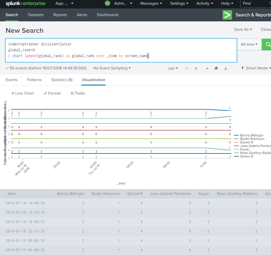
Does this work for you ?
index=cptracker|timechart latest(global_rank) as global_rank by screen_name
or
index=cptracker|chart latest(global_rank) as global_rank over _time by screen_name
---
What goes around comes around. If it helps, hit it with Karma 🙂
What goes around comes around. If it helps, hit it with Karma 🙂
Get Updates on the Splunk Community!
Observe and Secure All Apps with Splunk
Join Us for Our Next Tech Talk: Observe and Secure All Apps with SplunkAs organizations continue to innovate ...
Splunk Decoded: Business Transactions vs Business IQ
It’s the morning of Black Friday, and your e-commerce site is handling 10x normal traffic. Orders are flowing, ...
Fastest way to demo Observability
I’ve been having a lot of fun learning about Kubernetes and Observability. I set myself an interesting ...


