Turn on suggestions
Auto-suggest helps you quickly narrow down your search results by suggesting possible matches as you type.
Showing results for
Dashboards & Visualizations
Turn on suggestions
Auto-suggest helps you quickly narrow down your search results by suggesting possible matches as you type.
Showing results for
- Splunk Answers
- :
- Using Splunk
- :
- Dashboards & Visualizations
- :
- Splunk Charting Data Based on Type
Options
- Subscribe to RSS Feed
- Mark Topic as New
- Mark Topic as Read
- Float this Topic for Current User
- Bookmark Topic
- Subscribe to Topic
- Mute Topic
- Printer Friendly Page
- Mark as New
- Bookmark Message
- Subscribe to Message
- Mute Message
- Subscribe to RSS Feed
- Permalink
- Report Inappropriate Content
naralkar
Engager
11-25-2020
11:30 PM
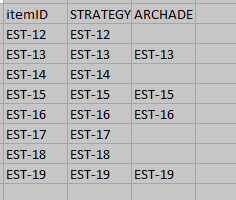
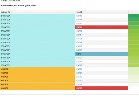
I have derived data from Splunk in the following format (Actual Format). But I want to format furthermore it in such a way that I can see which items are present in which categories, and which are missing (Expected Format). I am trying to chart it based on categoryID, but it's not working for me as I do not think max function is appropriate for this. Can anyone please help me know how can I achieve this
Tried using
| chart max(itemId) over itemId by categoryID
Expected Format

Actual Format

1 Solution
- Mark as New
- Bookmark Message
- Subscribe to Message
- Mute Message
- Subscribe to RSS Feed
- Permalink
- Report Inappropriate Content
to4kawa
Ultra Champion
11-26-2020
12:39 AM
| makeresults count=30
| eval categoryID=mvindex(split("Strategy,Archade",","),random() % 2)
| eval itemId="EST-1".(random() % 9 + 1)
| rex "(?<Comment>(?# this is your actual result, check this.
from here, the logic))"
| xyseries itemId categoryID itemId- Mark as New
- Bookmark Message
- Subscribe to Message
- Mute Message
- Subscribe to RSS Feed
- Permalink
- Report Inappropriate Content
naralkar
Engager
11-26-2020
02:58 AM
Thanks @to4kawa . This was all I needed..
Get Updates on the Splunk Community!
Introducing the 2024 SplunkTrust!
Hello, Splunk Community! We are beyond thrilled to announce our newest group of SplunkTrust members!
The ...
Introducing the 2024 Splunk MVPs!
We are excited to announce the 2024 cohort of the Splunk MVP program. Splunk MVPs are passionate members of ...
Splunk Custom Visualizations App End of Life
The Splunk Custom Visualizations apps End of Life for SimpleXML will reach end of support on Dec 21, 2024, ...
