- Splunk Answers
- :
- Using Splunk
- :
- Dashboards & Visualizations
- :
- Re: Sparklines very narrow - but not for all time ...
- Subscribe to RSS Feed
- Mark Topic as New
- Mark Topic as Read
- Float this Topic for Current User
- Bookmark Topic
- Subscribe to Topic
- Mute Topic
- Printer Friendly Page
- Mark as New
- Bookmark Message
- Subscribe to Message
- Mute Message
- Subscribe to RSS Feed
- Permalink
- Report Inappropriate Content
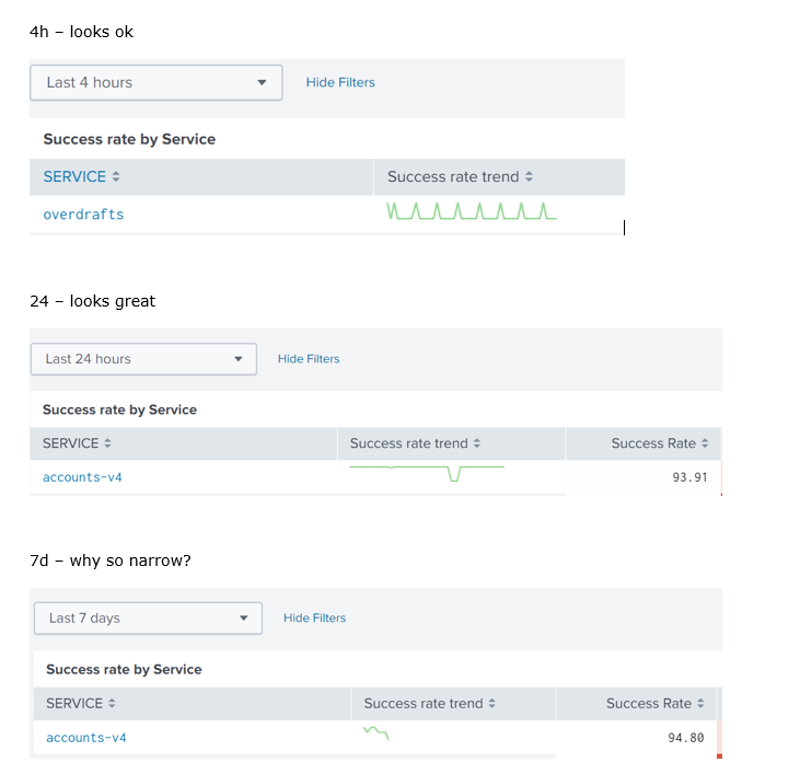
Sparklines very narrow - but not for all time periods
Hi there,
Any ideas why sparklines would be so short/narrow? I'm seeing that for shorter time windows - e.g. less than 4 days - the sparkline shows as expected. But once I extend it to a longer window the sparklines are very compressed.
Is that a common issue?
Thanks,
Phil
- Mark as New
- Bookmark Message
- Subscribe to Message
- Mute Message
- Subscribe to RSS Feed
- Permalink
- Report Inappropriate Content
Hi @phildotleeatanzdotcom,
How many data points are you getting for 7d, you could be hitting the limit of points that you can plot (10000) - as shown here https://docs.splunk.com/Documentation/Splunk/latest/Viz/ChartConfigurationReference#General_chart_pr... under charting.data.count. EDIT: This applies to timecharts and not sparklines...apparently sparklines are limited to around 100 points.
I advise you to use a bigger time span when going for 7d to allow for the sparkline to be displayed. You can test this by changing your span to 1d and looking at the 7d sparkline, should be working as you need it to.
Let me know if that helps.
Cheers,
David
- Mark as New
- Bookmark Message
- Subscribe to Message
- Mute Message
- Subscribe to RSS Feed
- Permalink
- Report Inappropriate Content
Thanks @DavidHourani - that could be it, although the sample size is every 30 minutes, so I would have thought that 7 days would only have had 7*48=336 data points. the base
e.g.
<search base="baseSearch">
       <!-- Group the events into 30 min block so we can get some realistic averages for success/failure percentage. If we use a shorter duration, the numbers fluctuate too much -->
       <query>
         <![CDATA[
         | bin _time minspan=30m
         | stats sum(success_count) as success_count sum(partial_count) as partial_count sum(failure_count) as failure_count sum(count) as count avg(avg_duration) as avg_duration by _time, SERVICE
         | eval success_rate=((success_count/count)*100)
         | stats sparkline(avg(success_rate)) as "Success Rate Trend" avg(success_rate) as "Success Rate Avg" first(success_rate) as "Success Rate Last" sum(success_count) as success_count sum(partial_count) as partial_count sum(failure_count) as failure_count sum(count) as count avg(avg_duration) as "Avg Duration" sparkline(avg(avg_duration)) as "Avg Duration Trend"  by SERVICE
         | sort "Success Rate Avg"
         ]]>
       </query>
     </search>
If I want it to dynamically modify the span based on the selected time window, is there an easy way to do that within the query? Currently I have a time picker on the page and run the base query based on the values in there, so I have access to variables for $time_token.earliest$ and $time_token.latest$
Thanks,
Phil
- Mark as New
- Bookmark Message
- Subscribe to Message
- Mute Message
- Subscribe to RSS Feed
- Permalink
- Report Inappropriate Content
Hi Phil,
So I double checked and edited my answer above. The 10k limit is for standard charting, when it comes to sparklines its 100 points max.
To workaround that you can replace the | bin _time minspan=30m by | bin _time bins=100 this will ensure you only have a maximum of 100 points regardless of the chosen time period. So whichever time you pick from the timepicker your sparkline should look just like you need it to.
Let me know if that helps.
Cheers,
David
- Mark as New
- Bookmark Message
- Subscribe to Message
- Mute Message
- Subscribe to RSS Feed
- Permalink
- Report Inappropriate Content
Thanks @DavidHourani. I tried but that still shows them as very short as soon as it goes above 3 days?

