- Splunk Answers
- :
- Using Splunk
- :
- Dashboards & Visualizations
- :
- How to make a custom heat map (choropleth like set...
- Subscribe to RSS Feed
- Mark Topic as New
- Mark Topic as Read
- Float this Topic for Current User
- Bookmark Topic
- Subscribe to Topic
- Mute Topic
- Printer Friendly Page
- Mark as New
- Bookmark Message
- Subscribe to Message
- Mute Message
- Subscribe to RSS Feed
- Permalink
- Report Inappropriate Content
How to make a custom heat map (choropleth like setting for grid/table) - NFL Statistics
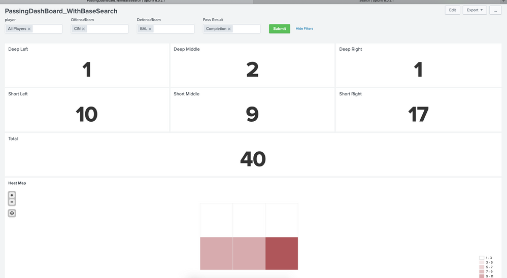
I've been playing around a bit with some NFL statistical data (source data is from http://nflsavant.com/about.php). Each passing play has a field called PassType where the six possible values are short left, short middle, short right and deep left, deep middle, and deep right.
I'd like to make a choropleth style heat map or table to visualize the data.
The visualization would be two rows and three columns. Deep passes on top, short passes on bottom with left right and middle where you'd expect. Is the best way to visualize this data with a cloropleth map? Is there something easier/better?
EDIT:
I've kind of worked through this. First I started by getting my data into single number visualizations where they are organized is a logical manner (deep passes on top, short on bottom, left, right and middle respectively). Then I kind of figured out how to do custom placemarks in a kml file to do the heat map. This was quite the mental exercise but I think I'm kind of there - the end result isn't as pretty as I was hoping, but it is fun to play with the data.

